Wednesday, January 31, 2007

Lost City


Photographs by Yuji Saiga that appear as if from one of Italo Calvino's Invisible Cities - an abandoned city on the Japanese island of Gukanjima. Originally known as Hashima Island it came to be called Gukanjima (battleship) Island because of the profile it's apartment buildings rising out of the sea. It was developed as a coal mining community and was populated from 1887 to 1974, eventually being abandoned when the coal ran out. In the 1950's it was apparently the was the worlds most densely populated community.


CITIES AND MEMORY 5

"Beware of saying to them that sometimes different cities follow one another on the same site and under the same name, born and dying without knowing one another, without communicating among themselves. At times even the names of the inhabitants remain the same, and their voices' accent, and also the features of the faces; but the gods who live beneath names and above places have gone off without a word and outsiders have settled in their place. It is pointless to ask whether the new ones are better or worse than the old, since there is no connection between them, just as the old post cards do not depict Maurilia as it was, but a different city which, by chance, was called Maurilia, like this one. (
Italo Calvino - Invisible Cities)


Also worth looking at are the photographs of the sea wall surrounding the island as well as photographs from 1974 when it was still inhabited


the Gallery of Regrettable Food

Food photography has come a long way in the last 50 years (to say nothing of cuisine...) Yep - that's meatballs in pink sauce - with the ever popular 1950's side dish of "chopped-off alien fetus pods".

If you've just had an operation, please don't scroll through The Gallery of Regrettable Food or you may burst your stitches.

But if you are a Baby Boomer you owe it to yourself to look at these and wonder in amazement at the fact we actually survived our childhood

Well worth hunting through the different 50's and 60's recipe books - especially the Knudsens Milk; Meat! Meat! Meat!; Knox cooking with gelatin - 0h and Cooking with Seven-Up - among others. A few of my favourites:


"I don’t know why, but this looks like some sort of control panel for a spacecraft whose occupants use only organic machinery. The egg slices on the left control the engines; the eggs on the right handle navigation.It goes without saying that the pea cluster is wired directly to the weapons array"


It really is Napalm-in-a-can - burns to 1120 degrees F...

"Was that a can in your pocket, or were you just glad to see me? But I’ll tell you this: there’s not a man alive who wouldn’t leap at the chance to deploy some Siz today. I mean, look at that thing. The colors. The shape. The name. No lighter run- off! Napalm with finger-tip control! It clings to each briquette and holds each coal in a clutch of fire. FLAMMABLE WHIPPED CREAM."


"Okay, here we go. It’s “Mashed Potato Surprise.” The recipe calls for a special kind of mushrooms: canned mushrooms. Which you feed to the dog. The trick is get him to throw up right in the middle of the mashed potatoes. "


Above- "Bleached, washed, plucked Scalp of Klingon"


And finally, no, you're not mistaken - that is Carnation hamburger....

And if you really enjoy the site, buy the book - for you Mum...

(all quotes and pictures from the Gallery of Regrettable Food)

Tuesday, January 30, 2007

Tree Roots and Trunk - Vincent van Gogh


"...this amazing painting – one of the very greatest (and least noticed) masterpieces from the founding moment of modernism – is yet another experiment in the independent vitality of painted line and colour, as well as the uncountable force of nature. Almost lost within it – as in Undergrowth With Two Figures – are allusions to and repudiations of, the exhausted traditions of landscape...

...The view is therefore bipolar: simultaneously that of the rabbit and the hawk. Colours – wheat-gold, clay-brown – tease the eye with possibilities of making sense of a field or a hill, but then scramble them into chaos. The usual aesthetic markers – beauty and ugliness – have been made meaningless. In Tree Roots the painted forms rap against the visual panes of our windows, as if trying to crash through the glass. In other paintings from these last weeks in Auvers the interior of the field – green or gold stalks – occupies the entirety of the visual field like a curtain. Without a beginning or an end this infinity of growing matter closes over us. It’s the ultimate compression of heaven and earth, a live burial within the engulfing sea of creation." Simon Scama on Vincent van Gogh's Tree Roots and Trunk"


(Once I've finished the Power of Art, I promise to stop quoting Schama so much...)

Bethicketted #3


The trees lack height and substance. There are no massive oaks or giant redwoods to anchor the forest either physically or visually and this northern forest lacks a dark dense forest floor. Instead the unique northern light, harsh, clear and oblique, angles through and reaches all but its deepest parts giving areas of strong shadow and highlight. The results are immersive landscapes where the viewer may become entangled and intrigued within the depths of the bush - bethicketted
tim atherton

Monday, January 29, 2007

Bee Flowers


Bee Flowers is an extraordinary photographer based in Moscow. He explores topics that range from Dutch suburbia, to Palestine/Israel and the West Bank to Fake Plastic Trees to Megastructure (Russia's urban planning) to Decommissioned Nation (the former Soviet Union) to Dachas and more.

His website itself is a work of art - one of the best websites I've seen full-stop, and certainly one of the best photographers sites. It's worth spending some time exploring. Click on a theme, follow a quick tour or go to the Gallery Index. There are also some great essays on there by Luis Gottardi (here among others) very well worth searching out.


I'd be hard put to pick my favourite work, so extensive are his projects. I've picked a few images from some of my favourites though.

Bee's work has recently been exhibited at the State Museum of Architecture in Moscow - the pictures of the show itself look fascinating - as well as the Yaroslavl Art Museum and the Astrakahn Art Museum.


Rumour has it Flowers is a Dutchman living in Moscow, a Russian who has lived in Holland and even one of the new Russian Oligarch's who does this on the side... (for the record I believe the first is true, but a little mythology is always good for an artists reputation... okay, he's probably going to kick my arse for that) - either way, despite the name, one thing he isn't is a 16 year old girl... (at least we don't think so) - even though I seem to recall someone hitting on him on the Streetphoto list under that assumption... not a pretty sight.


Flowers has also published some hand made artists books of his works. I'm saving up for one, and I've heard from others they are quite stunning.

From the introduction to Megastructures:

Ideal City
The clusters of large apartment blocks in Moscow, which form the central subject of this series by Bee Flowers, are called 'microrayons'. Sharing design & historical DNA with public housing and high-priced, free-market condominiums in many parts of the world, microrayons became a universal form of housing in Russia. Land, being government-owned, available, and plentiful, resulted in these units sprawling radially from the core of the city to its periphery. The architecture and design was not due to costs or other market pressures, but from an idealistic Communist vision of what a city and nation could be.


This Utopian vision of a functional cosmopolitan worker's collective would be facilitated, in part, by design, materials, and layout of the housing. Homogeneity in design was supposed to eliminate competition and individuality, creating a viable alternative to Capitalism. Instead, it resulted in density increasing as one neared the edges of Moscow, left dead industrial areas nearer to the core, caused high transportation/ supply/ maintenance costs and alienation. The early five-story version of these structures were referred to as 'khrushchovkas', derived from Nikita Khrushchev who initiated their construction around 1954, having released thousands of political prisoners from the Stalinist era, creating an instant housing crisis in Moscow.... (Luis Gottardi)

(below: diptych from Decommissioned Nation)

Saturday, January 27, 2007

Sugimoto


Trying to summarise Hiroshi Sugimoto's work up in a blog posting is an impossible task - I'll leave you to read the rather large retrospective book of the same name. All I want to do here is pick and chose a few of my favourites from his work.

Sugimoto has worked on a number of what may initially seem unconnected projects. But in a way they all do have an underlying theme - which is 
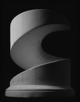
time - or more accurately, the passing of time and different kinds of time. The work has ranged from wax portrait and museum work, to the movie theatres, seascapes and architecture, on to mathematical forms and now fossils, among other things (he comments that fossils are really just photographs that take a long time to develop...
"Fossils work almost the same way as photography...as a record of history. The accumulation of time and history becomes a negative of the image. And this negative comes off, and the fossil is the positive side. This is the same as the action of photography. So that’s why I am very curious about the artistic stage of imprinting the memories of the time record. A fossil is made over
four-hundred-fifty million years—it takes that much time. But photography, it’s instant. So, to me, photography functions as a fossilization of time."
)
One thing about Sugimoto's work is it's often close to unique - he finds a very different way of approaching something, works with it and then moves on. He doesn't try and repeat himself, or milk an idea until it's long past dead. But equally, while he manages to find a unique approach, he manages to do so with turning it into a novelty. Those are two dangers plenty of others don't actually manage to avoid

Of his work to date, my favourites would have to be the movie theatres, the seascapes and the architecture - followed by the mathematical forms (though having worked on and off in museums, I also have a fondness for the dioramas).


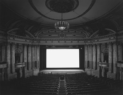
I once went to see a movie in San Francisco (Evita of all things) in a most beautiful ornate old theatre - but which had a strange sense of familiarity to it. It was only later that I realised it was one which Sugimoto had photographed. As I understand it, he made his photographs by using an extremely long exposure and photographing for the whole length of the movie - which lit the theatre but left a blanked out white screen. He also felt that the nature of the movie led to different results in the way the final photograph looked.

The seascapes are minimal and yet never really repetitive. In fact looking at a sequence of them - from different areas of the world - it's very easy to get drawn right into them. I think some where taken with very short exposures, while others were taken over several hours.

As for his architecture series, it really is one of my favourites. The photographs are taken at what he calls 2x infinity. That is, the lens is extended to 2x its normal focal length resulting in photographs which are out of focus - but in a way which still leaves the subject recognisable. Sugimoto explores Modern architecture all over the globe. The buildings remain identifiable in their essence, but we aren't caught up in the details. Of course they are also quite beautiful (and it's a great argument for not worrying about how razor sharp a lens needs to be).

I should add, these are definitely the sort of works which do really benefit from being printed quite large - they need the space.

With Sugimoto, I'm always waiting to see what he is going to do next, while I don't tire of going back over his work.


The Hirshorn has a very nice web presentation of their recent exhibit of his work

There is also an interview on PBS (links at the bottom of the page) - it also includes a fascinating slideshow of him planning an exhibition.

(For the technically minded, I seem to recall that he still works mainly in 8x10, with Tri-X in D23 to keep the contrast under control. And he likes to photograph @f64 - joking that he's the last of the Group F64)

Thursday, January 25, 2007

Lego versions of famous photos


Lego versions of famous photos from Atget (above) to Stieglitz to Evans, Robert Frank and Capa (below)


Interestingly, the Chris Jordan post raised a lot of discussion about photo-mosaics and also mosaic software. Out of that came a link to new work by Spanish photographer and artists Joan Fontcuberta including one of the first photo ever taken. So, which do you prefer - the high art or the Lego...:


(On the right, Niepce, 2005, C-print 120 x 160 cm, First photograph in history, taken by Nocéphore Niepce in Gras, France, 1826. The photograph has been refashioned using photomosaic freeware, linked to Google’’ Image Search function. The final result is a composite of 10,000 images available on the Internet that responded to the words"photo" and "foto" as search criteria.)

(Thanks Frank P for the Lego link)


Guess the photographer


Guess the photographer...

The answer is Esther Bubley - one of a number of pretty damn good photographers from the heyday of photojournalism. She certainly had an eye for colour from the little bit that's on her site (or maybe it's just that with Kodachrome II or whatever version it was - give it any tiny bit of red and it just zings + the slides still usually look as good today as they did 60 years ago)

Michael Kenna update...


George LeChat over on Hiding in Plain Sight (another favourite blog btw) has posted his own reflections on Michael Kenna - a slight contrast.

But any post that includes the phrase: "The Pictorialists, many of whom never saw a piece of gauze they didn't like, were the prime adherents of this stance." is worth reading imo...

Anselm Kiefer - Aperiatur Terra


A rip roaring review in the Guardian by Simon Schama of a London exhibition of Anslem Kiefer's most recent work

Kiefer is a contemporary artist I come back to again and again. Here are few gems (even if Schama is perhaps taking the "Lad" thing a bit too far these days...)

Trouble in paradise

"How do you like your contemporary art? A quick hit of juicy mischief, a larky take on mortality, binful of bluebottles, pocketful of glitter, everything you never wanted to know and more about the artist's entrails? Right then, give Anselm Kiefer a very wide berth - because, as the show about to open at White Cube, London, will confirm, he doesn't do droll, he does the big embarrassing stuff, the stuff that matters: the epic slaughters of the world, the incineration of the planet, apocalypse then, apocalypse often; the fragile endurance of the sacred amid the cauterised ruins of the earth...

...Much of Kiefer's art represents a resistance to this inhuman virtualisation of memory; its lazy democracy of significance, its translation into weightless impressions. The opposing pole from that alt/delete disposability is to make history obstinately material, laid down in dense, sedimentary deposits that demand patient, rugged excavation. Kiefer's work burrows away at time, and what it exposes also makes visible the painful toil of the dig, skinned knuckles, barked shins and all....

For visual drama that (I guarantee) will haunt your dreams, there's no one alive to beat Anselm Kiefer. This is because, along with being a philosopher-poet, he also happens to be a craftsman of phenomenal power and versatility.

Dazzling, nostalgically psychedelic shots of colour. Beneath the verse from Isaiah that speaks of heavenly mercy, "Rorate coeli desuper et nubes pluant" (Drop down ye dew and let the clouds rain upon the just), Kiefer has planted a field of blazing, flamingo-tinted poppies. But the mercy is not unqualified; the flowers are marshalled along perspectival lines all the way to a horizon that is built from raised skeins of greenish-black paint, the corrupted hues of chemical pollution. (Evidently we're not in Monet's picnic country of Les Coquelicots.) Kiefer's poppies with their black faces can be read interchangeably as columns of warriors or the floral memorials of their fiery entombment. And the petals of the middle distance suggest the flares of combat as much as a field of flowers....

This is as good, I think, as art ever gets: mystery and matter delivered in a rush of poetic illumination. That Kiefer's work happens to engage with almost everything that weighs upon us in our tortured age - the fate of the earth, the closeness of calamity, the desperate possibility of regeneration amid the charred and blasted ruins - and that it does so without the hobnailed tread of pedestrian polemics, is just one of the many marvels for which we have to thank, yet again, this most indefatigable of modern magi."

And I'd have to agree with Schama that this is what modern art should be about (btw, I think that last paragraph also actually delineates quite clearly for me the shortcomings of the Burtynsky work).

The Guardian also has a small slideshow up (hard to do justice to the work though)

Chris Jordan update...


I posted about Chris Jordan’s new work and it seems Conscientious picked up on it and the ensuing “Yes but is it photography” discussion on the Large Format list However, I think the comment:

“You should probably look at the ensuing errr... "discussion" yourself (and if you want to comment, do it over there); for me, it was interesting (and sad atthe same time) to see how many people would either write "fantastic" or something like "just predictable liberal dogma". Are there any nuanced opinions left?”
was at best rather premature

A list discussion is an evolving thing – if you follow the thread now, a few days later, you will find many more good nuanced opinions. Simply put, these things need time – and yes, like all discussions, you need to sift the wheat from the (not inconsiderable...) chaff.

Some snippets:

…I agree with everyone who finds work that's purely agitprop to be uninteresting. If the only thing going on in this work was a condemnation of industry, or capitalism, or humans, it would be a big yawn for me. Whether or not i agreed. But I see more going on. For one thing, the work is pretty. The graphic forms, the almost fractal looking repetition, the interplay of detail and textures at different scales, are all mesmerizing. There's a kind of terrible beauty. It's much like the experience of looking at New York City from an airplane or a high window. The scale of it is at the same time breathtaking and horrifying. It stands simultaneously as a monument to dozens of things that are admirable and regretable about our species.It doesn't offer the viewer any obvious explanations or answers. If it was Chris's intention to create simple propaganda, then I think he failed beautifully…

…I think art, if done well, can reach into a deeper and more moving place than the usual arguments can (numbers, statistics, profit margins, doom and gloom reports, etc.). I'm not saying my work has that kind of power by itself, but maybe it might contribute something along with all the other voices that are calling for a paradigm shift. I consider myself as being like an alcoholic in a family of alcoholics, and my photographs are saying "look at the huge pile of bottles in the corner, guys, those are ours." Whatever solution there is to it all, I'm sure not smart enough or educated enough to know what it should be. But I do feel an urge to stand up and at least say "we need to have a talk."…

..The mechanical reproduction in Evans' work magnified into the mega-reproduction in for example Gursky, also in your own pictures of waste, is now rendered so big, you can't see it for what it is as individual units, only as the idea expressed in the image. It's an interesting comment on the relation of an idea to its sublime reality, one which does not let itself be empiricially grasped but for your formation of it into a unified concept. Who, for example, can "see" the national debt in terms of what all those dollar bills look like? Can we see the "tragedy of the commons" in one of us buying a Hummer and how that contributes to an overall picture of waste and environmental catastrophe? These pictures conceptualize that in a very interesting way, and make for a very powerful statement….

…Consumption is a multifaceted problem, which has at its heart the belief in personal right over wider responsability. You are basically asking people to question a belief system. It isn't as if people don't know the problem exists. This interpretation and personal questioning of a personal paradigm is exactly what great art can do - it forces the viewer inwards and outwards at the same time, it can make connections between elements that the viewer has not thought of, it can be 'universal' - in the same way that the Guernica has become a universal image that people STILL are affected by when they see it. By allowing viewers to 'play' with the elements of an image and its meaning, you permit the opportunity for wider connections to be made than you originally thought of - the scope of the work becomes greater with each viewing, if you like….


Wednesday, January 24, 2007

Why can't I quite bring myself to like... Edward Burtynsky


Number two in a (hopefully) short series. And I must say that I also feel mildly un-Canadian - as well as unfashionable - posting this. We don't have that many photographers on the world stage (Jeff Wall, Geoffrey James, Lynne Cohen, Robert Polidori... okay I've probably missed a few - and Ed Burtynsky). The problem is, I have a hard time really liking Burtynsky's work

Certainly it's all the rage right now, he had the big Manufactured Landscape show and book at the National Gallery of Canada a couple of years ago, his new China book came out last year and another on the Three Gorges, he won the Ted Prize with Bono, there's even Burtynsky the movie.

But somehow the photographs just don't excite or intrigue me. And the thing is, they should. I think it's pretty obvious I'm a big Struthsky fan (along with Lynne Cohen, Candida Hoeffer, Chris Jordan etc). I really like the big, colour modern (post-modern?) work. I've looked closely at Burtynsky's books, I've peered at the big selection of prints that the Art Gallery of Alberta has, I've heard him talk and even buttonholed him afterwards, but somehow the juices just don't flow. In fact the feeling I had after spending quite a while in his show and his well illustrated lecture was... disappointment. I just didn't come away from it excited or moved or full of new ideas (which is how I felt after seeing Gursky and Struth at the Tate Modern for example).

Among all the recent praise there was, unusually, a rather scathing review in the NY Times - The reviewer didn't like Burtynsky's work, but mainly for all the wrong reasons. He was put off by the way Burtynsky will abstract something so you aren't quite sure what it is, or how he will use the same approach to different subjects - which are all approaches well utilised by plenty of other photographers. The closest he actually came to defining his unease was in suggesting that Burtynsky is really "just" a National Geographic photographer with a big camera - but I'm not entirely convinced that it's that either (though I think perhaps he had a kernel of something there).

My biggest difficulty with the work is that it is full of excellent ideas, good concepts - but that's where a lot of it stops - it doesn't go the rest of the way and find something more deeply important, something meaningful - beyond the obvious. It's not clinical like Lynne Cohen's work, but perhaps cool (in the chilly sense of the word), intellectual, but not felt - or at least that is what comes across to me. The work is very contemporary in style, but it's almost too flat, not sharp (punctum) or poignant. I guess I could sum it up by saying I found Burtynsky far more interesting to listen to than I found it looking at his work. He had a few early pieces which were actually quite intriguing but it's almost as if he lost the way after this. The message has taken over, the idea has become the thing - but that's only half of it - the work is missing the rest. The message has become the medium.

Yes, there are certain individual pictures of his that draw me more than others - the oilfield pictures for example - and also some that are individually beautiful. There are others that fascinate for a little while - the scale of the Three Gorges photographs. But I'm still trying to figure out why, when I like so much apparently similar work, I can't quite get hooked by his? Maybe I'm the only one that doesn't get it... So any hints - let me know.

Tuesday, January 23, 2007

Gabriele Basilico


It seems to me that when you think about it, there aren't actually that many contemporary black and white photographers at the top of their game out there. That is, photographers who work with black and white images in a contemporary way, rather than anachronistically replicating a style or approach long since past (the sort of period instrument orchestra or Civil War re-enactment style of photography) - certainly in many ways colour seems predominantly the medium of contemporary photography. But of those contemporary photographers who chose black and white, Gabriele Basilico would certainly be one. An architect turned photographer, concerned (you'd almost have to say obsessed) principally with the urban condition.

If you took something of rigour of the Becher typological approach and gave it a more Mediterranean sensibility, you would probably end up with Basilico. Although alongside the rigour and discipline there is also a lyricism to his work and perhaps the lingering influence of Luigi Ghirri or even Carlo Scarpa .

Basilico's projects have ranged from cross sections of the Italian suburban countryside, to the French Channel coast, to Seaports, to the ruins of Arles, to Berlin and Beiruit. I particularly like his work on the "dustcloud" landscape of the expansion of the Italian suburbs into the countryside and also his take on his home town of Milan.

There are numerous books of his work published. Porti di Mare; L'esperienza dei luoghi; Interrupted City; Italy - Cross-Sections of a Country; Gabriele Basilico Cityscapes and there is a very good little Phaidon 55 book (note, the printing in some of the later Thames & Hudson books isn't always the greatest - by comparison, something like L'esperienza dei luoghi is gorgeous)
"The beautiful hills of Tuscany, the marvelous historical treasures of Florence-the stuff of travel dreams. Gabriele Basilico shows us another aspect of Italy-the suburban sprawl and its highways, single-family homes, store houses, shopping malls, office buildings, sheds, and workshops. His crisp, analytical photographs delve into the fragmented, cluttered structures relentlessly expanding across much of his native country. As a whole, they coalesce into a portrait of Italy today and the conflicts that have shaped it: traditional agricultural society clashing with modern industrial culture, the transformation of social and urban structures by ever increasing and accelerating mass transit, the emergence of new ways of living and building amidst the indifference of political and architectural elites. "If we look carefully at the genealogy of constructions that Basilico has captured, the new urban territories of Italy seem to be the end product of thousands of little, confused tremors in space.""-Stefano Boeri


Monday, January 22, 2007

Italo Calvino - Invisible Cities


Italo Calvino is one of the most intriguing European writers of the late Twentieth Century. Among his many books, Invisible Cities stands out. It is a short book, only 165 pages long, but to read it properly seems to take a long time. It takes the form of a mythical dialogue between the young Marco Polo and the aging Kublai Khan. Polo weaves fantastical tales of all the cities he has visited in his travels for the ailing emperor: cities and desire, cities and memory, cities and signs, hidden cities, cities and eyes - travelling back and forth through history as well as through different cities - though it eventually becomes clear that all the tales are really about one city and every city.

For anyone who is interested in how we experience our cities today, especially for photographers concerned with trying to describe the modern city, Invisible Cities stretches the imagination in unexpected directions and does so in a very lyrical way. Two other good reads by Calvino are If on a winter's night a traveller with it's ever rotating cast of characters and plots and also Mr. Palomar, who sees the world in a way that will be familiar to many photographers

Invisible Cities is also a book which I would suggest should be mandatory reading for every City Planner...

"Your gaze scans the streets as if they were written pages: the city says everything you must think, makes you repeat her discourse, and while you believe you're visiting Tamara you are only recording the names with which she defines herself and all her parts. However the city may really be, beneath this thick coating of signs, whatever it may contain or conceal, you leave Tamara without having discovered it. Outside, the land stretches, empty, to the horizon; the sky opens, with speeding clouds."
Cities & Signs 1

"If on arriving at Trude I had not read the city's name written in big letters, I would have thought I was landing at the same airport from which I had taken off. The suburbs they drove me through were no different from the others, with the same little greenish and yellowish houses. Following the same signs we swung around the same flower beds in the same squares. The downtown streets displayed goods, packages, signs that had not changed at all. This was the first time I had come to Trude, but I already knew the hotel where I happened to be lodged; I had already heard and spoken my dialogues with the buyers and sellers of hardware; I had ended other days identically, looking through the same goblets at the same swaying navels. Why come to Trude? I asked myself. And I already wanted to leave. "You can resume your flight whenever you like," they said to me, "but you will arrive at another Trude, absolutely the same, detail by detail. The world is covered by a sole Trude which does not begin and does not end. Only the name of the airport changes.""
Continuous Cities 2


"Memory's images, once they are fixed in words, are erased. "Perhaps I am afraid of losing Venice all at once, if I speak of it. Or perhaps, speaking of other cities, I have already lost it, little by little" "


(The Utopia of Golf from peripheral vision)


Sunday, January 21, 2007

Three books by Lee Friedlander


If there is only one photographic genius of the second half of the Twentieth Century it would have to be Lee Friedlander. His way of seeing is unique. His output is prolific, though it never stays stuck on the same path - and he is always exploring new subjects and new ways of looking at them. He appears to have a deep commitment to his projects, which are often pursued over several years. And while I am really drawn into his urban and street photographs, I'm also especially fond of what you might very loosely call his "landscape" work.

Currently there at least three books by Friedlander out that explore the natural rather than the man made world - Stems, Apples and Olives, and Cherry Blossom Time in Japan all of them fascinating books for anyone who also tries to photograph trees and landscapes.

From the publishers blurb on Stems: "In 1994, suffering from aching knees and painfully concerned about it, Lee Friedlander decided to prepare himself for a sedentary life. He began to pursue the still life as a possibility and maybe a way of photographic life—a dramatic shift for a man who has spent his life photographing on the street, …anywhere but sitting down. He tried a variety of subjects with a few good results, but nothing stood out until he began to look at the fresh flowers that his wife Maria placed around their home in cut–glass vases. But nevermind the flowers. True to Friedlander's style, he very quickly found himself most interested in the stems. During the months of February, May, June and December of 1994, he focused his lens on wild arrays of stems and the optical splendor produced by light refracting through the glass vases that contained them."


BTW, Friedlander is a master if the photo book. I think he see it very much as a primary way of presenting his work. In the past he has worked on small run almost hand made editions. The printing in his books is nearly always gorgeous (Factory Valleys is one of the most incredibly printed photo books I've ever seen - I think Friedlander said the prints in the book look better than the originals). These three books are no exception, the printing and presentation is exceptional - and at times somewhat unique. Photoeye has a book tease available for each one - click on the covers:


Chris Jordan - New Work (Yes, but, is it photography??)


Some interesting new work Running The Numbers from Chris Jordan (the rhetorical question "Yes, but, is it photography??" is from Jordan himself posting on the Large Format list. FWIW, as I tend to take a very broad inclusive view of the medium, my response is - yes it is. Though there is an interesting range of comments on the list).

Chris has certainly come a long way - especially in terms of approach - since I first saw an exhibit of his luscious Northwest Rainforest photographs in Seattle back in about 1997?


Saturday, January 20, 2007

Fractured Goddess


From Wahbi House - memento mori


(BTW -if anyone can actually identify who the deity is I'd be extremely grateful. I've tried various avenues, but I'm not 100% certain if it's even a female...)
tim atherton

Friday, January 19, 2007

The Ebay Photo Archive

(1900's photograph of the Tempio di Vesta in Rome)

I don't know if it's because I've worked in historical photo archives on and off over the years, but my interest in older photographs has gradually increased over time. So why this didn’t occur to me earlier I don’t know, but I recently discovered what has to be the biggest online collection of old and antique photographs – the Ebay>Collectables>Photographic Images area. It's a sort of democratic archive of old photographs (although as it's constantly rotating, I'm not sure archive is quite the right word).

(I like this sort of proto-urban topographics night shot from the 40's)

At any one time there are often upwards of 20,000+ photographs for sale on ebay dating from before 1950. I've found it fascinating to trawl through just to see what's there - everything from Daguerreotypes to travel photographs to family portraits to strange landscapes to weekends at the seaside (and who knew our great-grandparents bought and hoarded so many naughty French postcards - enough to keep ebay going, literally, for years). The mother of all photo garage sales.

(I'm sure my parents brought one of these little credit card sized momentos back with them from their autumn in Paris in the 50's)

As I went through the auctions I realised there were certain things that interested me. First, this wasn't all just what you might call vernacular photography - family snapshots and the like. There was also plenty of work from professionals of one sort or another across the decades. As well, despite what the foretellers of doom predict about the overwhelming flood of digital photography, it was a little reassuring to see that there seemed to be as much bad photography produced in the 19th and 20th century as there is today. This despite the fact that for much of this time photography was a rather cumbersome pursuit, often utilizing toxic chemicals, and also comparatively expensive, yet there seems to have been no shortage of really really awful photography.

But there were also some gems – which is what really attracted me. And while there was the occasional legitimate Ansel Adams or Atget photograph up for sale (and well beyond my wallet), I took an entirely eclectic approach. I liked following various themes such as Victorian and Edwardian portraits of rather severe well dressed ladies or Travels in Egypt and Palestine or carte-de-visite of bewhiskered army officers and clergymen

(My all time favourite purchase so far the "10 Famous Marshals of the People's Liberation Army" accordion style book - what a great example of Communist kitsch meets Becher-like typologies)

And I went with what caught my eye - perhaps something quirky or an apparently unusual composition for the time, or an unconscious precursor of a later movement or style of photography.

What’s also nice about it (although perhaps depressing at the same time) is that most of these photographs sell for very little - and yet once they arrive in the mail, it's quite rewarding to hold something in your hand that's often quite beautiful and that was perhaps made in the 1890's.

(One that got away - I was too cheap to bid the extra couple of dollars for this and kick myself now...)

Thursday, January 18, 2007

Why can't I quite bring myself to like... Michael Kenna?


There's no doubt about it - Michael Kenna's photography is beautiful and he's certainly prolific. Yet I can never quite convince myself that I actually like it (a good litmus test of this ambivalence for me is that I'll look up a photographer's books. See which ones look good, read up on them a bit, and I'll even put them in my Amazon shopping cart but I can never quite bring myself to click on the "Proceed To Checkout" button).

I'm also sure Kenna is a really nice guy - he looks it in his photograph (at this show of his work in Banbury). I know some of his work has been influenced by Bill Brandt whose photographs have haunted me since before I was a teenager. And I've even bought a Kenna calendar a couple of times - a new image each month, sitting there above my desk - very pleasing. And yet the photos still don't quite grab me (and yes, I know there is meant to be a meditative aspect to his work). It doesn't quite work its way under my skin the way some other photographers work does. His photographs don't catch me unawares and impose themselves on my thoughts days or months later.

Maybe it's "too" perfect - unlike say Atget or Brandt. Or perhaps in most cases only beauty isn't quite enough? In a way I also find these more clinical than Lynne Cohen's photographs that I detailed in the last post. Is it too much emotional detachment? Or just too restrained for me...?

Perhaps it is that everything is photographed in the same impeccably beautiful way - from Le Notre's gardens to Easter Island to Hokkaido to Radcliffe Power Station (another image from my childhood) to Auschwitz-Birkenau?

Maybe it's an apparent lack of affection for what's photographed (are they "just" subjects?) Or possibly not finding some kind of quality or genuine poignancy, something that moves not just the viewer, but that also moved the photographer - or at least not revealing that the photographer was moved by it.

I'd like to like it - I really would - I just can't quite bring myself to do it (and it's not as if I haven't changed my mind on a photographers work before - there are some photographers whose work I just didn't "get" until something clicked)

Either way, make your own mind up at his website - he's also featured in the January "Legends" edition of Photo District News (and maybe let me know what it is I'm missing...?)

Much of Kenna's work is published by one of the best publishers of photography books - certainly in N. America - Nazraeli Press

Wednesday, January 17, 2007

Lynne Cohen


Eerie, creepy, bizarre, sinister, unsettling, shag carpet; are some of the words that seem to come to mind when viewing Lynne Cohen’s photographs – along with beautiful and sublime

In 2002 when Lynne Cohen had her retrospective at the National Gallery of Canada, the Gallery also came out with a nice big book No Man’s Land, mainly of her later colour work. My interest had been caught by a couple of magazine articles about the show so I eventually forked out for the book. When it arrived I had a mild sense of déjà vu and it took me a while to realise why. After digging around in my (still unpacked from a move) book boxes I realised that, years before in 1987, I had bought a copy of her first book Occupied Territory. It was a bit of a revelation to see that my interest in this sort of minimalist urban/architectural photography went back that far.

Over her career Lynne Cohen has explored all sorts of modern interiors (and almost exclusively interiors) – in one sense every day yet never mundane. Strange, often bordering on surreal, yet none the less ”real” - the interiors of men’s clubs with collections of strange ephemera, frighteningly decorated living rooms, lobbies, and more recently institutional spaces, all empty of people, yet echoing strongly with their presence – veterinary schools, emergency response training rooms, Army Staff College war rooms, spas, psychology labs…

I know that some find her work too clinical (and while she certainly out Düsseldorf’s the Düsseldorf school in terms of Post-Neue Sachlichkeit… I think some viewers miss the subtle humour in her work), but I find the work to be just far enough this side of clinical to be intriguing, fascinating and it draws me in. What exactly are these places? What goes on here – and is it as secretive and as frightening as its potential suggests. Photographs of extraordinary ordinary places

There are also some interesting touches – I like the way some of her bigger prints, both colour and black and white, were framed in formica, which is really a sort of “fake” architectural material (made from photographs) and often chosen by Cohen to the mimic a particular surface or material in the photograph. She also went from contact prints in her earlier work to big prints for some of the later colour work (though she has some useful things to say about big for big's sake and the problems with making some work too big)


Here are a couple of extracts one of the interviews on her site (which are very worthwhile reading - here and here):


...Eerie, and yet you are drawn to just such places. How do you explain this attraction?

I have an approach/avoidance reaction to them. Sometimes I find them seductive, sometimes repulsive, but mostly I have mixed feelings. Perhaps it would be best to say I‘m drawn to visual and ideological contradictions and deceptions. I‘m fascinated by boundaries that are more conceptual than real, by ambiguous messages, by things that don‘t make sense, by bad logic. It is strange how frequently things aren‘t quite what they‘re cracked up to be ? how often pictures of exotic places are unconvincing, how often luxury resorts resemble psychiatric hospitals and how often psychiatric hospitals look like health spas. The picture of a blackboard with a diagram of arrows going in two directions (opposite) sums it up for me. Is it a sketch for a bizarre philosophy of life?...

Sometimes it seems as though you are more interested in small details than in the big picture.

I‘m intrigued by architectural details and hardware. It‘s strange, but I‘ve never seen an electrical outlet that is level. There are people travelling around in spaceships but no one can properly install an outlet. Some people might find this consoling but I find it disturbing. Also I‘m acutely aware of things like surveillance cameras, ‘No Exit’ signs, fire alarms and grimy stains around light switches. Sometimes objects look pathological, sometimes not. It often seems as if someone could be shouting at me from the other side of the air vent. And why do heating units so often seem to be keeping an eye on things? They have peculiar human attributes ? they seem to want to join in rather than just sit there. Things like that amuse me: outlets, exhaust grates and office paraphernalia that look like minimalist sculpture. Sometimes the hardware speaks for itself; but sometimes it functions as a metaphor for something else. Every room is a conceptual piece, an installation in real time.


Cohen's website is here - lots of images and other goodies


Monday, January 15, 2007

Magazines


I'm not sure if it's just that my tastes have changed over the years or of it actually is the case that a number of good photography magazines have fallen by the wayside, but there are probably only two photo magazines that I really look forward to when they arrive on the news-stand shelves - Blindspot and Prefix Photo

I don't think I've ever got a copy of Blindspot that hasn't had at least one portfolio that has caused me to either think about something new, rethink something, or given me ideas for a new approach to photographing. I got a sense it lost it's way slightly after the founder and editor Kim Zorn Caputo died (far too young), but it seems to be finding it's direction again, and I hope it stays around in its current form.

With Blindspot I often find I'm hunting through old back issues trying to find a picture that has stuck in my mind. And in a nice example of serendipity, my five year old son was obsessed with fireflies this Fall - making ever more intricate drawings of them - when the current edition arrived. He was enthralled by Gregory Crewdson's Firefly photos.

Prefix Photo is along similar lines - more words (though plenty of photos) - almost as good as Blindspot, but it only seems to come out a couple of times a year. The essays are often quite interesting and sometimes head off at unexpected tangents.

One magazine I really miss is the old Doubletake - I enjoyed its eclectic mix of photos, prose and poetry.

As for the rest of the field, I like View Camera every now and then (in part because I use large format and the articles on old but still good lenses etc are invaluable). It can suffer from a few too many rocks/aspens/waterfall photos - but then it will surprise you with an article on Sally Mann or An-My Le's Small Wars or some such. There's also Aperture... I find I really only like about two out of every five issues of Aperture. Never enough to subscribe, but just enough to check out a new edition when it shows up. Sometimes it feels spot on but at other times it seems so wide of the mark you wonder what the heck they were thinking.

Other than that, I don't even look at American Photo or Outdoor Photographer or Photo Life or Photo Techniques or Black and White and such any more - it just seems to be the same old recycled stories and subjects.

Outside of photography magazines, I often find interesting photography and writing in publications like Dwell or Metropolis or Azure (I like buildings, architecture and urban stuff), or literary/art magazines like Brick or Border Crossings or Canadian Art and Art in America etc. At that point it's just a matter of grazing the shelves in a good magazine stand...

Sunday, January 14, 2007

Atget

Parc de Sceaux, mars, 7 h. matin 1925

Every now and then I'd like to throw one of my favourite photographers into the mix here - in this case, with two of my all time favourite photographs as well (If ever I win the lottery, I'll be hunting at least one of these two down - so Paris, if you're reading this and looking for a present for my upcoming birthday....).

The number one photographer for me has to be Atget - I'll be surprised if I ever tire of coming back to his work. He is probably one of the most important photographers in the history of the medium as well as the forerunner of modern photography. And yet every now and then I'm surprised by how many photographers either haven't even heard of him or are only vaguely aware of his work.

There's so much I could say about Atget, but for now I'll leave it to John Szarkowski from the introduction to The Work of Atget:

Atget, pointing

As a way of beginning, one might compare the art of photography to the act of pointing. All of us, even the best-mannered of us, occasionally point, and it must be true that some of us point to more interesting facts, events, circumstances, and configurations than others. It is not difficult to imagine a person-a mute Virgil of the corporeal world-who might elevate the act of pointing to a creative plane, a person who would lead us through the fields and streets and indicate a sequence of phenomena and aspects that would be beautiful, humorous, morally instructive, cleverly ordered, mysterious, or astonishing, once brought to our attention, but that had been unseen before, or seen dumbly, without comprehension. This talented practitioner of the new discipline (the discipline a cross, perhaps, between theater and criticism) would perform with a special grace, sense of timing, narrative sweep, and wit, thus endowing the act not merely with intelligence, but with that quality of formal rigor that identifies a work of art, so that we would be uncertain, when remembering the adventure of the tour, how much of our pleasure and sense of enlargement had come from the things pointed to and how much from the pattern created by the pointer...

To note the similarity between photography and pointing seems to me useful. Surely the best of photographers have been first of all pointers-men and women whose work says: I call your attention to this pyramid, face, battlefield, pattern of nature, ephemeral juxtaposition...

In his early work, Atget, like most intelligent beginners, tried many things. Many of his early pictures attempt a direct reportage of ephemeral contemporary life: groups of people at work or play, the bustle of the street, events of topical interest, etc. Most of these pictures seem merely circumstantial, and insufficiently formed, but a few succeed very well. These successes, to a photographer of appropriate temperament, would have been adequate encouragement; this line of exploration could only have been profitably pursued, preferably with one of the splendid new hand cameras rather than the ponderous and refractory stand camera that Atget used. There was, however, an opposing strain in Atget's early work which-we must assume-pleased him more. These pictures are still, simple and poised, and concern themselves not with reportage but with history. Very early in his career Atget stopped trying to catch the world unaware....


...The intensity of Atget's attention might be measured by the frequency with which he returned to certain families of subject matter. He loved dooryards, with their climbing vines, window boxes, caged canaries, and worn stone doorsteps; and courts with neighborhood wells in them, immemorial centers of sociability, news, and contention. Atget's pictures describe such places with a sharp but tactful scrutiny. They define a meeting ground between domestic and civil life, the innermost plane of the private person's public face.


Tavern, the Lapin Agile, rue des Saules 1926


Among the good books on Atget - and there are many - would be (click for a link):


John Gossage... again


After making John Gossage's work the subject of my very first blog post, and then recently posting about Terri Wiefenbach (aka Mrs. John Gossage as our grandparents used to say), I only just discovered Photoeye also has a portfolio of John's work from their joint book Snake Eyes.

If you can't afford the book... then it's interesting to look through both portfolios side by side.

"We are two photographers on the same days, in the same places taking different things in very different ways... There is a crystalline clarity in Terri's color, the particularity of her focus, her embrace of the beautiful. Far from random stuff. I, though, am the collector of clues, with a prejudice toward paths and borders, a lookout for the stones that have already been turned..."

There is also a useful bio with a list of his books here

Saturday, January 13, 2007

The Adventure of a Photographer


I want to write more about Calvino's fantastic (in the true sense of the word) book Invisible Cities later. But for now, here's a link to his short story The Adventure of a Photographer. Among other things, it essentially takes Flickr to it's logical - and ridiculous - conclusion.... (I also thought the lovely 1927 image The Photographer by Efrosiniya Ermilova-Platonova especially suitable):

"WHEN SPRING comes, the city’s inhabitants, by the hundreds of thousands, go out on Sundays with leather cases over their shoulders. And they photograph one another. They come back as happy as hunters with bulging game bags; they spend days waiting, with sweet anxiety, to see the developed pictures (anxiety to which some add the subtle pleasure of alchemistic manipulations in the darkroom, forbidding any intrusion by members of the family, relishing the acid smell that is harsh to the nostrils). It is only when they have the photos before their eyes that they seem to take tangible possession of the day they spent, only then that the mountain stream, the movement of the child with his pail, the glint of the sun on the wife’s legs take on the irrevocability of what has been and can no longer be doubted. Everything else can drown in the unreliable shadow of memory.

Seeing a good deal of his friends and colleagues, Antonino Paraggi, a nonphotographer, sensed a growing isolation. Every week he discovered that the conversations of those who praise the sensitivity of a filter or discourse on the number of DINs were swelled by the voice of yet another to whom he had confided until yesterday, convinced that they were shared, his sarcastic remarks about an activity that to him seemed so unexciting, so lacking in surprises.

Professionally, Antonino Paraggi occupied an executive position in the distribution department of a production firm, but his real passion was commenting to his friends on current events large and small, unraveling the thread of general causes from the tangle of details; in short, by mental attitude he was a philosopher, and he devoted all his thoroughness to grasping the significance of even the events most remote from his own experience. Now he felt that something in the essence of photographic man was eluding him, the secret appeal that made new adepts continue to join the ranks of the amateurs of the lens, some boasting of the progress of their technical and artistic skill, others, on the contrary, giving all the credit to the efficiency of the camera they had purchased, which was capable (according to them) of producing masterpieces even when operated by inept hands (as they declared their own to be, because wherever pride aimed at magnifying the virtues of mechanical devices, subjective talent accepted a proportionate humiliation). Antonino Paraggi understood that neither the one nor the other motive of satisfaction was decisive: the secret lay elsewhere...." Read the rest of the story here

(thanks for reminding me of the picture wood_s_lot)

Friday, January 12, 2007

Elger Esser


I must admit that despite all the hype, there's a lot about the Dusseldorf/Becher school that I like. There are also some individual artists to come out of that who I am really drawn to. One such is Elger Esser. Most of his work is very lyrical (and at times seems quite "un-Becher-like" in a way). Some of his photographs draw from 16th and 17th landscape painting. He's also informed by things like 19th Century postcards or writings and sketches by Guy de Maupassant and Flaubert. Esser also experiments with photographic materials; using large format film he often utilizing extremely long dawn or dusk exposures (30 or 40 minutes I believe) and their associated colour shifts

From a short article: "The most impressive images by far are Esser's cityscapes, many of which depict small French riverside towns. In Macon, a strip of modest buildings along a riverbank is reflected upside down in the greenish water, as it might be in a 17th-century landscape painting or an early tourist photograph. In Gien, an ancient stone bridge arches toward a stand of houses; behind them, a turreted castle looms. These antique-looking scenes are especially beautiful: the sky glows with a golden, pinkish light, and the old stone buildings practically pulse with harmonious tones of gold, rose and white. Yet Esser also makes them anthropologically fascinating: the resolution is so clear and exact that it's possible to discern cars, read signs and even peer into windows--making for a delicious confusion between the town's multilayered, modern-day presence and the photograph's old-fashioned look".


his two main books are Vedutas and Landscapes:


articles, shows etc : here and here - though like a lot of really good contemporary photographers, it seems there isn't actually that much about him online. None of the websites I came across give anything close the the impression you get from looking at one of the two books I mention.

Thursday, January 11, 2007

Terri Weifenbach


I don't know much about Terri Weifenbach, but something about her photographs grabs me. From her statement (I must say that personally I hate having to write an "artist's statement" but they do sometimes give a clue about the work):

Terri Weifenbach's photographs are careful observations of overlooked spaces and stolen moments - backyard gardens, a bee suspended in midair, the house across the street, open fields. Through her use of saturated color and selective focus we rediscover the wonder and lushness of nature.

There is more on the Photoeye Gallery site here.

She also has quite a number of books - I'd love to find a bargain copy of Snake Eyes which she did with her husband John Gossage (mind you I once bought a copy of her Instruction Manual No. 3 and it was - well a little tooo minimalist for me...)


Wednesday, January 10, 2007

Chromophobia


If there is one book (as opposed to photo-book) that changed my attitude and approach to colour and colour photography, this is it. As well as helping me with my own colour work, it helped me see in part why some colour photography works and some just doesn’t.

Chromophobia by David Batchelor is a short, fairly quick read, but it covers a lot of ground. It’s quirky and thought provoking. The gist of the book is that the Western (art) world has had a fear of and prejudice against colour for the last couple of thousand years. He traces a line from your kindergarten teacher telling you to make sure you “colour inside the lines” back to Aristotle and Plato’s comments about colour being merely cosmetic (often conveyed in photography as "colour captures the clothes but b&w captures the soul...") and to the primacy of line and form over colour.

Batchelor then takes off on a number of different tangents: from the rigidity of colour theory in art to Le Corbusier renouncing his Eastern induced intoxication with colour after a feverish encounter with the Parthenon to Dorothy falling from the grey world of Kansas into the colour of Oz to the problems language has in describing and containing colour.

From some reviews and articles:


“The central argument of Chromophobia is that a chromophobic impulse - a fear of corruption or contamination through color - lurks within much Western cultural and intellectual thought. This is apparent in the many and varied attempts to purge color, either by making it the property of some "foreign body" - the oriental, the feminine, the infantile, the vulgar, or the pathological - or by relegating it to the realm of the superficial, the supplementary, the inessential, or the cosmetic.”

“Urban life is filled with "color rhyming" moments; you walk down the street and a yellow truck appears in your frame of vision just as a man in a yellow jacket turns into view and suddenly you feel the ineffable. That's what the book is really about -- honoring moments like that.”


There's also an NY Times review here

Following are a few ideas and comments from the book that stay with me:

That line and form are linked to language – whereas colour precedes words and antedates civilization.

“That car might happen to be bright yellow, but no more than that bright yellow might happen to be a car.”

The essential difference between colour and colours (and where so much colour photography fails in recognizing that difference)

"To fall into colour is to run out of words"

Despite the Hollywood perception, research shows most of us dream in colour.

“It is a land that is still there to be glimpsed in the flare of brilliant colour, be it in the surfaces and fragmented reflections of the street or in the art that finds a way of harnessing this immaterial material so that we may look a little more closely and for a little longer.”

Tuesday, January 09, 2007

Ed Richards - The Katrina Project


Basically there seem to have been two kinds of Katrina photographers (well - maybe three if you include the storm chasing press photogs)

Those who travelled down to Louisiana in the days and months after the catastrophe. Who came and saw and photographed but who eventually left again - and produced their bodies of work - books and shows and articles. Chris Jordan, Robert Polidori, Larry Towell and others. The work is generally outstanding, full of clear sighted empathy. Some are even donating proceeds from their work to rebuilding the region.

Then there are those photographers who lived there. By chance (or bad luck?) they found the place they lived had become the locus of the storm. Some I know evacuated and then returned as soon as they could. Some rode out the storm. And while most of these are not what we tend to call "name" photographers - the guys with gallery representation or Magnum membership, there were some who are nevertheless, very very good photographers. They also had a unique eye and perspective. (though note - I am the last person to say that to really photograph somewhere you have to live there)

One such is Ed Richards who is based 70 miles from New Orleans in Baton Rouge (another would be Sam Portera who has published his stunning work in After The Water). Ed was on the edge of Katrina, but very much involved with disaster preparation and response and felt its impact. The first photos of Ed's I saw were raw - the images themselves were raw, technically they were raw and they were in large, overwhelming unedited collections. In retrospect I don't think this was a bad thing, and I also think it probably mirrored Ed's experiences. Over time he has refined the work (though as he says, the web really doesn't do the prints justice).

"...While I was busy in Baton Rouge, I kept I close watch on Katrina coverage in the news and in the photography community. I saw two trends: a lot of good news photography and photojournalism focusing on the human side; and serious photographers from out of the area, such as Chris Jordan, who were doing good work in New Orleans, but who, not being familiar with the region, did not venture far out of New Orleans.

As things settled down in Baton Rouge, and security was relaxed on the flooded areas, which was about two months after the storm, I started systematically exploring the entire region affected by Katrina, from Ocean Spring, Mississippi, which is just east of Biloxi, to Grand Isle, Louisiana, which is west and south of New Orleans. What I saw was both amazing and frightening. I started documenting the damage with my 4x5, but from the perspective of a fine art photographer rather than a photojournalist. I soon realized that there was a nexus between my professional work and my photography: documenting the effect on the built environment was a great way to get people to understand the long-term problems that most emergency planning ignores...."


Ed still has a lot of images on his website, but I think that in itself is important. These are an inventory of the after-effect of Katrina - especially in the lesser known areas outside New Orleans. In fact looking at these, I'm reminded of nothing so much as trawling through the image database at the FSA collection of the Library of Congress - Walker Evans's images of similar communities, or Russell Lee or Dorothea Lange. But make no mistake, Ed's photographs are not nostalgic or anachronistic - quite the opposite.


Bethicketted #2


The project is now moving from the very north edge of the Boreal Forest to the far south edge (and possibly on the other realms). This is a photograph from more recent work as I try to make "sense" of the slightly different landscape.

Bethicket me for a stump of a beech:
"...the farther back we manage to wiggle the more we need the loan of a lens to see as much as the hen saw. Tip. You is feeling like you was lost in the bush, boy? You says: It is a puling sample jungle of woods. You most shouts out: Bethicket me for a stump of a beech if I have the poultriest notions what the farest he all means. Gee up, girly! The quad gospellers may own the targum but any of the Zingari shoolerim may pick a peck of kindlings yet from the sack of auld hensyne" - Finnegans Wake
(thanks to wood_s_lot for pointing me to that - it seems to resonate and echo with something in the photographs - though I can never quite put my finger on it. If you want a more detailed exposition of the Joyce, go to Beckett Bethicketted)
tim atherton

Monday, January 08, 2007

Soth vs. Polidori - Trump and Rosie?


A small skirmish is taking place between two contemporary Large Format colour photographers – both of whose work is sometimes concerned with the urban/suburban condition (among other things) - Alec Soth and Robert Polidori.

Soth (Sleeping by the Mississippi, Niagra) often likes people in his photographs. Whereas I don’t think I’ve ever seen a person on a Polidori photograph (Zones of Exclusion, Havana After the Flood etc) – okay, maybe one.

A while back on his blog, Soth wrote about (among other things) the crop of projects and books coming out of the Katrina disaster – by Chris Jordan, Robert Polidori, Katherine Wolkoff etc and bemoaning the lack of people in the work:

"...I think these are all terrific photographers. And they’ve done admirable work. But after awhile I find the absence of people in the pictures a little frustrating.

Katrina is a good example of why I often defend the efforts of photojournalists. Certainly photojournalism has numerous faults, but I admire the attempt to connect the subject (in this case Katrina) to real people."
Now, it appears Polidori has taken it personally and responded with plenty of vigour:

"There were no people in these neighborhoods.
The place was empty. I happen to have a press pass.
That was the only way to get in unless you were
police, army, FEMA, or some other government entity.
The city was evacuated. What am I suppose to do?
Track down some owner and fly him him or her in and pose them
like stick figure props in front of their house? By this method maybe I would of taken 10 photos in the cumulative 3 months I spent there. And besides, and more to the point, that is not my intention. What more are you really going to learn from having a person here?
My belief is that you should take stills of what doesn’t seem to move, and take movies or videos of does..."

It gets better…:

"...Furthermore these comments about museums and galleries underpresenting photos populated by the human figure are ridiculous and sound as if the Great Lakes had become a Sour Milk Sea."
who knew blogging could be so much fun – two contemporary photographic egos marking their territory (more comments from Soth: here)

Sunday, January 07, 2007

Adrian Tyler - unpaintable landscapes?


Another in my series on exiled Brit photographers - Adrian Tyler - from his series "Road"

"The scale of the Spanish interior is of a kind which offers no possibility of any focal centre. This means that it does not lend itself to being looked at. Or, to put it differently, there is no place to look at it from. It surrounds you but never it faces you. A focal point is like a remark being made to you. A landscape which has no focal point is like a silence. It constitutes simply a solitude which has tuned its back on you" so writes John Berger in an essay about the Castilian meseta and the Spanish landscape.

When I saw these photographs by Adrian Tyler, Berger's words were the second thing that immediately came to mind. The first was travelling in Spain when I was a small boy - a summer of torrential thunderous downpours ("the rain in Spain falls mainly on the plain"...), hazy, dusty heat and small Spanish towns.

In his essay, Berger goes on to contend that the landscape of the Spanish interior is unpaintable (but perhaps not un-photographable?) and that "a landscape is never unpaintable for descriptive reasons; it is always because its sense, its meaning, in not visible, or else lies elsewhere"

It may well be that such a landscape is unpaintable (certainly I can recall very few painting of it), but I wonder if it is also un-photographable? Perhaps, among other things, the ability of photography to focus on certain specifics in its own particular and peculiar way allows for Tyler to make photographs such as these, that do indeed seem to convey and make visible in some small way the sense and meaning of this place?

"...there is no place to look at it from. It surrounds you but never it faces you. A focal point is like a remark being made to you." - yet in his photography, Tyler does seem to have found a place from which to look at this landscape. A viewpoint that also echoed with my own, distant, experience of this same place but a viewpoint very much anchored in the here and now.

Beyond that, Tyler also makes masterful use of colour in his work - this is what colour is meant for. He clearly understands the distinction between colour and colours, which is where so many photographers working in the medium fail

Adrian's website is at www.adriantyler.net

(quotes from "a story for aesop" in Keeping a Rendezvous by John Berger)


Binh Danh's “cholorophyll prints”

These are exquisite (thanks again Leo).

From the notes at the Ransom Center at the University of Texas (a few more images there):


"Danh has pioneered a fascinating mode of printing directly on plant leaves through the natural process of photosynthesis. By placing a negative in contact with a living leaf and then exposing it to sunlight for several weeks, the image literally becomes part of the leaf. Danh then permanently “fixes” the image by casting it in resin. He calls the finished piece a “cholorophyll print.” These compelling objects appear very contemporary, but also harken back to the botanical photogenic drawings created by William Henry Fox Talbot at the dawn of photography....


Images from the Vietnam War are prevalent in his work, providing a unique connection between process and subject matter. As he explains, "This processdeals with the idea of elemental transmigration: the decomposition and composition of matter into other forms. The images of war are part of the leaves, and live inside and outside of them. The leaves express the continuum of the war. They contain the residue of the Vietnam War: bombs, blood, sweat, tears, and metals. The dead have been incorporated into the landscape of the Vietnam during the cycles of birth, life, and death, through the recycling and transformation of materials, and the creation of new materials."


(my "advisor" thinks they are a little bit too contrived, but on the whole I disagree...)

More at the Haines Gallery and here

and a piece on NPR

Saturday, January 06, 2007

Simon Schama - Power of Art


I just got this book out of the library and already the dust cover blurb and the introduction has got me hooked...:

"Great art has dreadful manners. The hushed reverence of the gallery can
fool you into believing masterpieces are polite things, visions that soothe,
charm and beguile, but actually they are thugs. Merciless and wily, the greatest
paintings grab you in a headlock, rough up your composure and then proceed in
short order to re-arrange your sense of reality..."

Schama closes in on intense make-or-break turning points in the lives
of eight great artists who, under extreme stress, created something
unprecedented, altering the course of art forever. Caravaggio, Bernini,
Rembrandt, David, Turner, Van Gogh, Picasso and Rothko--each in his own resolute
way faced crisis with steadfast defiance. The masterpieces they created
challenged convention, shattered complacency, shifted awareness, and changed the
way we look at the world.

Most compelling of all, Power of Art traces the extraordinary evolution
of eight world-class works of art. Created in a bolt of illumination, such works
"tell us something about how the world is, how it is to be inside our skins,
that no more prosaic source of wisdom can deliver. And when they do that they
answer, irrefutably and majestically, the nagging question of every reluctant
art-conscript... 'OK, OK, but what's art really for?'"

I'll report later on whether the book lived up to its promise

(BTW I think Schama's Landscape & Memory is a book anyone who is involved with landscapes needs to read - fantastic. I'm going to write more about it later)


Friday, January 05, 2007

Simple art? William Christenberry


Can art be too simple? That is, can a concept be so simple and obvious that it ceases to be – creative (if that’s the right word)? Essentially it just states – or restates – the obvious.

What go me thinking about this is that I am almost in two minds about the work of William Christenberry. On the one hand I find his work very appealing. It draws me in, especially the long time sequences (and most of his photographs are really about time). Yet the photographs themselves, and the most apparent concept behind them, just seems so – well – obvious (I’m reminded of Harvey Keitel’s character in the movie Smoke who takes the same picture at the same time every day from exactly the same place outside his store – an intriguing idea – but is that all it is?).

And yet I’m not quite in two minds about Christenberry. There is something else about them that is greater than the sum of the simple idea and the apparent simplicity of the images. The photographs do actually catch and hold me. Certainly there is a level of lyricism that goes far beyond the ordinary. But more than that, I think it’s the deep sense of affection that inhabits the photographs, the affection Christenberry obviously has for these places.

BTW, there is an excellent interview with Christenberry on NPR – well worth listening to: here


Thursday, January 04, 2007

Bethicketted #1


From my ongoing project Immersive Landscapes: boreal forest-precambrian shield. More later on what it's about. For now, just an image

"Bethicket me for a stump of a beech" - James Joyce


(One side note - I love the web, but I hate trying to build a website. My two main presences on the web other than this blog really just grew out of ways to share works in progress with a few colleagues and friends. If anyone knows how to build a quick and easy website these days - as quick and easy as this blog... - that's clean, cool and simple - but not simplistic - let me know)

Stephen Shore movie


Leo at Streetphoto pointed me to this little movie about Stephen Shore - click here
Shore is one of a quite small number of colour photographers who really seems to get "it"

(and I think I need to get me one of those speaking light meter, film holder carrying things...)

Wednesday, January 03, 2007

Geoffrey James


Among photographers whose work I return to time and again is Geoffrey James. His work has ranged from Italian Gardens to the Etruscan landscape of the Campagna Romana to Canadian asbestos mines to the Mexican/US border fence to Olmstead’s parks to the Prairies and to Toronto. At first glance his photographs can often seem quite serene and yet as you look at them there is frequently a strong yet subtle dynamic that seeps you right into the picture.

He also makes complex pictures – especially his panoramic photographs, which I think he does better than anyone since Sudek (In a recent interview he noted; “One thing I have learned from using panoramic cameras for almost 30 years is that they are not very good at panoramas. They are very good in cramped or complex spaces.”)

For me, James is one a small group of photographers making Modern black and white photographs yet whose work isn’t romantic or anachronistic or sentimental but rather thoroughly contemporary (others would be George Tice, Gabrielle Basilico, Robert Adams, Toshio Shibata to name a few).

I’d have to say my favourite books are the two Italian ones – Italian Gardens and Campagna Romana, along with Paris (which is a gem) and Viewing Olmstead (which he did with Lee Friedlander and Robert Burley)

Geoffrey has also been something of a mentor, for which I am more grateful than I can express.

Following are some links to his books and a few other examples of his work:

Random Quotes #1


"Some photographers think the idea is enough. I told a good story in my Getty talk, a beautiful story, to the point: Ducasse says to his friend Mallarmé — I think this is a true story — he says, “You know, I’ve got a lot of good ideas for poems, but the poems are never very good.” Mallarmé says, “Of course, you don’t make poems out of ideas, you make poems out of words.” Really good, huh? Really true. So, photographers who aren’t so good think that you make photographs out of ideas. And they generally get only about halfway to the photograph and think that they’re done." John Szarkowski

-0-0-0-0-0-0-

"In a place where time isn't important, neither is memory." Kafka On The Shore - Murakami

-0-0-0-0-0-0-

"(Walker) Evans's photographs are about what is photographed, and how what is photographed is changed by being photographed, and how things exist in photographs". Garry Winogrand

-0-0-0-0-0-0-

"Landscape photography," wrote (Robert) Adams, "can offer us, I think, Three
verities - geography, autobiography, and metaphor. Geography is, if take alone, sometimes boring, autobiography is frequently trivial, and metaphor can be dubious. But taken together.... the three kinds of representation strengthen each other and reinforce what we all work to keepintact - an affection for life."

-0-0-0-0-0-0-

"Eggleston's photographs look like they were taken by a Martian who lost the ticket for his flight home and ended up working at a gun shop in a small town near Memphis. On the weekend he searches for the ticket - it must be somewhere - with a haphazard thoroughness that confounds established methods of investigation..." Geoff Dyer in The Ongoing Moment

Posting comments

Just a short admin note - I'm experimenting with different posting options. I'm trying to get the right balance between too much control (i.e. no comments allowed) and possibly too little (anyone can post). I want to try and constrict the number of idiots posting, but I also want to encourage some commentary (I guess you can't really call it discussion on here). One thing I've found is that some who want to post aren't Blogger members and are a little google wary, so that has discouraged them. So I'll ring the changes and see what happens...

Tuesday, January 02, 2007

Whatever became of... Chris Killip?


In the 1980's Chris Killip produced a book of photographs taken mainly in North East England. I was living in Durham (UK) at the time it came out and the book - In Flagrante - was sheer genius. He captured the heart of the region with his large format camera (possibly 8x10, or at least 4x5?). And most of these were people photographs - often up close and personal - a form of street photography with a big camera. I had been mesmerised a couple of years earlier by his show "Seacoalers" at the Side Gallery in Newcastle, and In Flagrante was probably the first photography book I bought that not only showed me a place I knew in a different way, but also caused me to look at photography in a very different way.

And then he disappeared. I understand he moved across the pond and took up a post at Harvard. There was a small Phaidon 55 book a couple of years ago (did they ever publish all 55?), but I rarely hear of him or see work with the byline "Chris Killip"

So I wonder what he has been up to? Did he come to love teaching and become absorbed by it, or has he been working away at the same time, stockpiling photographs for a magnum opus?


Size does matter - Big Prints


Go to almost any major art museum and you'll probably notice that big photographic prints seem to be in vogue – prints that are 4’ by 5’ or 8’x15’ – big big. And yet what’s sometimes strange (okay – annoying) about this is the number of photographers who seem to be threatened by any photograph larger than about 16”x20”.

Whenever the subject of big prints comes up, a guild-type photographer can always be counted upon to respond with a sarcastic “well, if you can’t make it good, then make it big”.

I recently came across this quote from an interview with John Szarkowski that seemed to sum up my own gut feeling on this:
In a bad photograph, a lot of the time, the frame isn’t altogether understood —
there are big areas of unexplained chemicals. It’s especially difficult as the
picture gets bigger. If it’s small, a little piece of black can look like a dark
place, right? But as it gets bigger, eventually it just turns into a black
shape. And you look at the surface of the picture and it reminds you of the
chemical factories on Lake Erie, creating pollution problems by making synthetic
materials out of soybeans and petroleum derivatives. And you don’t want that.
The basic material of photographs is not intrinsically beautiful. It’s not like
ivory or tapestry or bronze or oil on canvas. You’re not supposed to look at the
thing, you’re supposed to look through it. It’s a window. And everything behind
it has got to be organized as a space full of stuff, even if it’s only air.

Just making an image bigger doesn’t somehow improve the photograph - in fact it may do just the opposite and expose the flaws in the image. Not only does every photograph not work better as a big print, but some photographs certainly look worse when printed large. I’ve always been of the view that it’s not that easy to make a photograph that works well as a very large print (and in some ways you can actually get away with a lot less attention to detail in a small print).

Over its history, photography has frequently been imprisoned by the limitations of the current technology. Sometimes individual photographers have found a way to push those boundaries and expand the possibilities. Sometimes technology has made a leap that has just simply removed the barriers. Making large prints in the past was often a major technological challenge (Kodak employed teams of its best technicians to produce it’s Grand Central Station Coloramas). But, along with a number of things, the advent of wide format printers has made it much easier to make big prints.

Other visual arts never seem to have quite the same hang-up about big – from murals and frescoes to Monet’s giant water lily ponds to Michelangelo's David. Certainly small and exquisite contact prints can sometimes be quite beautiful, but we don’t need to be confined by limits that now exists only in photographers minds. The technology is there to make big prints. And while we don’t have to make our prints big for the sake of it - just because we can - we equally don’t have to stick to small prints because “that’s the way it’s always been done”. There’s nothing quite like seeing a giant Gursky print taking up the whole wall in front of you and suddenly feeling like you are somewhere down Alice's rabbit hole.

(Gursky photo by Jennifer ?? - can't find who she is on her blog...)

Monday, January 01, 2007

Photographers we need to see more of - Julian Thomas


The first in what will hopefully be a series on photographers who - imo - definitely deserve more attention.

Julian Thomas makes photographs of the Mediterranean urban/suburban environment with a deceptive ease. As well as using the (colour) square format to full advantage, he is also experimenting with diptychs and triptych like constructions and trying to break out of the frame that's so inherent to photography.

I've always joked that if I ever win the lottery big time, then Julian will be in line for the first (and possibly only) Underappreciated Exiled Brit Photographer Grant.

More of Julian's work at his website www.foundobjectsgallery.com


Michael Schmidt


I guess the blog is paying off already. Gudmundur pointed me to another (Berlin) photographer I had not heard of - Michael Schmidt.

I'm going to have to do a bit more tracking down and looking at some of his photographs, but beyond the first impact of the images, his work appeals to me for two reasons - he is an ex-policeman and his work deals with Berlin over the last 40 years. In addition, the stars of the Dusseldorf school have burned so bright, it is sometimes a bit hard to catch sight of those who preceded and informed them.

There is also a short bio here (you'll have to scroll down)