Friday, March 30, 2007

Try again. Fail again. Fail better


"Ever tried. Ever failed. No matter. Try again. Fail again. Fail better" Beckett


Baton Rouge Blues - William Greiner


A small package arrive in the mail this week - a copy of William Greiner's little book Baton Rouge Blues. It's a tiny pocket sized book simply produced by the Visual Arts Gallery of the University of Alabama. It's quite an exquisite gem - rough diamond - of a thing (and although I'd love if someone like Nazraeli - hope you're listening! -would take it and re-publish in their usual high quality print style, but in fact the slightly ad-hoc gritty style of the little book is quite appropriate for the subject matter - a photographer in exile in his own land).


Greiner really is a master of colour and colour coincidence (from the book Chromophobia: "Urban life is filled with "color rhyming" moments; you walk down the street and a yellow truck appears in your frame of vision just as a man in a yellow jacket turns into view and suddenly you feel the ineffable. That's what the book is really about -- honoring moments like that." )

This from the introduction:

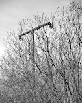
Born and raised in New Orleans, and having lived in the city most of my adult life, never in my wildest dreams did I envision myself living permanently in Baton Rouge. Baton Rouge is the capital of Louisiana, located about 65 miles northwest of New Orleans. However, after Hurricane Katrina hit, Baton Rouge is where I ended up.

The series, Baton Rouge Blues is the product of the emotional and psychological roller coaster I have experienced living here after the storm. Anger, frustration and bewilderment gave way to confusion, disorientation, then resignation and, finally, acceptance.


Whether the photographs in this series accurately exemplify the reasons and circumstances of their making is far less important than the process and product that got me through this almost unimaginable experience.

Bloom where you are planted.


I think the only way to get hold of a copy is to contact William though the book is published by the Visual Arts Gallery of the University of Alabama at Birmingham. I have no idea how many copies are available or what they cost.
Greiner's Katrina + Beyond blog is here

(Note: not all these pictures are from the book)

Thursday, March 29, 2007

Amy Stein


I keep coming across Amy Stein recently. Her work has popped up in several places, and we were also both asked to pick and describe "What Makes a Great Photo" for the Conscientious site (hers would be on my short list as well). She also has a fun blog


Anyway, here's some of her work and what she says about it


Domesticated: My photographs explore our paradoxical relationship with the "wild" and how our conflicting impulses continue to evolve and alter the behavior of both humans and animals. We at once seek connection with the mystery and freedom of the natural world, yet we continually strive to tame the wild around us and compulsively control the wild within our own nature. Within my work I examine the primal issues of comfort and fear, dependence and determination, submission and dominance that play out in the physical and psychological ecotones between man and the natural world.

The photographs in this series are based on real stories from local newspapers and oral histories of intentional and random interactions between humans and animals. The narratives are set in and around Matamoras, a small town in Northeast Pennsylvania that borders a state forest.


Stranded is a meditation on the tension and desolation found on the shoulders of America's highways and interstates. My photos challenge the viewer to slow down and witness scenes of futility playing out in an uneasy and alien space. Within these photos we see the faces of people stranded and evidence of lives broken down or lost on the side of the road... For this series I spend weeks at a time driving across America looking for and photographing stranded motorists.


Wednesday, March 28, 2007

Judy Linn - contemporary black and white


...well - and colour too. In my recent quest for who is doing contemporary black and white work, I saw Alec Soth had a post on Judy Linn. Apparently she's most well know for her photographs of Robert Mapplethorpe and Patti Smith - non of which happen to grab me (and I say apparently, because the one picture of her I had seen before was one of her "knee" photographs from an upcoming show at Vancouver's excellent Presentation House Gallery - she does seem to have a thing for knees and calves)


Anyway, she just fits in my arbitrary criteria of contemporary as being at least a Baby Boomer. The main stuff on her current exhibition is here and here

The short review from the New Yorker is interesting in what it says about her small show being so disparate - seemingly very different subjects, mixing black and white and colour and so on - and yet still hanging together. In fact, while a nice tight theme can be helpful and provide a good security blanket for a viewer, sometimes a photographer just takes picture of stuff and things - what they see - and the real underlying theme is just the photographer themselves.

Alec also picked all the best quotes, so go there for the full deal - I'll just cherry pick a couple

The short review from the New Yorker: "This survey of thirteen recent photographs—some in color, most in black-and-white—is modest, quirky, and offhandedly shrewd. Like so many contemporary photographers, Linn tends to take pictures of things that are not very interesting: bits of bread scattered on trampled snow, a sunny sidewalk peppered with tiny buds, a blond woman with an extravagant ponytail, a pine tree in a flooded field, a solitary cow. But each image is at once self-effacing and just right. The show doesn’t exactly cohere (what does this woman in bed have to do with that dishtowel?), but no matter; Linn’s scattershot approach feels right on target."


And this from Linn:

Words and pictures by nature don’t agree. There is no good fit. I can’t say what I do or have done, but I know what I want, what I try to do. I can tell how I aim. I can’t say how I land.

When I began, I hated what I couldn’t control—all the annoying things I couldn’t see in the moment of taking a photograph, the crazy stuff that jumps into the edges of pictures. Now I like that part the best. But I do want to be accurate, although “accurate” is a slippery word. I don’t mean a quality of photography. I think Cezanne, Ingres, and de Kooning are all accurate. I don’t think Ansel Adams is accurate. If you look at a Hiroshige woodcut of a whirlpool, you figure it is a fanciful rendition because how accurate can a woodcut be? But if you go to see the whirlpool, you see that he is telling you exactly what it looks like.


I think when someone first looks at a photograph they automatically wonder, “What is it?” I want a photograph that easily answers that question. I want to be extremely obvious; obfuscation is bad grammar. Hopefully, the two-dimensional arrangements of shapes on the paper will be as lively and interesting as the three-dimensional world trapped inside the photograph. There should also be something there you haven’t seen before. Something should happen in the act of looking.

I want a photograph that makes me aware of what is physically in front of me, a photograph that gives me the pleasure of getting lost. It is like asking yourself a joke: not really knowing what the answer is, giving up, and then seeing the punch line and really laughing.


(and I had to include the one colour photo because my laughing nearly caused me to choke on my morning coffee when I pulled it up...)

Tuesday, March 27, 2007

John Szarkowski (and George Tice)


Two nice little pieces in the latest Focus Mag (warning 26mb...) - one on John Szarkowski and one on George Tice. I think I'll probably be heading out to get a copy of this particular issue.

As always, John has some interesting things to say about photography (including a dig at the idea of "equivalents"..), as well as on big photographs (not necessarily bad):


Photography is the easiest thing in the world,if one is willing to accept pictures that are flaccid, limp, bland, banal, indiscriminately informative and pointless, but if one insists on a photograph that is both complex and vigorous, it is almost impossible. One can, like an unreformed gambler, keep going out, keep trying, hoping that one might one more time be visited by luck or grace and make one more photograph that is exactly right... and if one is to photograph seriously, that also takes one’s best, concentrated attention. It cannot be picked up on Friday night and put away on Sunday—except perhaps by the greatest geniuses or talented beginners...

Size is a very interesting problem and deserves a thick book. Big is not bad; consider the pyramids and the elephants.Furthermore, I will say without equivocation that the first pictures that Talbot made with cameras were too small. They were a little smaller than 35 mm contacts, and his wife called his cameras mousetraps. It is hard to do serious work while one’s wife is making jokes about how one goes about it.

On the other hand, I think it would not be unfair to ask the Germans exactly what they think they are achieving by making photographs that seem to compete—at least in size—with Raphael during his Roman years.To my mind something is lost in these gigantic prints...

and from the Tice article:


“One of the things Paterson is about is the story of Paterson,” says Tice.“Paterson II is part of the future of the first Paterson, 30 years later. Tice’s distinctive awareness of past time and future time in the present moments of his photographs separates them from the work of other photographers who have turned their lenses toward similar subject matter. A typical street scene by Lee Friedlander, for example, offers the energies of a frenetic puzzle of contemporary life, corralled and ordered for the viewer to release. The stillness in what Tice himself describes as the “sad beauty” of his urban scenes has a different weight, the weight of history, not moments, but stories evolving. As with putting down a good book to go and do something else for a bit, Tice says of his work, “Any of these projects that I’ve done, I feel I can go right back to them and pick up where I left off.”


(note: Fair Dealing review of Focus Magazine)

Monday, March 26, 2007

The only good photographer is an old photographer?


I'm a little cautious about blogging about blogs - it all starts to get a little incestuous and easily leads to some kind of internecine strife.

But then someone says something that articulates a vague thought that has been tumbling about in the back of your mind and - well - it just makes sense to point it out.

Over on Hiding in Plain Sight, George LeChat has this to say:


Writing in L.A. Weekly last fall, Holly Myers created a minor tempest with the following: "In thinking about Diane Arbus, as one does from time to time, I came to a distressing realization: that I couldn’t name a single photographer subsequent to Arbus (and Frank and Winogrand and Friedlander and Eggleston and the other greats of her generation) who ranked on anywhere near the same level, which is to say, who thrilled me near as broadly, deeply or consistently."...

...Myers attributed the decline to the elevation of concept over feeling. I think the problem is that contemporary photography too often lacks formal elegance or distinction. In its place, many photographers appear to believe that a clever, or topical, or referential subject will itself suffice. It seldom does.


George then goes on to give a couple of example of what he means using some photographs - Brian Ulrich and Lee Friedlander; Alec Soth and Manuel Alvarez Bravo.

Now, as LeChat admits, there are dangers to this sort of generalisation, but it certainly got me thinking.

While I like a lot of work from contemporary photographers - indeed, I'm obviously enthusiastic about a lot of it - when I sat back and thought about Myers' comments, there seemed to be a kernel of something there.

My list of photographers "who thrilled me... broadly, deeply or consistently" came from the same sort of group Myers describes. And despite all the contemporary books on my shelves, I really had to work hard to come up with even a couple who lived up to this description in the same sort of depth I think she's talking about.

The two I did come up with (and her choice of Tillmans didn't come anywhere close) were Thomas Struth and Martin Parr (I'd also pick John Gossage, though I think he sort of bridges these generations - and as much as I'd like to pick Sugimoto, sometimes he's just a little too cool and detached).

But for me, it became pretty apparent that the majority of photographers I'd pick whose work "thrilled me... etc" came from at least a previous generation. What about you? (Perhaps we could set the dividing line for current generation at the Baby Boomers onwards - say 1946 to be generous, though that may seem ancient to some of you...)


Sunday, March 25, 2007

Alleyway No.1

I'm dubious about posting these for all sorts of reasons.

First, I don't normally circulate work in progress until there is at least a small sized body of work that I'm happy with.


Secondly, the internet really sucks for showing the sort of Large Format (neg size that is) pictures that I make, where the intended print size is at the very least 11x14 and usually bigger. Additionally, the web sucks even more imo for black and white work. LCD displays that are out of balance with far to much contrast and brightness just don't convey something that is full of varying (often subtle) tones.

So, now that's all out of the way, here are a small selection from the first few negatives I've made on a new project - Alleyway (or maybe Alleyway's?) - you might also want to take into account a bunch of the stuff I've said previously about traces, evidence, oblique glances and so on...:


Tim Atherton

Saturday, March 24, 2007

Winogrand at work - the movie


Okay, it's only about a ten minute segment, but Michael David Murphy has a movie up of Gary Winogrand at work on Bill Moyers/PBS in 1982 (Note: right click and save is probably best - it's about 26mb).

It's quite incredible watching him and listening to him at work. It's a bit like watching Beethoven compose or Einstein busy calculating - as commented over on the Streetphoto List, this is the Zapruder film of SP...

There is also a transcript up - a couple of quotes:

A picture is about what’s photographed and how that exists in the photograph - so that’s what we’re talking about. What can happen in a frame? Because photographing something changes it. It’s interesting, I don’t have to have any storytelling responsibility to what I’m photographing. I have a responsibility to describe well...

The fact that photographs — they’re mute, they don’t have any narrative ability at all. You know what something looks like, but you don’t know what’s happening, you don’t know whether the hat’s being held or is it being put on her head or taken off her head. From the photograph, you don’t know that. A piece of time and space is well described. But not what is happening.

I think that there isn’t a photograph in the world that has any narrative ability. Any of ‘em. They do not tell stories - they show you what something looks like. To a camera. The minute you relate this thing to what was photographed — it’s a lie. It’s two-dimensional. It’s the illusion of literal description. The thing has to be complete in the frame, whether you have the narrative information or not. It has to be complete in the frame. It’s a picture problem. It’s part of what makes things interesting...


And wait until you see his filing system

(MP4 file here and wmv file here )

(Thanks for this David)

Friday, March 23, 2007

August Sander


I don't know - there's not much that you can add to what's already been said about August Sander. His skill as a portrait photographer is rarely surpassed. His far reaching project to document the typology of the German people at a particular point in history remains mesmerising - as well as being one of the starting points for a good few well know contemporary photographers.


And if I had to chose between Julia Margaret Cameron and August Sander for the best portrait photographer of all time, I don't think I could do it - it's pretty much a draw... Sander is one of a group of photographers I find I have to come back to time and time again to remind myself that yes, it is possible to produce such extraordinary work.

Thursday, March 22, 2007

What the heck is the Atlas Group?


Stanco (Stand Banos) asks "OK, a little help here, please! This Atlas Group- a few snapshots, a lotta concept, and some stained and unspotted prints that appear scavenged from the bottom of the reject bin of a Darkroom 101 Photo Class..."

The best I can do on short notice is a Guardian article from a couple of years ago (there's also an article in Village Voice among others):

...Among the various factions, cadres, cells and shadowy organisations that emerged in the aftermath of Lebanon's 15-year civil war, the Atlas Group remains one of the most enigmatic. Not only is there some doubt whether the group still exists, there are also those who believe it never existed at all. Rumour piles on rumour. Claim is matched by counter-claim. Forged papers, false documentation, fake texts, staged and doctored video footage and testimonies are at the heart of the group's work, just as rumour, myth, disinformation and bald untruth are the tactical weapons in the information wars that continue long after actual hostilities have ceased and the parties have reconciled themselves to whatever it is that the future holds....

...Although Raad's work, and the Atlas Group itself, deals in the gulf between events and their description, and casts doubt on those who claim to hold the truth, its purpose seems to me to go deeper. The larger truths of history - such as who won or lost a war, or how it came about - and the smaller events and individual experiences that make it up are not the same thing...


To me their work is about media, media bias, propaganda, seemingly endless regional conflict, the effect on people of such conflicts, humour, resilience, resistance, truth and deception, the truth and fiction of photographs, memory/history/archives, complicity and complacency - all of which are at the heart of our way of life today in one way or another.

A last quote from the Guardian (though I also like the introductory story - about a subversive surveillance photograph er who preferred to photograph the sunset from The Corniche than his subjects...):

We all know that how we read images, and what we infer from them, depends in large part on what we are told. This is as true of art as it is of newspapers, documentary footage, and even the things we see and experience for ourselves. Raad does more than pick away at our sense of certainty.

Over 15 years, 3,641 car bombs left 4,386 dead and thousands injured during the civil war in Lebanon. This much is certain. But is it also true that the only part that remains after a car bomb explodes is the engine, and did photo-journalists during the civil war compete to be the first to locate and photograph the engines, which sometimes landed hundreds of metres away from the blast? What do the 100 photos, annotated in Arabic, and which show soldiers, munitions experts and others gazing at the wreckage of all these cars, actually tell us, over and above the dreadful repetition of the images, the archiving of the scenes? Just to show them seems enough. And then one thinks of the absurdity of all the camera-toting picture-hounds, rushing to be the first on the scene.

and another from a gallery exhibit:

Walid Raad works with video, photography, and literary essays to investigate the contemporary history of war in his native Lebanon. (We Decided To Let Them Say “We Are Convinced” Twice. It Was More Convincing This Way.), a series of 15 large-scale photographs, specifically recalls the Israeli Army’s invasion and siege of Beirut in 1982. That summer Raad, an intrepid 15-year-old with a telephoto lens, took photographs of near and distant military activity in West Beirut from his home in the eastern sector. Recently reprinting the pictures from the original, now degraded negatives, he discovered that the images’ unusual discoloration, creases, and holes offered a disturbing but realistic representation of a broken world rendered flat by the series of catastrophes that had befallen it.


FWIW, my response to all this is very much a gut one. When I see something like this - even if only in print or in the internet, I get this kick in the guts that say - hey, he's got something there - even if that feeling has a hard time overriding some of my - hmm, that's a fuzzy tattered photo instinct (or the "I hate video installations" voice in my head). I've learnt that in the end I get most benefit from listening to the first gut response, even if it takes a while...

The Atlas Group archives can be found here

Wednesday, March 21, 2007

a few Immersive Landscapes


I came across this short passage in Steve Edwards excellent little book Photography: A Very Short Introduction (well worth a read btw):

"Panofsky felt that Renaissance perspective was neither natural nor inevitable; rather, it was the historical product of a society that valued detachment more than immersion; order rather than flux; regularity instead of discontinuity; and structure over experience."

(Link to more Immersive Landscapes)

Tim Atherton


and the winner is...

...Walid Raad/The Atlas Group - interesting choice

(Civilizationally, We Do Not Dig Holes to Bury Ourselves)

Big Photography Prizes

(The Atlas Group)

Photography doesn't have that many big prizes that are handed out (compared to - say - literature and writing), but one of those is the Deutsche Börse Prize - which is to be announced later today (btw, it used to be called the Citigroup and/or Citibank Prize if I remember correctly?).

Jim Johnson over on his thoughtful blog has a post about it. Like many of these prizes, I'm often in two minds about them. They often never seem to chose quite the right one - though last year the Deutsche Börse chose Robert Adams - and in fact the history of this particular prize has maintained a pretty interesting selection of finalists of the years

And I'm with Jim on this. I really think the Atlas Group should win (either ways, I had them lined up for a future blog post), but possibly Anders Peterson will take it - but who knows - all four finalists are interesting and very different.

Pictures from the finalists at the Guardian

And interestingly, in light of the hum generated by Charlotte Cotton's essay on the New Color, two of the four finalists are essentially black and white work (as was last years winner) - okay, The Atlas Group is really multi-disciplinary, but it seems to be their black and white based work that is most often highlighted.


(Anders Peterson)

Monday, March 19, 2007

Uta Barth


One thing I sometimes think happens is that we see work by a photographer and we can see there is something there. It immediately says something to us. But somehow we don't quite like it (though perhaps like isn't quite the right word). Each time we come across it we say to ourselves "oh yes, that stuff, I remember that". Then - sometimes quite a while later - it almost imperceptibly just clicks.


For me that's the case with
Uta Barth's photographs. And right now I'm going "ah yes - now I get it" and want to look at more of it. It's probably all in response to the how the areas and ideas I'm investigating right now resonate with the things she has done in her work. But there's a sort of double pleasure to it. Coming to the realisation that yes, your suspicion was right, there was something to it. But mostly, the excitement of pouring over some pictures that you had probably seen before and yet now they seem fresh and intriguing in a way you couldn't quite perceive before.


From Uta Barth: In Between Places: "Deceptively simple, Uta Barth's photographic works question the traditional functions of pictures and our expectations of them. By photographing in ordinary anonymous places - in simple rooms, city streets, airports and fields - Barth uses what is natural and unstudied to shift attention away from the subject matter, and redirect focus to a consciousness of the processes of perception and the visceral and intellectual pleasures of seeing....


...Uta Barth provides a compelling look at the nature of our own experience.Her beautifully composed photographs, most often created in places that seem somehow familiar, prompt our consciousness of visual sensations and a deeper consideration of what looking really means.


...Barth has used photography exclusively in her aesthetic projects, experimenting with depth of field, focus and framing to create photographs that are suggestive rather than descriptive, alluding to places rather than describing them explicitly. Her interiors and landscapes engage the viewer in an almost subliminal way, testing memory, intellect and habitual responses..."


There also a fairly in-depth interview with Barth here


A few tasters: ...We assume that the photographer observed a place, a person, an event in the world and wanted to record it, point at it. There is always something that motivated the taking of a photograph. The problem with my work is that these images are really not of anything in that sense, they register only that which is incidental and peripherally implied... I have never been interested in making a photograph that describes what the world I live in looks like, but I am interested in what pictures (of the world) look like.... My primary project has always been in finding ways to make the viewer aware of their own activity of looking at something (or in some instances, someone.) ...


Saturday, March 17, 2007

So, where "are" the New Black & White photographers?

(Idris Kahn)

I've been ruminating over Charlotte Cotton's essay The New Color: The Return of Black-and-White, which I blogged about recently, as well as some of the responses to it.


(Osamu Kanemura)

One thing that has come to mind is this; whether we believe or not that black and white might be on the the rise as the new darling of the art world, who exactly is doing new, vigorous, exciting, innovative work out there in black and white?


(Jason Evans)

Cotton gave her list - some of which seem worthy, others perhaps not. But that list aside, who else is out there? Right now it actually seems a pretty sparse field. Some of the best work is still being done by the old guard from the Sixties and Seventies (okay and Eighties) - Friedlander, Gossage, Adams, the Bechers, Frank - they remain innovative. Certainly, I hope this crowd keeps going at full steam and coming up with new ideas, but who are the new generation of up-and-comers, the new guard - those with a whole career ahead of them?


(Jason Evans)

One of the most continually innovative and fresh would have to Sugimoto, but he really belongs to the group I've already mentioned. There are also Basilico and Geoffrey James for example, but they are really masters of Modern photography, probably pushing it's boundaries as far as it can go?

I've hunted my bookshelves, and magazine pile and meandered around the internet, but I'm still a little stumped (I also hunted back through the archives of some blogs like Conscientious - and discovered a surprisingly small amount of contemporary B&W there). So my question is: who is there out there?

There were a couple on Cotton's list that have caught my eye.


An-My Lê (above) for one and Jason Evans (images higher up) for another. I like the way An-My Lê's Small Wars and Vietnam work has, among other things, taken the New Topographics deadpan cynicism and put a whole new twist and take on it. (Along with Susan Lipper, who Cotton also mentioned)


Idris Khan (nice article in the Guardian here too) is one I have come across elsewhere. He seems to be doing what I feel Abelardo Morell's work could succeed in doing (but somehow, with a few exceptions, the latter never quite seems to make it out of Keith Carter territory). I find Khan's work some of the more exciting and interesting contemporary black and white I've come across recently.


Michael Wesely is another I've encountered - I thought his Potsdamer Platz work was brilliant (though he has started to become rather formulaic now, and a little bit too clever - Berlin didn't quite seem to translate to the MoMA reconstruction project)

So - here's the big question - any more good suggestions for who to watch and where to find them?


(An-My Lê)

Photo Season play-offs


Well, this seems to be doing the rounds (got it via Amy Stein's blog). But it's a little bit of fun - you can print it off here.
I'm down to my final four in the semi-finals and it's Struth vs. Evans and Sugimoto vs. Callahan...

Friday, March 16, 2007

Feist


I like Feist (aka Leslie Feist). Her music has been keeping me company in the darkroom all week. She hasn't really had a major release since her 2004 album Let It Die, but she does have an eagerly awaited new recording - The Reminder - due out in April/May (hey - how come this Canadian girl releases it earlier in Europe than here huh...?) . Soulful, yet nowhere near as depressing as say Cat Power...


She has a MySpace here where you can listen to a few tunes, a minimal "official" website and you can watch Mushaboom on YouTube below:


Sugimoto on Serra

Short movie of Hiroshi Sugimoto on YouTube talking about his photographs of Richard Serra's sculpture (via the excellent Gallery Hopper) - when you think about it, Sugimoto and Serra seem made for each other...


Thursday, March 15, 2007

stefan beyst - seize obscurs objets de désir


One thing I hadn't anticipated when I started a blog was how many emails I would get with people asking me to look at their work. Sometimes it's a little hard to know how and if to respond. At other times there is no question.

But sometimes I get work like this from stefan beyst (who seems to eschew capitals) from Belgium.


Of his three projects, seize obscurs objets de désir interest me the most. It's not the sort of work I normally gravitate towards and yet I couldn't just dismiss it out of hand. Something about it made me go back two or three times to look again. And while an aspect of it reminds me of Stieglitz's "Equivalents" - which have to be one of the biggest early failures in photography - there is enough in beyst's work for me to want to look a little deeper.

"...(beyst) is now exploring a new territory in his 'Seize obscurs objets de désir': conjuring up desirable and desiring beings from meaningless 'found patterns'"


Wednesday, March 14, 2007

Distinction Fail 24/25 - Mike Ryder


One of the great things about the internet and the advent of digital has been the increased democratization of photography. And while some may say that this really happened with the point n' shoot and the drugstore lab, or even further back with the Box Brownie, one thing that's particularly different is the extent to which photography can be shared among a broad group of friends and stranger alike.


Now, some bemoan this and see it as detrimental to photography, especially photography as a precisely practised craft. But the truth is that phtography has never really been that difficult to do. And then there are others who say we are just being overwhelmed with a tidal wave of poor images. But as I've mentioned before, look at the photo section of Ebay Collectibles (among other places) and out of the 10,000+ photos from the 1800's onwards that are on there at any one time, a very high proportion of them are just awful - even from a time when photography actually was rather more difficult to do (and probably more expensive as well). In fact, I'd venture to say that today, with the higher volume of photographs being produced and shared, the total number of really crappy pictures may be higher, but I have a feeling the actual percentage of really good ones is in fact probably higher than it's ever been.


Which brings me to Mike Ryder - he's in that latter group as far as I'm concerned - the really good ones. And that's one of the other good things about the internet. Not only can you find plenty of info about, and pictures by, Sudek or Atget or Struth or Sugimoto, but you can also come across good work by photographers which - in any other time past - you would probably never have encountered.


I came across Mike on the Streetphoto list. He has three pages of work up 1, 2 and 3 - beyond that, and that he hails from London, I don't know much more about it - other than the fact that there is definitely something there worth looking at.

Tuesday, March 13, 2007

Josef Sudek


Time for another classic - Josef Sudek.

There are some photographers who just seem to effortlessly resist the passage of time, and Sudek is one of those.


While often celebrating intense beauty, Sudek never seems to come too close to falling into sentimentalism. Indeed some of his work from the industrialised Black Triangle area is so direct and unsentimental that it appears as a precursor for some of the sort of photography that only came to be made by other photographers much later on.

As well as his lyrical pictures of Prague, Sudek was the master of the pano photograph - often depicting the most mundane things in a manner that requires that we pay attention to them.


Add in to all this that he made many of his best works under a Communist (and before that - Nazi) regime and with only one arm (lost in the first war) - not easy when lugging around a view camera.

Personally, I think everyone should have at least one good book of Sudek's work on their shelves, if not two or three (He also had a studio that would be the envy of any creative photographer...)

"...everything around us, dead or alive, in the eyes of a crazy photographer mysteriously takes on many variations, so that a seemingly dead object comes to life through light or by its surroundings.... To capture some of this - I suppose that's lyricism...

I believe that photography loves banal objects, and I love the life of objects." -Josef Sudek

Flaubert once expressed an ambition to write a book which would have no subject, "a book dependent on nothing external ... held together by the strength of its style." Photographers have sometimes expressed parallel aspirations to make light itself the subject of their photographs, leaving the banal, material world behind. Both ideals are, of course, unobtainable, but nonetheless they may be worth pursuing... Sudek has come closer than any other photographer to catching this illusive goal. His devices for this effect are simple and highly poetic: the dust he raised in a frenzy when the light was just right, a gossamer curtain draped over a chair back, the mist from a garden sprinkler, even the ambient moisture in the atmosphere when the air is near dew point. The eye is usually accustomed to seeing not light but the surfaces it defines; when light is reflected from amorphous materials, however, perception of materiality shifts to light itself. Sudek looked for such materials everywhere. And then he usually balanced the ethereal luminescence with the contra-bass of his deep shadow tonalities. The effect is enchanting, and strongly conveys the human element which is the true content of his photographs. For, throughout all his photography, there is one dominant mood, one consistent viewpoint, and one overriding philosophy. The mood is melancholy and the point of view is romanticism. And overriding all this is a philosphic detachment, an attitude he shares with Spinoza. The attitude of detachment that characterizes Sudek's art accounts for both its strength and weakness: the strength which lies in the ideal of utter tranquility and the weakness which is found in the paucity of human intimacy..." (from an essay by Charles Sawyer )

Monday, March 12, 2007

Simone Nieweg


Simone Nieweg is another Becherite out of the Dusseldorf School - part of the second generation after Struth and Gursky and friends. And while you can certainly see the influence of that whole group, she also displays a certain individuality.


I'm not quite sure why I like photography of these sort of gardens and allotments and market gardens and so on (as my wife will quickly tell you, I'm the most useless kind of gardener...). I suppose some of these places aren't so different from what surrounded me growing up in England. And although I lived in Germany for a couple of years, somehow I don't seem to remember the summers much - more autumn, winter and early spring. (also, Autumn was exercise season for NATO, so we spent a lot of time out on German farmland training to keep the red menace at bay)


From one exhibition statement (btw, I think artists from many other countries would kill for the level of support the Goethe Institute gives to their homegrown artists...):

"Simone Nieweg belongs to the second generation of Becher students at the Kunstakademie in Düsseldorf. Unlike her forerunners, who won international acclaim with themes such as portraiture, architecture and interiors, she has chosen a subject so unspectacular as to seem almost parochial.Her work focuses on the suburban fields and allotments that are to be found in the populated and industrialised areas in the Ruhr and Lower Rhine regions of Germany.

Devoid of human presence, these quietly beautiful colour photographs nonetheless attest to the profound human intervention in those seemingly unremarkable landscapes on the outskirts of the cities. Nieweg's images are carefully balanced compositions which radiate a sense of precise perception and pure description. At the same time, her pictures are imbued with a subtle sensuousness."


Sunday, March 11, 2007

Gregory Crewdson's Fireflies


I posted briefly about these when I talked about magazines, but I thought they were worth coming back to for their own post. I think the prints would be interesting to see - I haven't even seen the book, just the reproductions in Blindspot. What I do love is when contemporary photography draws the comment "sweet" from my five year old...

Here's some of the show blurb (a little OTT):

In the summer of 1996, Crewdson spent two solitary months at his family’s cabin in Becket, Massachusetts. Using both small and medium format cameras, Crewdson obsessively photographed his subjects illuminating the night sky. Crewdson was drawn to the flickering lights, in part, by the underlying impossibility of capturing their elusive beauty in pictures. For various reasons, the artist chose not to exhibit this body of work until now.

Printed as single editions, these intimate, black and white pictures seem like a radical departure from Crewdson’s recognizable style of large-scale, cinematic photographs. At the core, however, the fireflies share a set of common interests with Crewdson’s oeuvre; a sense of wonder in the nocturnal landscape, light as a narrative event and a fascination with nature as a psychological mystery. Although consistent in terms of their subject matter, these photographs demonstrate a wide scope of visual expression ranging from almost pure abstraction, to more idyllic representations of the natural landscape.


And this excerpt from an article in Village Voice:

The firefly pictures not only give us Crewdson unplugged, they provide a touching clue to the origins of this artist's more popular work. All fireflies that flash are males looking for love. Female fireflies, meanwhile, basically lounge in the grass smoking insect cigarettes and eating bonbons as the males go through this desperate, pathetic attempt to impress them by lighting up the brightest and flying the highest.

It's a perfect metaphor for how hard and to what lengths Crewdson has always been willing to go to gain our attention and how underneath it all he wants to connect. It's also wonderful to be able to look at Crewdson's pictures without him directing our attention this way and that. These pictures show Crewdson simply lighting up rather than manically controlling every inch of the picture.


What I find intriguing in both pieces is a sort of desperate attempt to link these photographs with his more well known work and try and shoe horn them into his "body of work". What I take them for is something simpler: a photographer doing what he does - taking photographs - of something that intrigues him and catches his eye. And, in this case it would seem, something in which he could also find solace.

Friday, March 09, 2007

The Bartender Never Gets Killed - more Julian Thomas


Julian has been posting some of his recent work blog-style at The Bartender Never Gets Killed.

I really like some of the triptychs he's doing now (click on them for a slightly bigger view):


Although every now and then one of his classic squares still really hits the mark...


Photographers and their Man Purses


Or Man Handbags for the Brits out there. Any male photographer with a spouse or significant other knows the problem. With our Billingham/Domke/Crumpler/Fogg or whatever bags we are accused of them really just being Man Purses (even those of us lugging 8x10's around fall prey to this). Especially when it's discovered that not only do they hold cable releases and filters and lens tissue and spare film and tiny screwdrivers, but also Polo Mints, sunglasses, paperback detective novels, IPods, asprin, stamps, lip balm etc etc. And no arguing that they are really just re-purposed trout fishing or bike messenger bags seem to make the tiniest bit of difference... nope - they are regarded as handbags for men


Well, apparently a new craze is coming to our rescue. It seems it started in Japan and has made it's way to Korea and Singapore and is now to be seen on the streets of West Cost USA cities and the more liberated European centres. PingMag - a site I enjoy from Japan has the latest...


The New Color: The Return of Black-and-White


A while ago I happened upon what looked like a promising new site for discussions on contemporary photography - Tip of the Tongue. One of the first essays is up, by Charlotte Cotton, author of the excellent little book The Photograph as Contemporary Art and it's an interesting one entitled The New Color: The Return of Black-and-White. Here's a taste:


"..But it is definitely more hit-and-miss for a photographer working in black-and-white to anticipate whether or not the full meaning and contemporary relevance of their imagery will be understood in light of color art photography’s dominance. At the beginning of this millennium, I found it difficult to keep my confidence that photography’s monochrome history continued to exert a strong influence on the way we see...


A career-oriented art photographer (and maybe this is the first generation of artists who can consider it a “career”) sticks very close to the now well-traveled path of contemporary color photography’s aesthetic homage and partial remembrance of, for example, gorgeous Kodachrome, or the beam of an enlarger. In a career-oriented era, perhaps this strategy is wiser than trying to beat a path through the resistance to presenting imagery in other ways and forms that actually respond to the potential of digitization. Of course I feel bemused at why a nascent art photographer would be so openly conservative as to adhere to apparent conventions, and at my most pessimistic, I wonder if there’s too much “trying-to-be-like” Eggleston, Shore, et al., and too little “creative-departure-from” the stellar standards that they have set...

I am sure I’m not alone in beginning to think that the more complex, messy, unfashionable, and broad territory of black-and-white photography is where we are going to find some of the grist to the mill in photography’s substantive and longer-term positioning within art..."


There is also some good discussion of the essay on the site as well. Now, whether she's correct in her prediction and justified in her enthusiasms is another matter. But it's certainly a somewhat thought provoking read. (I think many traditional analogue photographers probably won't approve of some of her contemporary black and white choices among other things). And while I like and enjoy viewing and making what you might call contemporary colour work, I'm stubborn enough to believe there are also some exciting contemporary direction to explore with black and white...

Wednesday, March 07, 2007

Gabriele Basilico update - Workbook 1969-2006


If anyone is looking for a nice overview of Basilico's work, the new book Gabriele Basilico - Workbook 1969-2006 is a pretty good introduction. It takes you through many of his different series of pictures and the printing is far better than some of the more recent smaller format books (though not quite as good as some of the original books such as Porti di Mare). I should also add his "bottom" shots were an intriguing revelation...


Apart from an awful cover (and an academic essay that may possibly have been understandable in Italian, but seems to have become unintelligible in translation...) it is a very good presentation of his work.

A quote from the Basilico himself (there are only a couple in the book unfortunately):


"Before dedicating myself to the urban landscape I was interested in photojournalism. I had points of reference: the works of Bill Brandt or that of Eugene Smith. But over time, space occupied all my attention, slowly replacing events and people, and I accepted it and allowed it to be my focus. The photographic culture that my generation referenced was full of myth, of widespread commonly held views, such as Cartier-Bresson's "decisive moment". To slow down vision was for me a small revelation in the way of seeing and even a return to the past, to when photographers, from technical necessity, used slow film and large cameras with tripods. They could represent the world only in a static manner. But this "slowness of the look", attuned to the photography of places, became for me a lot more: it is an existential and "philosophical" attitude through which to try to find a possible "sense" in the external world."


William Greiner - New Orleans & Baton Rouge


A while back, when I posted about some of the "controversy" around photographers travelling down to photograph post-Katrina, I got an email from William Greiner. I looked at his blog and something struck a chord but I couldn't quite catch hold of it. Later it came back to me and I tracked down his website.


I had looked as some of his pictures in an early copy of Doubtake magazine and hunted down one of his books (A New Life?) a few years ago and then lost track of his work when I was doing my own research into the important colour photographers - Shore Eggleston, Sternfeld, Graham etc.. and William Greiner.

Greiner's home was New Orleans until Katrina struck. At that point he moved with his family to his Baton Rouge where his wife comes from. And in the year or so since, William has been trying to make sense of all this both through his photography, and also through his blog - at times heartfelt, at times angry. There is a sense of exile and loss in it all, as well as strength and clear perception.

Greiner has just published some of his post-Katrina work "Baton Rouge Blues":

"Hurricane Katrina devastated the Gulf Coast, with New Orleans its most famous victim. Everyone who lived through that storm has vivid memories of that experience. For William Greiner, who was forced to move away from New Orleansand chose to live in Baton Rouge, the storm triggered a pilgrimage of sorts. He has assembled a group of his photographs in a tribute to the unmemorable, the commonplace and the banal. With a humorous and often bittersweet quality, his pictures are a record of the inconsequential that now lingers and haunts our feelings about things now gone...


The main exhibition of photos from New Orleans does not deal with dramatic views of destruction or calamitous evocations of devastation. What we see is a range of pictures that start a recall process. The mundane, the ordinary and the unremarkable become an almost unbearable part of our consciousness...


There is something fleetingly memorable about garishly excruciating bad taste. Greiner captures the irony and the humor of determined declarations about people saying to the world, "I am here, this is me." None of these photographs includes people, yet Greiner's photos are notations of life. They are fragments that give determined evidence of place and time."
I'm not sure if the pictures I've picked from his blog are the ones he chose for the booklet (and some of them I chose from his earlier work). As well, it's well worth looking at his entrancing colour work pre-Katrina, to put it all in context

Tuesday, March 06, 2007

Winogrand 1964


For four months in 1964, Gary Winogrand drove across the US, photographing wherever he went:

...New York photographer Garry Winogrand traveled across the country in a Ford Fairlane to discover "who we are." The Cuban Missile Crisis, Kennedy's assassination and the looming threat of war in Vietnam had persuaded him to pursue art full-time. As he remarked: "You have to realize you're nothing before you can be free." During his four-month journey, Winogrand took nearly 20,000 photographs (although he passed through 14 states, he spent half of his time in Texas and California). When he returned to New York, he printed 1,000 of the images. Some of these resulting works are widely known, but the majority have never been exhibited.


...Winogrand, whose trip was sponsored by a Guggenheim grant, said in his application: " I look at the pictures I have done up to now, and they make me feel that who we are and how we feel and what is to become of us just doesn't matter. Our aspirations and successes have been cheap and petty. I read the newspapers, the columnists, some books, I look at some magazines [our press]. They all deal in illusions and fantasies. I can only conclude that we have lost ourselves, and that the bomb may finish the job permanently, and it just doesn't matter, we have not loved life. . . I cannot accept my conclusions, and so I must continue this photographic investigation further and deeper. This is my project." (from Artnet)


I'm not a huge huge fan of Winogrand (the volume just overwhelms me sometimes), but the theme of the journey and the thread of year holds this project together better than some other collections. And so many of the photographs are just incomparable.

(It was unfortunate that Arena Editions went bust - they produced a number of books which were not only very nicely made, but they also made some intriguing choices of what to publish. Another good book by them is Walker Evans: The Lost Work.)

Monday, March 05, 2007

Worlds in minature


(Olivo Barbieri)

Worlds in miniature - well, some of them are and some of them aren't - and okay, some of them are actually life size.

That said, I've always been drawn by photographers who play with this aspect of photographic "reality". Making pictures of existing places look like they are miniature models and unreal in some way. Or photographers who make miniature worlds and make them look almost like they are real places. Or even those - like Thomas Demand - who make life sized "reality" out of paper and cardboard and photograph it. And in a way, this follows on somewhat from the whole Jeff Wall thing.


(Thomas Demand)

It's not a major preoccupation. Nor is it something I really want to do myself (and too much of it gets to be a little - well, too much). But I'm rather glad there are photographers out there, doing this, playing with the boundaries of what a "real" photograph and a "real" place is.


So here are a few

(Naoki Honjo)


(Toni Hafkenscheid)


(Marc Räder)

Sunday, March 04, 2007

Snake Eyes - Weifenbach and Gossage


Okay, I realise this is about the umpteenth post about John Gossage as well as Terri Weifenbach, but I finally got hold of a copy of their joint book Snake Eyes. All I can say is WOW.

First, I hadn't twigged that the book was so big. It's about 13x18 and beautifully put together. I can't quite imagine how the prints would look on a wall, but I can say there's a big disconnect between how the pictures look on the internet and how they look in the book (though as Gossage says; "Books are better than exhibitions").


Luis Gottardi commented that; "Weifenbach's work brings to mind Hugher Foote's, but is more emotionally expressive & less analytical. The color seems a little on the decorative side." In fact, once you have the book in your hands, rather than decorative, when the colour photographs are up to 11x14 or so, they are quite powerful and actually take on a slightly daunting, almost threatening feel - very different from "pretty" colour (which is how they can come across online). Coming close, in my mind, to the original pre-Romantic notion of "sublime" - of awe, confusion and uncertainty.


The counterpoint of Gossage's black and white images is fascinating. The whole book really quite draws you in (btw, there are a lot more of the colour photographs to pick from online than the b&w ones).


Here's a couple of things they had to say about the book in an interview from Photoeye:


"Terri: I think that photographers as a general rule edit from the world. They take what is in the image as the content. Painters have to construct and as a result the content isn’t always the imagery. You have experiences that take you far beyond what's recorded in the image. I have stepped into a particular position by stating that beauty is more than simple entertainment. Beauty has depth. And that position is a mine field in photography. Snake Eyes is of a place that we have proposed as being beautiful and I’m offering this as a serious body of work.

Terri: We had different reasons for pairing different photographs. For example, I had an image that was like a dark fairy tale, so John picked photographs of his own to place opposite, which held up that idea.


John: The images 19-22/XII are an example. Terri's photograph shows a church, though you know that only because of the shape of the window. I wanted to show four photographs alongside that image, but not a sequence of four photographs. I wanted the viewer to question, "Why are these connected?" In order to figure that out, one has to really look at the photographs. That's where I want to point you. They aren’t explicitly connected, but then, you've just spent time closely looking at four pictures. That’s the ‘work’ for me. It makes people either uncomfortable or fascinated"


I've got some time this week to sit down and do some research, and this is one of several book I want to spend some time with. I certainly don't think it will be time wasted

I also got a copy of Gossage's Berlin in the Time of the Wall, and again, I must say this is a stunning book too. It's packed and dense and needs a lot of time and attention, but that too will be time well spent.

(P.S. - I recently saw Terri described as "the Emily Dickinson of photography" - now, I'm sure that's very nice and in many ways quite fitting (I think I always saw Emily as a colour sort of girl, never b&w, for one thing). But would you actually want someone to make that kind of comparison? I'm sure it's very flattering and all, but if someone described me as the T.S. Eliot or the W.H. Auden of photography (and it 'ain't going to happen...), I mean - how the heck do you live up to that, unless you have an ego like The Donald?)


Wall update

(Dead Troops Talk)

Another article on Jeff Wall - this time by Sarah Milroy in the Globe & Mail (I certainly find Sarah is one of the better writers/critics covering photography).

A few quotes from A Window into Wall:

"Inevitably, each show emphasizes a different aspect of this wide-ranging artist. There's Wall, the omnivorous gourmand of painting's history, transmuting the traditions of past centuries into his elaborately staged colour transparencies, or Wall, the disciple of photography's greats (Walker Evans, Laszlo Moholy-Nagy), a taker of well-riven pictures.

There's Wall, the maker of frozen cinema, orchestrating his elaborate narrative visions with the epic ambition of a Hollywood director, or Wall, the diagnostician of the body politic, constructing from the phantoms of his own lived urban experience those moments of disruption in works that he calls “near documentary.”


But there is also Wall, the deep diver of the unconscious, creator of dream-like, digitally concocted images such as The ventriloquist at a birthday party in October 1947, in which a woman (a mother or a hired performer?) presents a nightmarish talking puppet to a roomful of attentive, well-scrubbed youngsters. (One boy backs up against the wall, his face a study in frozen consternation, a stand-in, perhaps, for the artist as detached spectator.)

And there's Wall, the theoretician, concocting Picture for Women (1979), his now famous feminist-influenced riposte to Manet's A Bar at the Folies-Bergères. (He rejigged the players in order to place the gazing woman in the masterly role of overseer.)

Finally, there's Wall, the Vancouverite, an interpretation he roundly repudiates in conversation, but which one observes in his piercingly insightful scenarios of the city encroached on by wilderness, a unique and vivid characteristic of urban life on Canada's West Coast...

Wall has become impatient over the years with the way critics perpetually situate his work in relation to his French 19th-century sources – particularly Manet...

Still, I had to admit, Degas's painting The Dance Lesson (c. 1874) seemed like a natural point of reference... The work of the factory is thus conflated with the sweaty toil of the ballerinas, who itch their backs and adjust their slippers, enervated by the gruelling routine.

Modern life was compressed by Degas into a dense package, rife with meaning, the industry of leisure deftly positioned within the diverse economies of the city. Different aspects of urban life were brought into violent collision in a way the ailing man at the MoMA might well have appreciated."

Saturday, March 03, 2007

Eric Fredine's Winter

Eric Fredine is based in Edmonton. And I must say his photographs depress me... First, after several months, it's really time for winter to go - really, really time for it to go. Yet Eric can muster the willpower to go and make some good photographs of it, damn him...

But secondly, Eric has really got a sense for this place, this city. After a couple of years, I'm still trying to make sense of it - visually, photographically. I have some inklings, but it takes time. Someone recently commented that it didn't look like the city they had spent a few years in. Eric's response was that to took him more than a decade to get to this point.

Now, I'm not going to say that someone can't go for a place for a few weeks, or make a number of visits, and not make good pictures. But generally they tend to be different from work made by someone who has been able to take the time to become intimate with a place (although, of course, the other danger is that after a longer period of time you actually stop being able to see the place)


Eric has some other good city work that I couldn't find on his site right now. In the meantime, here is one of his prairie pictures. He has done a couple of series of work which also really make some visual sense of the prairie. (and once again, they suffer from what I'm coming to call internet prettiness - reduced to a small jpeg online, they tend to look interesting but pretty. Having seen some of the prints at a show, that isn't at all what comes across "in the flesh")

(BTW, the top picture just won a Winter in Edmonton, Now photo competition - I almost entered, but - oh yea of little faith - figured icicles and cute snowy trees would be more along the right line. It blows me away that they were open enough to chose Eric's photo as the winner - that alone is almost enough to carry me over to spring!)


Friday, March 02, 2007

You know how to whistle, don't you, Steve?


Found on ebay - a publicity still of Lauren Bacall. (sadly not from "To Have and Have Not", but the later move "The Gift of Love")

Who can fault a movie with a screenplay by William Faulkner, based on a novel by Hemingway, starring Hoagy Carmichael - and of course, Bogie and the young Bacall - she makes Scarlett Johannson look like a frumpy old maid...

“You know you don't have to act with me, Steve. You don't have to say anything, and you don't have to do anything. Not a thing. Oh, maybe just whistle. You know how to whistle, don't you, Steve? You just put your lips together and... blow.”

Click here to hear it and also a short clip from Carmichael and Bacall singing Am I Blue? here


Thursday, March 01, 2007

Job Posting - MI5


Well, here's an interesting one - MI5 has a job posting up for a photographer (thanks to Photostream for the link):

"Photographer - MI5

The shots our photographers take play an important role in many of our operations. Typically, you’ll be part of a small team, tasked by our intelligence officers. We’ll provide you with state-of-the art equipment and you’ll receive technical training and on-going development.

Although fieldwork will take up the majority of your time, just as important are the written reports that you’ll file back at the office.

And, as you might expect, the role requires significant out-of-hours and weekend work. You should also be prepared to undertake at least six months’ initial training in London.

Discretion is important to the Service, so please only discuss this application with your partner and/or immediate family"
- oops

The camera never lies...


Interesting take on the much heralded photograph by Spencer Platt, winning image of the World Press Photo awards (thanks for the pointer Joerg).

When it originally appeared in the press at the time of the Israeli invasion of Lebanon, but even more so since it won the WPF awards, this picture has been variously described along the lines of "rich young Lebanese sightseeing in a bombed out neighbourhood", "rich Lebanese Disaster Tourists" along with, at times, commentary on their "obviously" inappropriate dress for being in a conservative neighbourhood and so on.

Here, for example, is part of the Photo District News take on it at the time the awards were announced:

"The picture shows a group of five cavalier Beirut residents cruising in a red Mini convertible through a neighborhood that has been reduced to rubble by Israeli bombs."It's a picture you can keep looking at," said World Press Photo jury chair Michele McNally, assistant managing editor for The New York Times, in a statement announcing the prize. "It has the complexity and contradiction of real life, amidst chaos. This photograph makes you look beyond the obvious.""


Spiegel has a somewhat different take on it in - "Catering to a Lebanese Cliche":

"We're from Dahiye, from the suburb, ourselves," Bissan explains on a hot February afternoon in Beirut. She, her 22-year-old brother Jad and her 26-year old sister Tamara fled the neighborhood during the Israeli bombings. They stayed in a hotel in the safer district of Hamra and did what most Lebanese did at the time. They waited. The siblings met the other two women in the hotel, Noor Nasser and Lillane Nacouzi, at the hotel. Both are employees of the Plaza Hotel and were allowed to stay in vacant rooms during the war.

On Aug. 15, the day of the ceasefire, Jad borrowed a friend's orange Mini Cooper. For weeks the siblings had heard nothing about whether or not their apartment block was still standing -- now that the fighting was over, they wanted to go and see for themselves. Jad drove and Tamara rode shotgun, while Bissan squeezed in between the two friends on the backseat, holding her camera phone ready. "We spoke briefly about whether we should really open the roof," she told SPIEGEL ONLINE. "But it was so hot, and there were five of us in the small car, so we folded it back."...

Bissan admits that, at first glance, her excursion must look like a prime example of disaster tourism. "But look at our faces. They clearly show how horrified we were, how shocked," she says. "We were not cheerful."

...She has told journalists that her apartment was badly damaged, with all the windows broken and the furniture crushed by shock waves from the bombs. More at this
link

Daryl from PDN sent a link to further article I missed on their site Award-Winning Photo Puts Subjects On Defensive which adds a bit more.

Now, what was that about "looking beyond the obvious"? This is certainly a good example of the ambiguities inherent in photography in general and photojournalism in particular (and which, imo, are actually at the heart of what makes photography work)