Saturday, June 30, 2007

Gone fishing...


Well, actually I don't fish (though I do help my 6 year old collect bugs, water beetles and frogs).
I'm going to be back and forth over the next couple of weeks, so it's going to be quiet on here.

BUT do keep ordering prints...! (I will be checking gmail and shipping).

And I may make the occasional post here and there. Happy Canada Day ( and Fourth of July)


Friday, June 29, 2007

I want to be here - Julian Thomas


I see Julian is selling prints of one of my favourites of his pictures.

I want to be here - sat in a cafe, drinking espresso and nibbling pastries and reading Pessoa and Berger and Carlos Williams and Calvino...

I guess I'll have to settle for northern Saskatchewan and mosquitoes as big as small helicopters :-)

Melissa Catanese's "Jungle"


Ms. Catanese seems like a woman after my own heart, with a love for the visual messiness and confusion of forests and woodlands.


I would love to see these as physical prints. She has other interesting work on her site as well


They also remind me a little of Thomas Struth's Paradise pictures

Thursday, June 28, 2007

Robert Polidori's Stop Smoking/Katrina ads


"Your Body is Your Home. Don't Smoke" is the slogan - there has been a little (but not that much as far as I can tell) discussion about these adverts from an award winning Anti-Smoking campaign in Brazil - here and here.

The intriguing thing is that they use images of domestic devastation from work that Robert Polidori made in New Orleans and the Gulf Coast post-Katrina.

Now, there was already a little bit of uncomfortableness over the Katrina devastation work being displayed as "art for sale" in galleries (I don't have too much problem with that, though I'd have to wonder about individuals - as opposed to institutions - that would buy it...)

(and there was also a spirited discussion of Polidori's Katrina work on Alec Soth's blog)

Then Bill Griener wrote some fairly angry posts about photographs that Polidori made of a victim of Katrina who had died in his own bed. Bill felt it was a terrible invasion of privacy and a fairly awful thing to do (I felt conflicted about it - a big part of me agreed with Bill and completely understood his reaction, but I also wasn't quite sure what was that different about Polidori's photographs and the probably hundreds or thousands of intimate photographs of the dead and injured from wars and disasters around the globe - oft times in their own hones - about which we tend not to make so much noise in terms of ethics. I think that it was in the USA somehow brought home the potentially callous nature of such photography).

Which brings us to these recent photographs - or rather the use to which they have been put.


First, they are quite intimate photographs shot - I'm guessing - in many cases without the permission of the homeowners (?), showing the devastation wreaked by hurricane Katrina in ordinary homes.

Then, they are taken entirely out of context (in fact, for the ads to work the context of the photographs needs to be essentially unknown) and used as a sort of metaphor for the internal destruction smoking causes to our bodies.

A good idea, and even though this is for something of a "good cause", is this, I wonder an appropriate use for such images?

I'd also be interested to know, did Polidori donate the use of these images, or was he actually paid a standard advertising usage fee? I think it might make a difference, but I'm not sure how much? Is it, as one commentator has put it - simply not in good taste?

(I'd also be interested to know if the property owners gave their permission for the images to be used?)

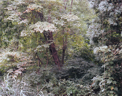
below - a non-ad Katrina photo from Polidori - at least so far. Roofing Contractor anyone?

The Fantasy World of Ryan McGinley


A somewhat pointed critique from Slate - Does Photography's Hot Young Thing Deserve All The Hype (follow the slideshow and article), about Ryan McGinley and his roadtrips with a couple of vans of models and crew - which, after comparisons with Larry Clarke, Nan Goldin and Wolfgang Tillmans, concludes:

"What's striking is how easily McGinley's signature style translates from one platform to the other. His shots of naked twentysomethings riding bicycles through the countryside mean more or less the same thing on the walls of the Whitney or in an ad for Puma. McGinley has essentially created a successful lifestyle brand—a stylish fantasy of youth, beauty, and hedonistic fun. It's great for selling sneakers and cell phones. But I think we can expect more from art."

At what point, I wonder, does it just become The Simple Life?

(p.s. - have you ever actually tried riding a bike naked... ouch)

Bernd Becher redux


Following up on the news of Bernd Becher's passing, Sightandsound has re-posted a very good interview with the Bechers that took place in conjunction with a retrospective of their work:

"If against all expectations, Wim Wenders were to make another good film, set on dusty highways, in cheap motels and provincial coffee shops – these could be his heroes: two strangers in Alabama, sometime in the seventies, lovers, driven by one obsession. They've been waiting for the right light for weeks, just the right amount of cloud, to photograph the recently closed blast furnace at the local steelworks, just as they have photographed a hundred other blast furnaces before. It's a fight against the sun and the clock. In the evenings the man stands in a windowless shower room of a seedy five-dollar motel and develops the films while the woman prepares dinner on the gas stove. And again they'll have to wait for a day when the sun burns less mercilessly, a day, they fear, which could come too late.


The blast oven is up for demolition any day, only a lone trade unionist who they met the previous evening at the bar in "Logan's Roadgrill", seems still to have any hope. The government, a new investor, any one could step in at the last momentand save the region from decline. The strangers know better: the only thing that will remain are their pictures.

Bernd and Hilla Becher have taken thousands of them over the last 50 years. Photographs of winding towers and cooling towers, of silos, lime kilns and blast furnaces, of coal bunkers and gravel plants. They are the souvenirs of a world recently lost...." more here


Wednesday, June 27, 2007

The most influential work of modern art


From Clare Margetson at the Guardian Art Blog - The most influential work of modern art, commenting on a Newsweek feature (worth reading btw). For once, they seem to have came up with a pretty good answer: Picasso's Les Demoiselles d'Avignon (a stunning and revolutionary painting based, in part, on a photo postcard...):


"The new edition of Newsweek asks a familiar question, Which is the most influential work of art of the last 100 years? The answer, according to Peter Plagens: Picasso's Les Demoiselles d'Avignon.

No great shock there. I can still remember the first time I was shown the slide of this extraordinary work by my history of art teacher and told this was the painting that changed modern art. It seemed brutal, extraordinary, ugly, yet exciting, to my untrained eye. My teacher certainly never mentioned Marcel Duchamp's Fountain - the chilly looking urinal, marked R.Mutt, that in a survey of 500 artists and curators, beat Picasso to the top spot (Les Demoiselles came second, Warhol's Marilyn Diptych third).

Tyler Green
on his blog today makes a good case, on the other hand, for Matisse's Blue Nude, although Matisse didn't figure at all in the artists' survey. Should Matisse have been there? Or should he forever play second fiddle to Picasso?

And, if you were to think of the most influential work of the last 20 years, what would that be? Sharks, beds, white blocks ... I suppose it is too early to say."

Or Damian Hirst's diamond skull... nope


Ha - real or fake...?


Take this auto desk test and see if you can tell which images are real and which are computer generated (via Mrs Deane - although I was actually targeted with an email from them about it which I didn't bother to read).

Thankfully I got 9 out of 10 - but I'd love to get my mum to try it (if she actually used a computer that is...) and see if she could tell.

Who needs product photographers anymore....

(of course I'm probably just contributing to autodesk's advertising posting this)

Tuesday, June 26, 2007

Covering Photography

(Lee Friedlander)

A while back Alec Soth wrote and interesting piece about photography and book covers


(Atget)

Then today I noticed a post by Mary Virgina Swanson about "Covering Photography" a sort of database and archive of photographers and book covers. You can search by photographer, author, publisher etc. It's surprisingly interesting. Especially intriguing is what photographer is matched with what book - sometime rather incongruously so. And how many of my favourite photographers find their way onto the covers of books of poetry...


(Roger Fenton)

(oh, and Alec mentioned Covering Photographs in his original post, but I never clicked on the link...)


(Robert Adams)

POSTSCRIPT - Drew commented on this cover for the Iliad - cool...:

Monday, June 25, 2007

Looking-Glass Editions - Print #2 - affordable art

So, the people have spoken (sorry Mel).

I've selected the second print for my
Affordable Art Editions. It's from - Traces: Alleyways and Spandrels my current "work in progress" and the picture is "Alleyway #5 - 83rd Street"

(Click on the picture for a larger view)


"The alleyways of the city and suburbs provide a sort of unnoticed network of alternative routes and pathways. They are usually ignored and unnoticed, often uninhabited, especially during the day. I look for traces of things - of people, of memories – clues. I often find myself led from one thing to another, often like following evidence. I photograph to make sense of things around me, to try and understand what I see - these traces, these clues give rise to more questions, and to looking more closely."


I recently started to send some of this work out to some trusted colleagues and curators and I am already getting very positive feedback from them - probably more so than any of my work to date, the the project as a whole is still pretty raw right now.

This picture is the second of the Looking-Glass Edition affordable prints and is available for only US$25.00 until the edition of 100 is all sold out - print is 7 1/2"x9 1/2". The first print is already selling rather better than I expected...

BTW - if you actually frame this - as opposed to sticking it on the fridge with a magnet - it looks really good with an over-sized matte.

Simply click on the link below to buy - 25.00 + 9.50 shipping to wherever you are.(If you are in Canada, email me at the link in the sidebar, as shipping is a bit cheaper. I will also take USPS International Money Orders - again, email for details.)


Bernd Becher 1931-2007


The wires are reporting Bernd Becher passed away in Rostock.

Becher, working alongside his wife Hilla was known for his industrial typologies. As a professor at the Staatliche Kunstakademie Düsseldorf , he was also known as the influential teacher and mentor of most of the members of what has become known as the German Scool - Struth, Gursky, Esser, Höfer, Ruff and many more.


(Hilla and Bernd Becher - Photo by?)

Becher was probably one of the major influences on contemporary photography.
(Link to NY Times obit)


Atget at the BnF


La Bibliothèque nationale de France currently has a rather good online exhibit about the work of Eugene Atget (as far as I can tell, only in French?). It seems pretty easy just to click around on it and enlarge various images, which are collected together in different themes Le vieux Paris, parcs et jardins, zone et banlieue etc as well as section on the Albums, Atget himself, some you can zoom right in on and so on.


There are certainly lots and lots of pictures on here to enjoy (almost every image on any page can be clicked on and enlarged)

The actual physical exhibition itself is only on until July 1st - so if you are lucky enough to be in Paris, hurry along there before it closes.


Edward Burtynsky and politics


Jim Johnson over on (Notes on) Politics, Theory & Photography has sparked some interesting discussions with a couple of posts (here and here) on Edward Burtynsky:

"...is environmental degradation of the sort that Burtynsky depicts less lethal, less of a humanly created catastrophe than war or famine or massive forced displacement? Would it be acceptable to simply remain non-committal (and, as I suggest below, that is precisely the stance Burtynsky strikes) about the latter sorts of events? Again, think of Salgado or Nachtwey. How would we judge them if they adopted so non-committal a stance regarding the political and economic implications of their photographs of devastation and mayhem? Why is it easier to let Burtynsky off the hook here (in say his pictures of large dams in China like the one I've lifted above) than would be to allow Salgado or Nachtwey to remain analogously silent regarding, say, their images of corpses of cholera victims in Zairean refugee camps? I simply do not get this...." more at the links above


Sunday, June 24, 2007

Looking-Glass Editions #2 choices... choices.. choices...

Well, the first of the affordable art editions seems to have got off to a reasonable start, so now I'm starting to think about what picture to chose for the second print edition (I'm coming around to thinking it would make sense to have four or so running in rotation at any one time - at which point I'm probably going to actually have to bite the bullet and put up a website).

Warning - wandering digression: One thing I have been reminded of in all this is that I find 8x10 to be a particularly unhelpful size. It's amazing how many prints just don't work in 8x10 (and one of the reason I've never really been a big fan of the Holy Grail of 8x10 contact prints). Now I've gone on at length in the past about the current trend towards mega-prints, which I happen to quite like most of the time. And I find that most photographs will often work very well around 11x14 up to 20x24 - it doesn't really matter too much. Some have a bit more impact at the bigger end but I find a broad range of my pictures work at these sizes. And the same also goes for smaller. I've had a practice of producing small postcard sized editions in different forms to send out to editors and curators and galleries and such. Again, I find a lot of photography works really well at this 4x6 or slightly bigger size - and yet move many of these up to 8x10 and - kinda blah - take them up to 11x14 or so and tra-la - good visual impact.

So, that's a rather roundabout way to say I've actually been having a hard time to find prints that work really well at 8x10. Some of my favourites just don't...

So, here are a few I've come up with so far. Let me know if you are really keen on one in particular for the next pick (or if there is one that would cause you never to come back to this blog again...)


I was thinking of this one "Slow Children" from Peripheral Vision - The Yellowknife Project. It looks pretty good as an 8x10, but then I remember I had another picture where I had changed lenses and perspective a bit and that I had never really printed up apart from a couple of test prints:


This one actually works really well as an 8x10. What do you think?

Another option would be to pick one more from my immersive landscapes - here are two which work well and that I like:


The one below actually works very well in 8x10


Or, (my own favourites, because it's what I'm working on right now) is one of these two from my Traces - alleyways & spandrels project. The second one, of course, is the one selected for the current
Humble Arts Foundation Group Show


Let me know. I'm not exactly going to be taking a vote, but I'm hoping to get an idea of what's what...

Saturday, June 23, 2007

HP's Z3100 photo printer - 17"??


A rare technical post - so tune out if you are as averse to them as I am on most other blogs...

That said, for years I have fiddled with Epson printers - used third party inks, loaded my own with syringes (and ruined a couple of good shirts in the process).

Finally the Epson 2400 (and its bigger brothers came along) and basically, as far as I was concerned it was plug and play. I get great colour when I need it, and on Crane Silver Rag I get excellent black and white prints. Though on the latter I'm pretty picky - most of the time the prints are 98.5% there - although they are as good as most of what I ever produced in the darkroom.

But then something comes along to spoil it all. HP has a range of pro printers, the Z2100 and Z3100 range and a smaller 13" sibling the Photosmart B9180. I've been hearing good things about these. Well, today I saw some black and white prints done on one and damn - they are 99.825% there. Basically they seem to do pretty much what I want - no complaints. A show printed up on one of these would just look great. Bugger.

Trouble is, I don't want another 13" printer when the one I have is going strong. And as much as it would be nice, a 24" or 48" is out of the question. But a 17" Z series prosumer printer along the lines of the Epson 3800 (or even 4800) would just hit the spot.

So come on Hewlett Packard - we're waiting - a good sized market of creative photographers. Heck, I'll even test drive it for you. I want to see what the picture up top (and many more) look like on the HP.

Okay, Online Photographer mode is now off for another few months and back to regular programming.

"Alec Soth on video" - Featured Comment - new american portraits


Popping back to the Alec Soth portraiture post, Claudio Cambon made the following comment which for me really got to the heart of things. He starts by affirming Soth's comments about the visceral experience of the 8x10 ground glass, but then goes on to comment on contemporary portraiture in general (though I don't think Soth in particular). He says - much more clearly and eloquently - pretty much what I was trying to say about contemporary portraiture way back here (the humdrum portraits trend), especially the part I have emphasised in the last paragraph:


"...I do love the "movie" feeling of the large ground glass; I feel like I'm in my own camera obscura, my own world, as Soth says... I also agree that a lot of the time portaits with smaller cameras are hard because the person doesn't know who to interact with more, you or the camera. Larger cameras definitely create a remove that allows a person to confess directly to the lens; in many situations minimizing one's own presence can really help.

I also agree that the photographs measure the distance between photographer and subject perhaps more than the subject itself, but ultimately I find many contemporary photographers too complacent about this distance. I feel it becomes a way to be safe, not to engage; it's too comfortable.

I should emphasize that I don't mind distance per se. I think, for example, that Walker Evans was a master at photographing both the social and class distance he felt from his subjects, which was huge, and at the same time the very personal sense of shock he felt at how they lived, which was overwhelming. That is why pictures such as the series for "Let Us Now Praise Famous Men" are at once almost icy in their gaze (Kirstein called it a "puritanical stare"), and at the same time so immediate and piercing for me. For being so far away and close at the same time, they are very honest pictures.

On the other hand much contemporary work that holds this distance doesn't elaborate on what that distance means for them. I feel like asking, "OK, so you feel removed, but what do feel about being removed?" I don't sense anything particular about it, be it dismay or nostalgia or desire or whatever; I'm not hearing the photographer's voice. There is little contact, or transgression, or crossing boundaries. The pictures are good, but somehow often not dynamic enough for me. Distance as a kind of objectivity doesn't bother me, but distance as neutrality does."

Admittedly, I haven't seen it in person, but I think this applies to many (though not by any means all) of the examples on the current hot A New American Portrait show at Jen Bekman Gallery (more here)

Friday, June 22, 2007

The Sea by John Banville


If you are looking for some good reading to take away to the beach/cottage/hacienda/Blofeld style mountain-top lair then The Sea by John Banville is a good pick.

Sure, it's a little bit melancholy and somewhat bitter sweet, but Banville's poetic way of writing (among other things, he seems to make up the odd word to express what he wants in a sort of Joycean way, though not nearly so relentlessly as Joyce) is at times quite magical, though always down to earth. The book is very evocative of place and - if you are at all interested in memory and how it works - Banville is a master of making memories both concrete and ephemeral at the same time. In many ways, his writing is quite "photographic" - I could often pretty much imagine the photographs that would illustrate the prose.

The Guardian has one of many good reviews - following is an extract (warning - the full Guardian review has a bit of a spoiler in it...):


"Max Morden, whose name points to death and, like the Northern line terminus, an end, is mourning the wife he has recently lost to cancer. He first love had also once stayed. Reconstruction through memory is Morden's drug: he binges on it and on grief, booze and writing. The sea is where his first love disappeared and where he is now disappearing. The sea is memory itself, its high rising tides are what threaten to drown the present and even the past. Like memory, the sea has a life of its own: at the close of the novel, Morden remembers a moment when a strange swell seemed to express the unacceptably cruel world: "the whole sea surged . . . Just another of the great world's shrugs of indifference."...

Banville writes novels of complex patterning, with grace, precision and timing, and there are wonderful digressive meditations. In The Sea we hear about work and mediocrity, how "Be yourself!" actually means "Be anyone you like", on how first love can put an end to the "immanence of all things" and turn the world "into an objective entity"....

In this scopic world, people become things. Morden prefers it that way: "What are living beings, compared to the enduring intensity of mere things?" It's not only the intensity of things that Morden likes perhaps, but the fact that they don't speak. In speech, living beings expect to be understood on their own terms. The sudden dramatic turn of Morden's memories hinges, it transpires, on a colossal misunderstanding, as we see at the novel's end..."


(Pagham Beach - Tim Atherton)

Thursday, June 21, 2007

Irving Penn in... inkjet


(Iceland Poppy/Papaver nudicaule (E), New York, 2006 digital pigment print with Epson UltraChrome Pigmented Inks on Crane's Museo Silver Rag paper, mounted to board 19 7/8 x 24 inches ©Irving Penn)

I've always really quite liked Irving Penn. I know he has his detractors - he's really just a fashion photographer fooling us he's an artists and so on. But watching what he has produced overt the years - and continues to produce into his 90's - you can't help but admire the creative mind and aesthetic sensibilities at work behind the camera.

(His frozen foods are just one example of something that was done pretty much before it's time and that you still find younger artists "making reference to" today)


Anyway, over on the LF list I saw a reference to Penn and Epson K3 inks... so I had to check it out. And true enough, earlier this year Pace/MacGill Gallery had a show of Penn's work (these beautifully "Pennesque" flowers among others) which not only had classic dye transfer prints and Platinum prints (remember this is the guy who pretty much re-introduced platinum printing to the photography world) but - horror of horrors - Epson Inkjet Pigment Prints - on the beautiful Silver Rag paper (ahem - the paper chosen for my print offer), as well as basic old Epson Enhanced Matte.


(Poppy: Barr's White, New York, 1968digital pigment print with UltraChrome Pigmented Inks on Epson Enhanced Matte paper, mounted to board19 1/2 x 17 1/2 inches ©Irving Penn)


From the Gallery: Pace/MacGill is pleased to present an exhibition of flower studies made by Irving Penn between 1967 and 2006. Penn has been working in this genre for over four decades, utilizing a variety of printing processes that meet his consistently high standards for quality. The show will feature a series of color close-ups printed with digital and dye-transfer methods as well as a black and white platinum print.

Without artifice or sentimentality, Penn’s flowers are statements of fact. Recording what is in front of his lens with as much fidelity as the camera allows, the photographs dissect each whorl and petal, each stem and stamen with the honesty of an X-Ray. Penn examines the topography and biological wonder of each specimen, many of which are in a state of decay. He makes note of the feathery skeleton of the Dandelion/Taraxacum officinale bearing the weight of droplets of water and the withering petals of Peony/Paenoia: Silver Dawn. Each browning, twisting flower is seen with cool objectivity.

Beyond the display of striking clarity, there are moments within each composition where Penn’s objective study becomes poetic contemplation. The passage of time is implicit in these images: the pink pigment drips from the tips of Tulip/Tulipa: China Pink and Iceland Poppy/Papaver nudicaule (C) is caught cocooning into itself. With subjects found at the penultimate moment before their expiration, Penn documents each flower’s vitality while speaking of its mortality.


(Dandelion/Taraxacum officinale, New York, c. 1973 digital pigment print with UltraChrome Pigmented Inks on Epson Enhanced Matte Paper, mounted to board22 x 17 3/16 inches © Irving Penn)


I'm pretty sure there's a few folks turning in their graves over this, as well as a few others who think it must be a sure sign of the End Times... But kudos to Pace/MacGill for being willing to actually show these (though I'd have to wonder if they actually had much choice in the matter!).

Wednesday, June 20, 2007

Meeting Resistance - with the Insurgents in Iraq


There has been much comment about the role and place of journalists who are "em-bedded" with the US/Coalition forces in Iraq.

In this documentary Meeting Resistance, two western journalists - Steve Connors and Molly Bingham spent ten months filming the stories on the other side, of the Iraqi insurgents


I haven't seen the film yet (you can view a few sections here), but definitely want to track it down. Steve Connors is one of my oldest friends, who - as a photojournalist - photographed in Bosnia (if you recall the harrowing pictures of starving prisoners from Trnopolje and Omarska...) the war in Sri Lanka, Rwanda, the former Soviet Union and Afghanistan. I'd lost track of him over the last couple of years, so it was doubly interesting to find out what he was up to... (even if it seems partly insane!)

From the blurb:
MEETING RESISTANCE is a verité-style non-fiction feature-length film set in the streets, alleyways and ubiquitous teashops of the Adhamiya neighborhood of Baghdad. It enters the physical and psychological heart of the "insurgency" against the American occupation. Photojournalists/directors Steve Connors and Molly Bingham spent ten-months among the insurgents there to create this exclusive, unique, and at once horrifying, compelling and insightful film about their lives, motivation, and goals.

MEETING RESISTANCE focuses on eight "insurgents", each with his or her own tale and reasons for opposing the American-led occupation, yet all people who within days of the fall of Baghdad were arranging themselves into resistance cells, finding the money and weapons to fight against the American military. The film witnesses how they began to organize themselves, reveals why they have decided to violently oppose the occupation of the country, and hears in their words the underlying ideological foundations to their fight and how and why those have changed over time.


MEETING RESISTANCE is a fascinating journey through a tumultuous period with diverse members of the Iraqi resistance. Their personal stories as well as their ideological ones are at once dramatic, eye-opening, and concerning - and they challenge the notion that those opposing the occupation are simply "dead enders," "common criminals," "Al-Qaeda operatives" and "die-hard Ba'athis."
And you can listen to a very good MP3 interview here (50min) with Connors and Bingham