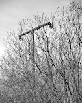
When I was doing the northern part of my Immersive Landscapes project, I produced a number in colour as well as the black and white that the majority of the project was done in.
Most of the colour photographs didn't work that well. A few did.
Here are a couple of the ones that I think did (I also posted another one previously here). I'll see if I can dig out a couple more. Click for a bigger view.


7 comments:
Sweet f****** ******, these are f****** phenomenal!
Much, very much prefer these to their b/w counterparts. I commented similarly when presented earlier on with a similar 'choice' but you went with the b/w so obviously you see things differently. I find the color version more interesting, more eventful; the color is doing/shaping things, fleshing things out. Aside from just plainly looking good, that is.
Sometimes less color is really preferable to me too: that tree at the end of your earlier post http://tinyurl.com/2h4dmv for example I wouldn't want to see in color I think; it has that basic/rugged abstract-expressionist thing going for itself, like a Franz Kline or so.
But again, I do understand you have some other artistic considerations invested in your pictures, so...
tim, these are just the best i've seen, get into the contacts man, you really have something here.
adrian
Tim,
I wonder how the project might encompass both points of view; if the color and b/w images might have more to say together, than either set or series of images might have to say on its own.
I find that first photograph particularly striking, with the distant pines providing such a wonderfully contrasting frame to the center bush. It reminds me (quite favorably) of the tree portraits scattered throughout William Eggleston's "Democratic Forest."
Keep digging, even if the well's not deep (and who's to say it isn't?), the water's quite cool and clean and satisfying.
I'm with Bee and Adrian - as you can probably guess! As we've discussed before this is harder to do in colour than BW - much harder. The struth paradise book shows all the problems really clearly and even has one bw print for comparison. IMO this is the whole purpose of that big camera you carry, to be able to make these colour landscapes 'speak'. Mas mas!
print the good ones in color and go back and re-shoot the ones that didn't work when the light is different
ct
very good work
Post a Comment