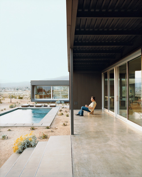
"Drink in hand, he settled into the numb nothingness of his self-imposed isolation".
(Photo: Daniel Hennessy; Dwell, November 2006)
On a mildly serious note, over the last few years it's been interesting to note how the "deadpan" aesthetic in photography - applied to both people and places - has eventually made its way from the edges through to illustration and advertising. From the New Topographics by way of New Colour and the "Dusseldorf School" etc. it has been showing up more and more often in ads and magazine articles. Nowhere is this more so than in the case of architecture, design and "lifestyle" magazines.
At first seen mainly in the more hipster magazines such as Azure or Dwell or ID or Wallpaper this style is now found in even the most staunchly traditional architectural magazines. Check the architecture and design magazine section at Chapters, Borders or Barnes & Noble and you will find no end of articles apparently illustrated by the combined team of Thomas Struth (huh - I can't believe I've never done a full post on Struth), Rineke Dijkstra, Joel Sternfeld and Stephen Shoren Ltd.
We are presented with models or owners - not a smile among them whether adult or child - with their deadpan gaze lit by diffuse and slightly unsaturated colour, as is the rest of their dwelling - usually on an overcast day - seen fair and square by the camera. Rarely pretty or beautiful or stunning but always understated. Somber and mildly sublime but never harsh or bold or brash.
Now this happens to be a look and a type of photography that I actually quite like. At first I was excited as I started to see it effecting main stream commercial photography and especially as it started to fracture the dominance of a style of architectural photography that had been in place since sometime in the 1970's. But now I'm coming to realise that it can become rather tiring in such quantity (if not downright depressing) after flicking through the third or fifth or tenth magazine with article after article illustrated in a similar deadpan style - even if meticulously executed, as they usually are.
And while I know that many of the photographers also pursue their own personal projects alongside their commercial work (wherein the latter has become a happy subsidising side-effect; making hay while the sunshine lasts) I find that once this approach moves too far into the commercial realm it also seems to take on a deadening effect. Whereas the personal work, the art projects, may appear deadpan and impassive they are often in fact suffused with a sense of real irony or genuine affection or fascination or criticism or even subtle humour. Yet with most of the commercial work this more often seems lacking and all we are left with is the austere, sober deadpan.
Which is why I was happy to run across the site "Unhappy Hipsters" - subtitle: "It's lonely in the modern world" (thanks for the link Shafraz). The (anonymous??) author takes a sample of these pictures and adds his own humorous (though often highly believable) take on them by adding his own captions. Some are gut-achingly funny. Most are wry. Some beautifully satirical. Many are tellingly accurate - at least as far as the current urban middle class condition goes.
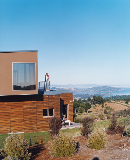
"The emotional distance was immeasurable.
(Photo: Noah Webb; Dwell, February 2007)"
Really, I enjoyed the site as just being very funny but it did prompt me to do a bit of musing on photographic style as well as (a mildly humorous take) on meaning in photographs - how images contain a multiplicity of meanings independent of the original creator (I know adding captions to change meaning - intentionally or unintentionally - is nothing new, but this seemed a particularly well done example). So just enjoy Unhappy Hipsters
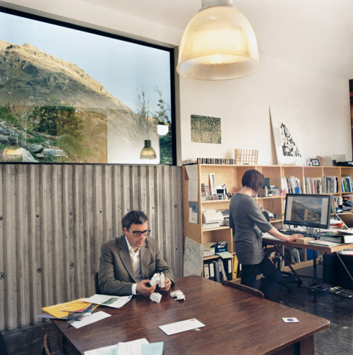
"He deeply resented her insistence that their wardrobes coordinate.
(Photo: Stephen Oxenbury; Dwell, March 2009)"
BTW the competition posts (they start about halfway down the page), where readers were invited to send in their own captions had me creased up in part because of the wonderful brilliance of the subject photograph by Gregg Segal (who must have a beautifully humorous sense of irony):
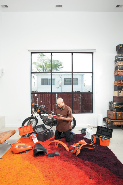
(Photo: Gregg Segal; Dwell,
October 2009)
October 2009)
And a couple of sample captions:
Zen had come easily to him—sparse interior, shaved head, “rug-garden.”
It was motorcycle maintenance he was having problems with.
-Sebastian Biot
He knew she would be happy that he had adhered to the “NO SHOES ON
THE CARPET” policy. Finally, he was getting their relationship right.
-Brilliant Anonymous
He had no intention of ever riding it, or even fixing it. But he decided
from this moment forward, all visitors would enter to find him in
exactly this position.
-SteveZ.


6 comments:
Thanks for the link. Outstanding. Hilarious.
And I, too, actually like this style of photography. Why not mock it anyway?
The blog is really funny...but I'm bothered by the use of "hipster" in the title. The term itself seems to have no real meaning anymore, but takes on whatever sense the author wants it to. In this case, he seems to be using it to refer to 38 year old architects and designers making $250,000 a year. I'd rather call it Unhappy Yuppies.
Being a photographer, I'm also very aware of how much the stiff, uncomfortable poses of the people in these pictures are a product of the long exposures and large format cameras used to photograph them. This kind of technique is almost unavoidable if you want to get architecturally correct perspective and use natural light, and sometimes I think this way of shooting gave rise to the deadpan aesthetic, not the other way around.
I thought yuppies were extinct by the time the Millenium came around...?
hmm - maybe - but August Sander and Julia Margaret Cameron were stuck with much slower and more cumbersome cameras and film than a modern 4x5 with 160 or 400 speed colour neg film, yet they managed not to get constricted by and confined to a "deadpan" aesthetic.
I just wish I could get the captions voiced by Werner Herzog.
Interesting point of view that shows some real insight into the current aesthetics of architectural photography.
Post a Comment