
The latest issue of Blindspot turned up the other day, and while it's not my favourite issue ever, it certainly has some thought provoking stuff and is certainly worth the cover price.


and the individual images by Jason Fulford:


(Jason Fulford)
But there are a couple of portfolio's that reminded me certain things that just don't seem to do it for me.
One was Alpine Star by Ron Jude. This is all black and white pictures which have very obvious grainy looking halftone dots because the are enlarged prints from newspapers, culled from stories in Jude's local newspaper. I can see the idea behind this - ti's a reasonably interesting concept - and I would probably find looking at the show, on a gallery wall interesting - once. But I've seen this technique used before several different times, and for me it really just doesn't work. Occasionally, perhaps when used in conjunction with something else, or when used for specific purpose - say the photographs in Sebald's novels - it works. But as a whole series of images I've always found this approach is, for me, like nails of a blackboard.

One was Alpine Star by Ron Jude. This is all black and white pictures which have very obvious grainy looking halftone dots because the are enlarged prints from newspapers, culled from stories in Jude's local newspaper. I can see the idea behind this - ti's a reasonably interesting concept - and I would probably find looking at the show, on a gallery wall interesting - once. But I've seen this technique used before several different times, and for me it really just doesn't work. Occasionally, perhaps when used in conjunction with something else, or when used for specific purpose - say the photographs in Sebald's novels - it works. But as a whole series of images I've always found this approach is, for me, like nails of a blackboard.
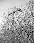
The other thing was some (and only some) of Jason Fulford's work. Now, I like Jason's work (and love his publishing projects at J&L Books), and there are individual pictures in here I really like. But what I'm having a harder time with is the composites or collages - such as the one adorning the cover above. It's not the way the composites go together - the choice of images to combine - that usually seems to work and can be intriguing and interesting. I think it's more to do with the two-dimensionality of them. In a way what appears to be their digital nature. It's not just that they are flat, but it's almost as if they are more than flat. Add that in with the fact that they also appear in a way as just a set of Photoshop layers and I think it really has to do with their physical nature as objects rather than their content.
(Jason Fulford)
It might seem a simple and possibly unnecessary thing, but if you compare them with say the work of Masao Yamamoto, one thing that comes across to me - even in reproduction - is their physical nature, as well as what the pictures are actually about. The two things are intimately bound togehter. They physically overlap, the corners of some curl, they may have a few creases, or glue bubbles. The prints are often also not quite 100% square and even - whereas the digitally made ones seem so rigidly bound by their edges - more so than an individual print. Somehow (and I'm not quite sure why) this makes a big difference for me. The same could be said of David Hockney's "joiners". I've seen digital versions people have made using the same technique, and it's not just that they don't ever have anything near the skill and genius of Hockney, it's also to do with their physical nature. You know Hockney's are made of hundreds, if not thousands, of 4x6 pints all glued together. You know if you saw them first hand you could see that, and that if you ran your hand over them, you could feel that.

(Masao Yamamoto)
(Masao Yamamoto)
Which for me is interesting, because for "straight" photographs, I'm not overly enamoured by the tactile nature of the print. It can be nice, but it's not usually essential for me to experience the physical print as a Pt/Pd print or and Albumen print or such - it can add a bit, but it's not the main thing (although I'm a little intrigued by Stephen Gill burying his prints in various locations around London and digging them up later to use, making use of their decay and damage). But it seems for work that moves into the area of constructs, or collages or combining images, I'm drawn quite strongly to some kind of physicality of the work, its three-dimensionality, and that I usually find it doesn't quite seem to work when it's done digitally.


1 comment:
Its a difficult question with IMO no real answer. I'm playing around a lot with these kind of layered montages and i can't make them work yet, but not for the reasons you've stated, just I can't maintain the purpose of the individual pics - this really isn't easy. So I'm using grid arrangements at the moment, although if I can find a way of combining the elements that syas what I want too, I'll probably switch.
I thought about physically mounting each element for the urplace pics, but the points of union for each of those are so precise it had to be done in PS.
As you know I've been a fan of Yamamotos for a long time, but i think he is handplacing as part of an aesthetic. The incluision of elements is almost random for him (you pick a third of the total and he chooses the rest and arranges them) . If you think of the 'mirror/window' argument he is totally mirror. An emotional response, with no other attempt at a structural unity, so the 'hand of the artist' is important. He also isn't dry mounting these flat, but 'floating' them in some way to enhance that feeling (dunno how he manages that and maintains any semblance of archivability).
The difficulty with JFs new work (I'm a big fan of his) is you loose the meaning of the layered images, you can barely see them, which is surely the point, but i think it is a shame. Yupmontages are hard!
Post a Comment