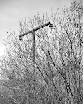
I recently came across the work of Jan Stradtman (via Intersecting Images) and especially his collection of work called To Combine Things Together.

I quite like these - the subtle shifts in viewpoint and perspective (as Matt Niebuhr put it tilt/pan/shift). Looking at them is a bit like looking at one of those children's puzzles "find the 8 things that are different between these two pictures".

(note: the effect on the website is better than on blogger)


1 comment:
Rudy VanderLans' book Supermarket uses a multiple image layout to great effect.
http://www.gingkopress.com/_cata/ima2/super-00.htm
Post a Comment