skip to main |
skip to sidebar
more traces
...or Alleyway - second batch. And I need to come up with a better working title... (I'm thinking of Snicket or Ginnel as a couple of suggestions so far - along with Twitten...)
(please join in the "discussion" in the comments)


7 comments:
Bob Thall did a book on Chicago alleys that you might want to see.
http://www.press.uchicago.edu/cgi-bin/hfs.cgi/00/15452.ctl
--- Luis
thanks for that Luis. I'd been trying to place that book and couldn't remember who it was by (I have Thall's earlier book).
Where I'm looking is more su-urban than urban.
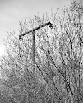
I'm intrigued by this network of alternative pathways through the city like a spiders web that no-one ever quite notices. People tend to travel them only within a short distance of their home. Each superficially the same and yet the more closely you look, each different. Each having a different view of the places they traverse than the view from the main street.
Tim, gotta ask, why are doing this in BW? With your subject matter, the formalism, just using lines as happens in BW, is going to be tricky as every alley is a series of receding lines. In the pics you've posted... the lights on the fence don't have the 'oddity value' that it would have in colour, the flags I bet would be primary colours against the green, which would stagger and add another point of interest, the shot with the icecream van (?) would have another dimension rather than the echoed square and would be a stronger focal point IMO...
Ha - wellll... in part I have been going through my usual schizophrenia about colour or b&w.
And there are a few of of the pictures I have taken so far which might work very well in colour (a couple I have taken in colour, but I'm waiting for the film back - no one for several hundred km processes colour neg anymore here...) but those are, I think, a minority.
In part, because the colours you mention aren't there not quite in that way.
The overwhelming palette is dull brown, grey and dirty white. Even with the lights on the fence (which is the most obviously colour one), the fence is a most hideous dirty chocolate/shit brown and the evergreens are still in a dark dull winter green.
the "ice cream van" (actually a "land-yacht") would be a perfect example of the three colour palette above (the grass isn't green - it's basically grey)
The "flags" would become a one trick pony - bright orange gas-line marker flags against grey/brown monotone back-ground - I don't know - I'm not sure if they would stagger or not...
I'm open to being convinced - especially when I get some more of the colour back.
(And yes, the receding lines are something to be overcome)
In colour, it seems to have the danger of becoming a sort of swatch book of suburban backyard kitsch...?
Anyone else?
ok, makes sense. Too used to Barcelona light and colour range! We also have colour neg processing too!
well - I almost added into my previous posts "forget Barcelona light and colours - think the light in Manchester on a late winters day... only not so nice"
You've been spoiled Julian
eric's photo is a good example (he also got it on a good day...)
http://www.ericfredine.com/silverskate/st_benedict.htm
I see nothing wrong with the use of B&W on this project. The receding lines are something to be welcomed. Real problems usually are sources of energy. Look at the way Atget dealt with the receding lines, which was a problem he confronted often.
In the soft light, color contrast could be helpful, but apparently, the chromatic range is rather narrow. Ironically, in this kind of circumstance, color B&W filters can be used to great advantage.
I think either B&W or color would work well for this project. It all depends on the photographer.
--- Luis
Post a Comment