Well, the first of the affordable art editions seems to have got off to a reasonable start, so now I'm starting to think about what picture to chose for the second print edition (I'm coming around to thinking it would make sense to have four or so running in rotation at any one time - at which point I'm probably going to actually have to bite the bullet and put up a website).
Warning - wandering digression: One thing I have been reminded of in all this is that I find 8x10 to be a particularly unhelpful size. It's amazing how many prints just don't work in 8x10 (and one of the reason I've never really been a big fan of the Holy Grail of 8x10 contact prints). Now I've gone on at length in the past about the current trend towards mega-prints, which I happen to quite like most of the time. And I find that most photographs will often work very well around 11x14 up to 20x24 - it doesn't really matter too much. Some have a bit more impact at the bigger end but I find a broad range of my pictures work at these sizes. And the same also goes for smaller. I've had a practice of producing small postcard sized editions in different forms to send out to editors and curators and galleries and such. Again, I find a lot of photography works really well at this 4x6 or slightly bigger size - and yet move many of these up to 8x10 and - kinda blah - take them up to 11x14 or so and tra-la - good visual impact.
So, that's a rather roundabout way to say I've actually been having a hard time to find prints that work really well at 8x10. Some of my favourites just don't...
So, here are a few I've come up with so far. Let me know if you are really keen on one in particular for the next pick (or if there is one that would cause you never to come back to this blog again...)
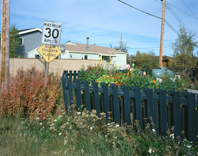
I was thinking of this one "Slow Children" from Peripheral Vision - The Yellowknife Project. It looks pretty good as an 8x10, but then I remember I had another picture where I had changed lenses and perspective a bit and that I had never really printed up apart from a couple of test prints:
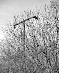
Another option would be to pick one more from my immersive landscapes - here are two which work well and that I like:

The one below actually works very well in 8x10

Or, (my own favourites, because it's what I'm working on right now) is one of these two from my Traces - alleyways & spandrels project. The second one, of course, is the one selected for the current Humble Arts Foundation Group Show


Let me know. I'm not exactly going to be taking a vote, but I'm hoping to get an idea of what's what...


4 comments:
The last one. i think you'll find you'lllook back on that image in later years and see it as a turning point. IMO it really shows evidence of the Japanese pohotographers you've been looking at
tim, i agree with julian as to the quality and significance of that last image. the faint outline of the building in the lower right is really quite spectacular, even as it lurks there to be missed, a like second thought, but oh what a second thought.
all of that said, i must also express a real appreciation for the first of the immersive landscapes you posted above; i see in that one a quite gentle wonder and i find that quite appealing.
My vote would have to go to the next to the last one, with that dangling, twisted rope and torn netting. In an abstract way, it sings about the zeitgeist, in a way reminiscent of the pictures of Herbert List.
Second vote would be to the last one.
--- Luis
From a purely selfish stand point, since I am awaiting Willow #7, I am drawn to the 2nd Immersive Landscape so they might keep one another company.
The gentle intrigue in the last two is wonderful.
Slow Children would present the opportunity for a survey.
P.S. I refuse to submit to 8 x 10. Framers are people too!
Post a Comment