Tuesday, June 28, 2011

Found Books - Andre Kertesz "The Early Years"


Unpacking boxes of books after moving I am finding - or at least rediscovering - quite a few books I hadn't looked at for a long time (some had been pushed into to top shelves of the bookcase in the basement. Others hadn't actually been unpacked since the last time I moved...).

One of these is an enchanting little jewel of a book - Andre Kertesz, "The Early Years".


It is actually a fairly small book about 5" x 5" - roughly the size of the original
Phaidon 55 series, although it is hardcover. Published by W.W. Norton in association with a 2005 exhibit at the Bruce Silverstein Gallery


The pictures in the book are all small contact sized prints for a box full of negatives that Kertesz had from his early days in Hungary when he was experimenting as a photographer. In fact most of the photographs in the book are smaller than they appear on screen here, yet with the crispness and depth of a contact print. A number of these early photographs are some of his most well know pictures. Others are less well known.


The Early Years is a wonderful book to have on hand for just sitting and browsing through for a few minutes every now and then. The photographic equivalent of a zen moment, mediating with your morning coffee/tea.


"When Hungarian photographer André Kertész did not have access to an enlarger early in his career, he made contact prints instead. And he became quite adept with this size, creating miniature images with incredible depth and sophistication. A real feeling of youth and artistic exploration dominates these pictures, which span from 1912 to 1925. From the very joyous experiments with his brother, Jeno, in the countryside, to his idyllic romance with Elizabeth, from his portraits of WWI soldiers, to his later hospital stay as he convalesced from a wound, we witness Kertész explore different photographic
interests and subjects. In order to compose for such a small format, Kertész needed to ground his images in strong lines and geometry, forging the hallmarks of his later modernist vision. Thus, the Hungarian Contacts, as they are called, chronicle not only Kertész’s coming of age as a man, but also his development as an artist. Before emigrating to the U.S. in 1936,
Kertész left the contact prints with an agent in Paris, who was later forced to flee the city under Nazi occupation. She buried the cache of tiny works in a makeshift bomb shelter on a farm in southern France. Kertész lost contact with her, and decades passed before the agent re-discovered Kertész because of his Bibliothéque Nationale exhibition in Paris in 1963. Thankfully, she led him to the site where he recovered the still-buried treasure. Though some of the Hungarian Contacts were part of the National Gallery of Art’s 2004 retrospective and though Kertész enlarged some of the images in his later years, a broad selection of them are presented together here as art objects in their own right and in the size that Kertész originally
intended for them. The book commemorates an important show of the work at Silverstein Photography in New York City and includes an engaging personal essay by Robert Gurbo, the curator of the estate. This new volume presents the Hungarian Contact Prints—many unpublished before now—in a wonderfully small format that enchants and refreshes.".
Denise Wolff


I've always felt that Kertesz is one of the more important photographers of the Twentieth Century, especially (though not only) in the whole area of what might be called "Street" or "Candid" photography. Kertesz's photographs are in many ways a much needed antidote to the so called (and incorrectly named) decisive moment. More broadly, his place in the development of modern photography is frequently underrated. In most cases I'll take Kertesz over, say, Cartier-Bresson any day.



Wednesday, June 22, 2011

The Lytro camera will let you focus your pictures after they've been taken (and see around the edges...)


It will also let you see around the edges of foreground objects... I'd read a bit about the Plenoptic/Light-field camera before but hadn't quite got my head around the physics. Lytro is a spin off from Stanford

Interesting news via Charlie Sorel at Wired:


"...Ng’s company Lytro is planning on launching the camera this year.
Regular Gadget Lab readers will recognize the technology as a a
light-field, or plenoptic camera. These camera put an array of
micro-lenses over the sensor. This lenticular array sits on the focal
plane of the camera (where the light is focused by the lens — also known
as the film plane), and the sensor sits slightly behind.


Thus the camera not only records the color and intensity of the
light, but also the direction. Using some heavy processing, this
information can then be used to do the magic you see above. It also
replaces much of a camera’s precision mechanics with software.


While this after-the-fact focus choice is the clear wow factor, there
are other neat tricks the camera can do with this information. First is
that the camera can shoot in much lower light. Second is that, as the
sensor is recording direction information, you can peek “behind” the
edges of the foreground objects...." (more).


From Lytro:

The Science Inside


Light Field Defined

What is the light field?

The light field is a core concept in imaging science,
representing fundamentally more powerful data than in regular
photographs. The light field fully defines how a scene appears. It is
the amount of light traveling in every direction through every point in
space – it’s all the light rays in a scene. Conventional cameras cannot
record the light field.


Light Field Capture

How does a light field camera capture the light rays?

Recording light fields requires an innovative, entirely new
kind of sensor called a light field sensor. The light field sensor
captures the color, intensity and vector direction of the rays of light.
This directional information is completely lost with traditional camera
sensors, which simply add up all the light rays and record them as a
single amount of light.

Light Field Processing

How do light field cameras make use of the additional information?

By substituting powerful software for many of the internal
parts of regular cameras, light field processing introduces new
capabilities that were never before possible. Sophisticated algorithms
use the full light field to unleash new ways to make and view pictures.

Relying on software rather than components can improve
performance, from increased speed of picture taking to the potential for
capturing better pictures in low light. It also creates new
opportunities to innovate on camera lenses, controls and design.


If this is technology that really does prove practical and scale-able then it has the potential to quite radically change photography. It's also a nice reminder that photograph isn't a picture of a thing, but a recording of light. "Now how much reality is there in that" as David Hockney once said of photography...


Thursday, June 16, 2011

Picture of the Day

Photograph - Rich Lam (via Bleacher Report)

From the post Stanley Cup riots in Vancouver last night. Although there are more than enough humorous retorts I'm tempted by (maybe in the comments...), I just like it as one of those classic daily news shots.

It captures the confused ambiguity of such a situation rather than just one more picture of a thug smashing a shop window.

Excellent catch by Vancouver photographer Rich Lam.

Wednesday, June 15, 2011

"The Waste Land" app

(App icon)

There are hundreds and hundreds of not very good apps for the iPad. And thousands of really crappy ones. And then there are the few imaginative ones which are starting to appear which take advantage of what the iPad can (and, as importantly, cannot) do.

All that's needed is a bit if creativity and a modicum of lateral thinking to start exploring the potential of the iPad.

I have a couple of apps - mainly for my boys - from Stephen Wolfram and Theodore Grey and their colleagues at Touch Press - The Solar System and The Elements. They are just to very nice apps that are trying to make better use of what the iPad can do.


Some magazines have also started coming up with apps that are actually quite nicely done and take advantage of what the iPad can do (one of the better ones I've come across happens to have been free for the first few issues - Intelligent Life from the Economist. Another, which also happens to be free is Dazed & Confused magazine).


Which brings me to the Waste Land App. I had originally read that it was published by Faber & Faber, - Eliot's publisher. Until I was writing this I hadn't caught that it is actually produced in partnership with Touch Press who I mentioned above. I haven't got my hands on this yet but I really like the look of it and what they have done around one of the more important and influential poems of the Twentieth Century.

From a couple of reviews:

The LiteraryPlatform

"The gallery is my favourite bit, giving us a clutch of relevant postcards – of Bob Dylan, Dante Alligheri, the first Mrs Eliot,

a crowd of people crossing the river Thames,
‘so many,
I had not thought death had undone so many.’

These images create real breathing space around the poem. They evoke, inform and leave the poem be.

There’s a picture of the first edition of Prufrock in a plain brown cover, then all the pages of the typescript manuscript with the inky slashes of Pound’s fierce corrections and comments. The notes, presented in a Comment-press style, can be brought up when wanted, then brushed away if you want the text plain. Likewise it’s a doddle to switch between the different audio readings or switch them off entirely."

and Salon

"You can watch (Fiona) Shaw read for a while, then switch back to the text to check a reference or translation, then go on reading the lines to the accompaniment of Ted Hughes' very different vocal interpretation; the app keeps track of your place as you go. Eliot's friend Ezra Pound played a crucial role in shaping "The Waste Land"; and the inclusion of the original manuscript with Pound's handwritten edits offers a glimpse of that process. These various ways of approaching the text are enticements to the multiple readings that make a full appreciation of the poem possible.


Spending a day poring over "The Waste Land" app made me look at my old Norton critical editions with a new gleam in my eye. Instead of leafing through tissue-paper-thin pages of "Paradise Lost," squinting at the tiny footnotes, it would be so pleasant to scroll through Milton's epic (maybe with Gustave Dore's engravings?), tapping on the lines that cry out for elucidation while listening to a professional narrator vault the poet's enjambments far better than I ever could myself. How about "The Canterbury Tales," with an audio track in Middle English to juxtapose against a modern English translation? I would indeed pay for these, and the enthusiastic reception for "The Waste Land" app suggests that I am not alone."

I already have two or three different recordings on my iTunes/iPad of Eliot, Hughes et al reading the Wasteland and various other Eliot poems. But I like the way this app appears to take those, along with the text itself and a multitude of other things about the poem and draw them all together."

If The Wasteland app is as nice as it appears to be in the review I've seen then I have no problem paying a decent price for it. Some people automatically start to moan when and app costs more than $3.00 or $4.00, whatever it is. I'd rather have one good, creative app like The Elements that cost $10.00 or $20.00 than a couple of dozen crappt 99c ones.

BTW, I haven't yet seen many photography based apps (as opposed to "photo apps") which have managed to take advantage of the iPads possibilities quite as well. In fact I'm having a hard time thinking of one worthile one that I would pay more than the usual 99c or $1.99 for. I paid out a bit more for one that was billed as "the first photo book designed for the iPad" or some such, mainly to see what it was like but it was basically pretty lame.

I think there is lots of potential for some very creative and intriguing photograph based apps along the same broad, general direction. I just haven't really come across many yet.

Mind you, now I'm waiting for The Wittgenstein app.... Stephen Wolfram, Theodore Grey... anyone?

...

THE river's tent is broken: the last fingers of leaf
Clutch and sink into the wet bank. The wind
Crosses the brown land, unheard. The nymphs are departed.
Sweet Thames, run softly, till I end my song.
The river bears no empty bottles, sandwich papers,
Silk handkerchiefs, cardboard boxes, cigarette ends
Or other testimony of summer nights. The nymphs are departed.
And their friends, the loitering heirs of city directors;
Departed, have left no addresses.
By the waters of Leman I sat down and wept...
Sweet Thames, run softly till I end my song,
Sweet Thames, run softly, for I speak not loud or long.
But at my back in a cold blast I hear
The rattle of the bones, and chuckle spread from ear to ear.
...

--------

P.S. Talking of apps, this post was written with Blogsy - so far the only decent blogging app for the iPad. For the longest time blogging from the iPad was a really rather clunky affair. There was no decent blogging app at all, which was a little strange as really, the iPad and blogging go together like 5 year old Stilton and a tankard of Scrumpy (and led to me beginning to muse on the possibility that the rumours of the death of blogging were not actually premature...). I had the opportunity of beta testing Blogsy and was quite excited about it when it came my way. It has been out for a couple of months now and the creators have continued updating and tweaking it and it continues being nice app that's very good at what it's supposed to do. Usually link to the AppStore stuff

Friday, June 03, 2011

Sohei Nishino's Diorama Maps


Istanbul


I really like this work by Sohei Nishino - his Diorama Maps. I came across it some time ago but didn't get around to writing about.

These are pictures I'd definitely like to see in person, but even on the internet they draw me in. Their depth and texture and detail are quite mesmerizing.


Istanbul - detail


I've long been a fan of Hockney's "joiners". I think that they said a lot about the limits of photography and also opened up interesting new potential. The problem with them was that they were such a brilliant Hockneyesque step that it seemed pretty hard to move much further beyond them in in a new direction. For a few years we were subject to a good few joiner type projects with most being somewhat poor imitation of the original idea (rather like that Gheary-lite museums popping around the globe after the Guggenheim Bilbao). When we were finally subject to a slew of joiner-like advertising it was pretty much over for the time being.

One of the more important things I liked about Hockney's original joiners was how they broke out of the perspectivism that binds most photography and how they showed some new potential ways of stepping outside Renaissance perspective with the camera.


London


I think Sohei Nishino's pictures have taken this at least one good imaginative step further in that direction. In part because of their scale. Not necessarily the scale of the prints - though I think they certainly need to be a certain size to be able to interact with them (originals are around 50" or 60" wide), but the scale of what they depict - a whole city. And while Hockney tackled some large subjects such as the Grand Canyon he still did so from a somewhat limited, if multiple, range of viewpoints.


London - detail


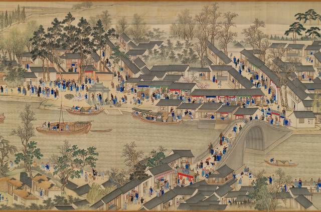
Sohei Nishino's pictures move to an almost infinite and ever changing multiplicity of viewpoints and perspectives in depicting the city. For me they combine the multiple viewpoints and perspectives of a classical Chinese scroll depiction such as one of the Kangxi Emperor's magnificent 17th Century Southern Inspection Tour scrolls - an inspiration for Hockney's joiner work as well as his panting - along with the imaginary vision of the city such as Italo Calvino's Invisible Cities.


Detail Kangxi Emperor's Southern Inspection Tour, Scroll Seven: Wuxi to Suzhou (University of Alberta: Mactaggart Collection)


But then they also speak to our ways of seeing, remembering and imagining places today; from touristic views to modern technological innovation and the social networking of photographs with things like Flickr, Photosynth and Seadragon (as well as to the early career of Louis Daguerre, one of the fathers of photography, who invented the popular Diorama shows in Paris before going on to invent the photographic Daguerreotype process)


Kyoto


And all this is aside from the technical brilliance and what I think must just be dogged, painstaking determination in actually photographing, producing and constructing these.


From Sohei Nihino's website:

"The narrative behind the Diorama Map series is the fluid nature of memory and the setting is always a city.
The creation of a Diorama Map takes the following method; Walking around the chosen city on foot; shooting from various location with film; pasting and arranging of the re-imagined city from my memory as layered icons of the city.

The Diorama Map, which is almost a bird's eye view of the city, is not a precise google map, but presents the key elements of the city in a form closer to my own memory and observation. Therefore, every single element amongst the enormous mound of pieces reflects my own act of photographic creation itself.
"


Kyoto - detail


Of course the question now is where to take these next. A never ending series of city pictures would eventually become merely monotonous so I hope Sohei Nishino is letting his imagination run wild in considering new directions.

But in the meantime I'll continue to enjoy and take inspiration from these pictures for what they are.


Paris
All Photographs - Sohei Nishino


Wednesday, June 01, 2011

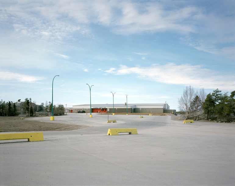
peripheral vision - the yellowknife project


the suburbs as a state of mind (a mild retrospective continued....)

There no longer appears to be a clear division between the suburbs and either the urban or rural environment. There now seems to be a generic suburban condition that may be a potential quality for all inhabited spaces. This extended suburban condition does not easily show up on maps, it is in many ways more of a suburban state of mind than a topographic location.


Yellowknife - a city perched on the Canadian Shield and surrounded by Boreal forest is like an isolated specimen of this condition - the idea of the suburbs. Wherever you are in Canada (or indeed, North America) there is a mundane, yet reassuring familiarity to the suburbs and the strip malls and the big box stores that results from the pressure of market forces and from blunt expediency. And while each place often displays subtle individual differences, the movement is away from difference towards similarity and the success of homogenization. What dominates is the generic.


In photographing Yellowknife I find myself looking at things that are somewhat off centre, off to the side - a peripheral vision. Things that are often unnoticed and just below our level of perception. Things seen that are in plain sight yet so familiar or obvious they are usually ignored, unseen, and their existence barely registered - attention no longer paid to them.


The landscape is forced to conform to the construction of standardised suburban sub-divisions and the exposed Canadian Shield, some of the oldest rock in the world, is blasted and flattened to accommodate familiar suburban housing rather than the housing being designed to conform to the landscape.


This project conveys everyday North America and the infiltration of the city by suburban culture - the place seen on the way to the office or the supermarket - viewing these familiar environments from an off-centre perspective, revealing the ambiguities and artifice of everyday life.


All images © 2005 Timothy Atherton

Wednesday, May 25, 2011

Spring Time - A Mild Retrospective

Spring time is here and things seem to be slowly coming back to life (including me).

I've going through boxes of stuff in a form of forced spring cleaning recently. Plenty of things to throw out but also coming across many things that I'd forgotten about but were a joy to rediscover.

In that spirit I'm going to post some pictures on here over the next while that I hadn't really looked at for some time. I find I often put pictures together for an exhibition or for a web page or whatever - pictures from a project that I might have spent some good time working on - and get so caught up with that often frantic end presentation process that it finishes with a sort of "fire and forget" conclusion. A quick glance, a sigh of relief and then on to whatever is next.

So I've been taking some time to go back over some of my pictures and projects and will be posting some selections on here - A Mild Retrospective.

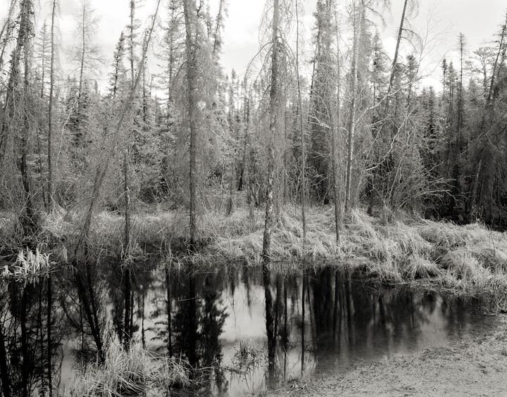
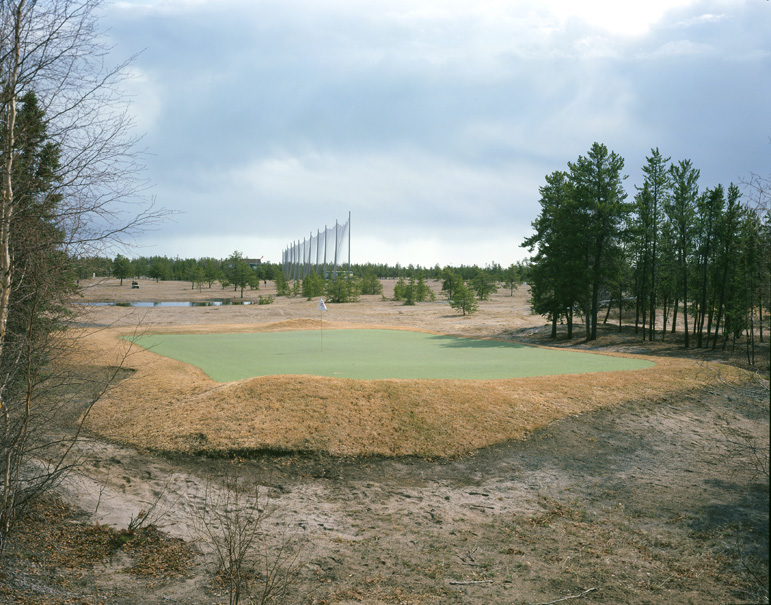
Today a few pictures from Immersive Landscapes - boreal forest/precambrian shield


All images © 2005 Timothy Atherton