Thursday, January 31, 2008

A couple of squares


Or rather a couple or so.

Here are a few from my first experiments with the square format - you might call them the start of Traces 2.

I've only got two or three rolls back (and some of those frames were just used to check the old camera was still working and focussed okay...).


I also just found that this city of about a million now has nowhere left that process C41 neg film - at least in sizes above 35mm. So I now have to send the neg film out to Vancouver by mail - jeesh. At least you can still buy the stuff for now.

Anyway. These were the first two or three I found interesting and I'm now waiting for the next three or four rolls to come back. Mind you, it's still not exactly going out and photographing weather, with the -28c to -35c temperatures and wind chills often doing down to below -40c due to last into next week some time... oh well.

Wednesday, January 30, 2008

"Well, it looks like truth?"

("Machinen 3440, 2003" by Thomas Ruff)

I've just started looking at Michael Abrams' fascinating and thoughtfully book Strange and Singular which explores the vernacular photograph and the snapshot (which I want to write about soon - hopefully after I have had a chance to talk to Michael). As an archivist/curator and as a photographer, such images have always fascinated me - although in recent years I have certainly become more interested in them.

In this vein, I've also been looking at the information about a current exhibit at the International Centre for Photography - Archive Fever: Uses of the Document in Contemporary Art.


("Abdul Aziz holding a photograph of his brother, Mula Abdul Hakim, 1997" from the series "The Victor Weeps: Afghanistan" by Fazal Sheikh)


There was a good little review in the NY Times about it a while back headlined "Well, it looks like truth?"

...The archive of the title is less a thing than a concept, an immersive environment: the sum total of documentary images circulating in the culture, on the street, in the media, and finally in what is called the collective memory, the “Where were you when you heard about the World Trade Center?” factor.

Photography, with its extensions in film, video and the digital realm, is the main vehicle for these images. The time was, we thought of photographs as recorders of reality. Now we know they largely invent reality. At one stage or another, whether in shooting, developing, editing or placement, the pictures are manipulated, which means that we are manipulated. We are so used to this that we don’t see it; it’s just a fact of life.

Art, which is in the business of questioning facts, takes manipulation as a subject of investigation. And certain contemporary photographers do so by diving deep into the archive to explore its mechanics and to carve their own clarifying archives from it...

The second, far less well-known work that opens the show is a 1987 silk-screen piece by Robert Morris that does what the Warhol does but in a deadlier way. It too is based on an archival image, a 1945 photograph of the corpse of a woman taken in the Bergen-Belsen concentration camp. Although such pictures initially circulated in the popular press, they were soon set aside in an ethically fraught image bank of 20th-century horrors. As if acknowledging prohibitions, Mr. Morris has half-obscured the woman’s figure with old-masterish strokes of paint and encased it, like a relic, in a thick black frame swelling with body parts and weapons in relief...

("Floh: Bathers in Sea, 2000" by Tacita Dean)

Other artists present randomness as the archive’s logic. The casual snapshots that make up Tacita Dean’s salon-style “Floh” may look like a natural grouping. In fact they are all found pictures that the artist, acting as a curator, has sorted into a semblance of unity.

And from the ICP info on the Exhibition:
No single definition can convey the complexities of a concept like the archive. The standard view evokes a dim, musty place full of drawers, filing cabinets, and shelves laden with old documents, an inert repository of historical artifacts. Against this we have another view of the archival impulse as a way of shaping and constructing the meaning of images. It is this latter formulation that has engaged the attention of so many contemporary artists. Archive Fever explores the ways in which artists have appropriated, interpreted, reconfigured, and interrogated archival structures and materials. The principal vehicles of these artistic practices—photography and film—are also preeminent forms of archival material, and artists have used them in a variety of ways. The works presented here take many forms, including physical archives arranged by unusual cataloguing methods, imagined biographies of fictitious persons, collections of found and anonymous photographs, film versions of photographic albums, and photomontages composed of historical photographs. In spite of the diversity of subject matter, these works are linked by the artists’ shared meditation on photography and film as the quintessential media of the archive.

("The Fae Richards Photo Archive, 1993-1996" by Zoe Leonard)


I'm still personally exploring all these things, both with my own work and with the archives and vernacular photographs I come into contact with - all these things intrigue me - fiction, truth, memory, appearances, memento, history, identity..

(Oh, and there's also a big thick book of the show coming out: Archive Fever from Steidl)


("Untitled (Death by Gun), 1990" by Felix Gonzalez-Torres)

Monday, January 28, 2008

Jacob Carter


I came across Jacob Carter's work at BLDGBLOG.


He has a number of series - among others: River Thames; Wilderness Series, Canada; 1940 Landscape Series; Utopian Visions.
"The Wilderness Series are a collection of photos taken in remote parts of Canada, where there is little human habitation. Only vital services can be found spread across the surrounding country, from rail lines carrying freight to the rare but vital gas station. I have focused in particular on the parallels between the natural, untouched surroundings and the elements of human intervention that become greatly apparent when seen in such a context.


The photographs were created using a combination of both digital and filmic techniques: Photographed using film that expired in the 1970s which is then digitally restored and manipulated to restore appropriate details...


All technologies and inventions have written within their lifespan the certainty of being rendered obsolete by improvement. Technology is in a state of unceasing change.


The fabric of cities stand as testament to the unrelenting development by man upon once open land. Layer upon layer of dense building and rebuilding; the constant urge to improve upon or change the surrounding environment has given rise to vivid cityscapes. Empty wharfs, unused power stations and other now derelict buildings of industry stand as the ruins and remains of once cutting edge technologies.


I believe a similar parallel exists in the world of photography. A catalogue of photographic processes and techniques now cast aside by progress stands testament to this...

The most recent work I have created is the result of a long interest in the aesthetic of early photographic methods, in particular colour postcards from the 19th century. I have attempted to synthesis the particular colours, textures and tones that have become synonymous with a more primitive era of photography.


The techniques are the result of much research, experimenting with methods such as Gum Bichromate and salt-printing, as well as using varnishes. The resulting images were created using specifically chosen expired film stock (expiry date 1970!) and then perfecting the images digitally."


-47c ...

(Photo via Edmonton Journal by Walter Tychnowicz - Jasper Ave., Sunday)

Definitely Brass Monkey weather...

It was -47c with the windchill in Edmonton this morning when I took the kids to school (-30c actual), so I don't think I'll be going out of the office much today. Just plenty of cappuccinos and looking at the three fantastic photo books that arrived on the weekend in a box from Loostrife Editions.

Saturday, January 26, 2008

Capa Cache Discovered


(Thousands of negatives of photographs taken by Robert Capa during the Spanish Civil War, long thought to be lost forever, have resurfaced)

A cache of rolls of Robert Capa's negatives from the Spanish Civil War - long thought to have been lost during the Nazi occupation of Paris - have been discovered.

From the NY Times:
T0 the small group of photography experts aware of its existence, it was known simply as “the Mexican suitcase.” And in the pantheon of lost modern cultural treasures, it was surrounded by the same mythical aura as Hemingway’s early manuscripts, which vanished from a train station in 1922.

The suitcase — actually three flimsy cardboard valises — contained thousands of negatives of pictures that Robert Capa, one of the pioneers of modern war photography, took during the Spanish Civil War before he fled Europe for America in 1939, leaving behind the contents of his Paris darkroom.

Capa assumed that the work had been lost during the Nazi invasion, and he died in 1954 on assignment in Vietnam still thinking so...

From what experts have been able to piece together from archives and the research of Mr. Whelan, the biographer (who died last year), Capa apparently asked his darkroom manager, a Hungarian friend and photographer named Imre Weisz, known as Cziki, to save his negatives in 1939 or 1940, when Capa was in New York and feared his work would be destroyed.

Mr. Weisz is believed to have taken the valises to Marseille, but was arrested and sent to an internment camp in Algiers. At some point the negatives ended up with General Aguilar Gonzalez, who carried them to Mexico, where he died in 1967. It is unclear whether the general knew who had taken the pictures or what they showed; but if he did, he appears never to have tried to contact Capa or Mr. Weisz...

The films eventually came into the possession of Gen. Gonzalez's nephew. After some false starts and much negotiation they finally ended up with Capa's brother Cornell at the International Centre for Photography

...“They seem like they were made yesterday,” he said. “They’re not brittle at all. They’re very fresh. We’ve sort of gingerly peeked at some of them just to get a sense of what’s on each roll.”

And discoveries have already been made from the boxes — one red, one green and one beige — whose contents appear to have been carefully labeled in hand-drawn grids made by Mr. Weisz or another studio assistant. Researchers have come across pictures of Hemingway and of Federico García Lorca.

The negative for one of Chim’s most famous Spanish Civil War photographs, showing a woman cradling a baby at her breast as she gazes up toward the speaker at a mass outdoor meeting in 1936, has also been found. “We were astonished to see it,” Mr. Wallis said. Full story at the NY Times

All I can say is - WOW

Thursday, January 24, 2008

The Secret's Out


Well, I guess the secret is out... I've talked at least a couple of times about the wonderful historic photograph resources at the Library of Congress, and how some interesting parts of their archives are digitized - some of them with large enough downloadable files to be able to print a nice 11x14 print. Everything from Walker Evans, to Ansel Adams, to the Depression in Colour to Panoramics of 1920's bathing beauty competitions to Gardner and Brady's Civil War photographs and more.


The problem was that the good digitized images were always a little hard to search out on their database - which in itself was an iteration of some pretty early work in collections databases. Although it is reasonably efficient, it is a little clunky by today's standards.

Now, the LoC has decided to put part of it's digital collections online on Flickr. They've started with the FSA/Depression in Colour work and also New in the 1910's - I think, to test the waters. Hopefully more will go up with time. The files sizes are also modest (a function of Flickr I think) - but they have links to the higher-res files when they exist.


In response to this move by the LoC, one of my photo-archivist colleagues commented:

"It is more than just an opportunity for user access. Crowdsourcing the onerous task of tagging/SEO-ing/researching digitized materials is, in my research and work, a way to _translate_ collections on line in ways that utilize the emerging social and semantic technologies to move beyond merely early 90s style emulation of meatspace. Not only does your collection get organized/worked on for free but socialized, publicized and spread with potential for as-yet undefined pedagocial richness."

Which - when you unpack it - is actually pretty interesting...

(I wasn't going to bother with the captions, but I just had to add this one: "An American pineapple, of the kind the Axis finds hard to digest, is ready to leave the hand of an infantryman in training at Fort Belvoir, Va. American soldiers make good grenade throwers")

There have also been quite a few blogposts about this, but my favourite was from Mrs. Deane who pointed out that the LoC pictures are starting to get typically Flickresque comments:
"nice sharp photograph"

"excellent and very artistic photo! ;]" (I'm sure Jack Delano would be pleased to know it... but he passed away in 1997...)

"Hi, I'm an admin for a group and we'd love to have your photo added to the group." (hmm - see above)

“Very good detail and wide dynamic range in the image. I suppose the transparency is bigger then 35mm” (Damn right it is - and it gave better pictures back in 1943 than your DSLR is ever likely to give today!)
Love it! (though I'd have to say there really are many more "wow" comments in response to people discovering not only that the 1940's were in colour, but also what fantastic pictures there are in this collection and are available to them).


BTW, the Wisconsin Historical Society has also started doing this with their collection, including the intriguing Wisconsin Death Trip Photographs. Their digital imaging specialist is Andy Adams of Flakphoto


(Oh - and if anyone finds a comment pointing out to Andreas Feninger that his picture would be better if he used the rule of thirds, he should set the iso on 400 on his digicam and should really introduce some Gaussian Blur into the sky, do let me know)


Tuesday, January 22, 2008

Detroit Public Schools Book Depository/ Roosevelt Warehouse


John Brownlow of the Streetphoto List pointed me to these amazing photos from "Sweetjuniper" on Flickr of the derelict Detroit Public Schools Book Depository/ Roosevelt Warehouse

"This is inside the building right next to the Michigan Central Station. Apparently at one time it was a post office, and then it was used by the Detroit Public schools to store textbooks and materials. The columns in here are particularly beautiful. I think I read somewhere that the building was designed by Albert Kahn, but I haven't been able to verify that.All those metal bars once supported pallets where all those papers and books were stored. This is the state I found it in."


Like the ruins of some war devastated city or a building unearthed from dormancy by a team of archaeologists, the textbooks from the 1980 - pile after collapsed pile - remain like artifacts of some long dead civilization.

The photographer writes about their experience here :


"This is a building where our deeply-troubled public school system once stored its supplies, and then one day apparently walked away from it all, allowing everything to go to waste. The interior has been ravaged by fires and the supplies that haven't burned have been subjected to 20 years of Michigan weather. To walk around this building transcends the sort of typical ruin-fetishism and "sadness" some get from a beautiful abandoned building. This city's school district is so impoverished that students are not allowed to take their textbooks home to do homework, and many of its administrators are so corrupt that every few months the newspapers have a field day with their scandals, sweetheart-deals, and expensive trips made at the expense of a population of children who can no longer rely on a public education to help lift them from the cycle of violence and poverty that has made Detroit the most dangerous city in America. To walk through this ruin, more than any other, I think, is to obliquely experience the real tragedy of this city; not some sentimental tragedy of brick and plaster, but one of people...


Pallet after pallet of mid-1980s Houghton-Mifflin textbooks, still unwrapped in their original packaging, seem more telling of our failures than any vacant edifice. The floor is littered with flash cards, workbooks, art paper, pencils, scissors, maps, deflated footballs and frozen tennis balls, reel-to-reel tapes. Almost anything you can think of used in the education of a child during the 1980s is there, much of it charred or rotted beyond recognition. Mushrooms thrive in the damp ashes of workbooks. Ailanthus altissima, the "ghetto palm" grows in a soil made by thousands of books that have burned, and in the pulp of rotted English Textbooks. Everything of any real value has been looted. All that's left is an overwhelming sense of knowledge unlearned and untapped potential. It is almost impossible not to see all this and make some connection between the needless waste of all these educational supplies and the needless loss of so many lives in this city to poverty and violence, though the reality of why these supplies were never used is unclear. In some breathtakingly-beautiful expression of hope, an anonymous graffiti artist has painted a phoenix-like book rising from the ashes of the third floor..." (more)


The Hand Drawn Negative

(Charles-François Daubigny
Vâches à l'abreuvoir)


I must say, I had never come across this art form until I noticed a post at gmtPlus9 (-15) about an exhibition at Peter Freeman - The Hand Drawn Negative: Clichés-Verre by Corot, Daubigny, Delacroix, Millet and Rousseau (1854 - 1862). They are quite intriguing.

Clichés-verre were an early experiment by various artist exploring the possibilities that the new photographic medium presented.

(Jean-Baptiste-Camille Corot
Les Arbres dans la montagne)

"...The cliché-verre, a relatively obscure and still largely-overlooked medium, was borne amidst the flurry of excitement and experimentation following the invention of photography in the early 19th century. Considered a hybrid of printmaking and photography yet made without camera, the cliché-verre was both a creative curiosity and an innovative and unique means to instantly produce differing versions of a single image.

(Jean-Baptiste-Camille Corot
Le Petit Berger (second plate))


Starting with a collodion-covered glass plate, the artist would draw a picture using an etching needle, paintbrush-end or stick; the resulting cliché-verre thus functions as a glass negative for contact printing. Less commonly, an image could also be conceived tonally by painting different densities of emulsion onto the glass surface. Once prepared, the glass plate would be placed face-down against light-sensitive paper, usually salt paper, and exposed to the sun, and the image would slowly be reproduced onto the paper through the photographic process. To achieve a varied effect, the glass plate could also be flipped or a second plate of glass could be inserted between image and paper, producing a softer, almost dewy interpretation of the original image via the refraction of the light rays through the glass.

(Jean-Baptiste-Camille Corot
Le Petit Berger (first plate))


It was in the communities of Arras just outside of Paris and at Barbizon near the Fountainebleau forest where cliché-verre gained a foothold and briefly flourished in France over the course of two decades. Jean-Baptiste-Camille Corot (1796-1875), greatly intrigued by photography, became its most passionate and prolific practitioner, ultimately attaining fluid, free, almost abstract sketches which demonstrate his assurance with the medium and which are striking in their modernity. Corot's extensive visual exploration with this new medium was enthusiastically shared by Charles-François Daubigny (1817-1878), whose expertise as an etcher informed his sensitive and masterful treatment of the glass plate..."

It's interesting to see how much experimenation took place in the early days of photography - far more than just these - in many ways, almost nothing is new. I guess today if they were showing this work, Corot, Delacroix et al would be described as "artists working in photographic medium"...

(Charles-François Daubigny
Effet de nuit)


Monday, January 21, 2008

The Alphabet Project


I've been invited to take part in the Alphabet Project:
What is the Alphabet Project?

The Alphabet Project is a photography project that is taking place between March 2008 and March 2009. It involves 26 photographers from around the world. Each photographer has a first name that begins with an unique letter of the alphabet, (see right). Every two weeks the person whose letter of the alphabet it is sets a photographic task for both themselves and the other 25 photographers.

The task that the photographer sets can be an adjective, a noun, a specific instruction, a verb etc but it must start with the same letter as the first letter in their name.


By the end of the year there will be 676 photographs with 26 individual interpretations of 26 tasks.
It sounds like fun and should keep me on my toes - I'm hoping it will give me a bit of a creative work-out and keep me thinking and seeing new things instead of getting stuck in the tunnel vision of one or two projects.

I just hope I can keep up producing enough good pictures.


btw - not all the letters are taken yet...


(photo - Walker Evans)

Friday, January 18, 2008

Paul Greenleaf's postcards

(This is were [sic] we go in the water you would love it the sun shines all day, hope you are feeling better.)


I just came across Paul Greenleaf's work (via conscientious).

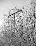
I especially like Correspondence where he takes postcards from about the 1960's and re-photographs the scene - the resulting work includes the new photograph, the picture postcard as well as the original message on the back.


(Here for 8 days on holiday. Having a great time.)


There's always something slightly depressing about most English seaside towns - even at the height of the season (never mind somewhere like Bognor Regis is the middle of winter...) - and yet there's also something about them that attracts - like a moth to a flame. And the ubiquitous holiday postcard "Wish you were here... etc" embodies all of this.

"The ongoing series Correspondence, combines 'found' photography with new photographic work. An initial discovery of old postcards at Greenwich market inspired Paul to retrace and photograph the depicted locations.

'I aim to highlight how the land has changed physically, by neglect, ‘development’ or sometimes coastal erosion, and the way the landscape has changed culturally, illustrating changing trends. The work exposes clichés within these rose-tinted tourist towns and offers a modern day alternative to the picturesque.

( am enjoying every minute of our holiday & am a good girl. We have had lots of sunshine but today is cloudy. We went to Lyme Regis on Monday.)

With the original postcards exhibited alongside the photographs, I invite a direct comparison between the past and present, both being subjective viewpoints. The 21st century ‘reality’ of the locations offers a stark contrast to the often vibrantly coloured dream-like postcard images, revealing a personal view of contemporary Britain.'"

I like the idea of a sort of combination of the re-photographic survey idea and also vernacular photographs - it's at essence a very simple one. And I particularly like the way this is done - it's straightforward and unpretentious, but nicely effective. Some vistas have changed dramatically and yet some have changed hardly at all.


(Had a pretty good journey on wed. A few incidents on route. [sic] Weather perfect so far. Been out all day Thurs & to-day. Rhoda knows lots of beauty spots & loves driving. Sidmouth is not busy at the moment still like it very much – the flat is super. All being as planned return Wed. Will see you soon.)

I can recall walking along that path at Ventor on a trip to the Isle of Wight and my Mother probably has a stack of these old postcards we received over the years, and I can certainly remember sending a good few of them...


(This is our hotel v. posh. We are here till Saturday tripping all over with WALLY (NO COMMENTS PLEASE) the coach driver he and the two old biddies (Bell & her Dozy friend) are a scream!……So see you at 8.30am 2nd Sept till then HAPPY HOLS.)

Thursday, January 17, 2008

Mårten Lange


I quite like Swedish photographer Mårten Lange's work for a couple of reasons.
The first is pretty obvious - his Woodland project approaches the whole "trees/forest" subject in a way that seems failry close to my own approach - and on the whole I like the way he's done it.


His Machina work has also grown on me quite a bit. I also like the similarly between the two projects; the view of complex tangles, a sort of disorder (yet with an underlying - less obvious - order) and messiness. Visually confusing but intriguing.


The second reason is how he approached publishing his work. He has established his own Press and publishes what are basically photo-zines which are in a way closer to the zine comic book world than the fine art photo book world. It's a nice approach. 5B4 has a good review of his books and his publishing

"When most young artists dream of publishing a photography book they may desire for it to be accepted into the hands of a Hatje Cantz, Aperture or Steidl. Often the dream entails lush production values and a care given that is tantamount to the respect one tends to place upon their own work.
On the other side of the coin, there are artists that have a DIY approach similar to the vast amounts of fanzines (’zines) that appeared throughout the heyday of the punk and hardcore music movements in the early 1980’s. ‘Zines are rather cheaply produced magazines of varying length, often Xeroxed and staple bound and distributed through various independent channels...

One such small publisher who is taking advantage of this type of low-fi production is called Farewell Books which is run by a photographer named Marten Lange in Sweden. Originally started to publish his own photography, he has branched out to publish others including the prominent photographer and conceptual artist John Divola. All of the books are various sizes; laser printed and perfect bound in soft cover."


Finally, I'm pretty sure I can see a big dose of influence from Lee Friedlander in his work - both the Desert and Olmsted work and also the At Worker and Cray projects. I wonder if Lange is breaking away from that a bit more in new work?

Tuesday, January 15, 2008

Melissa Catanese Pt III - on process


When I posted last week about Melissa Catanese's work I mentioned the sort of "off to one side" part of her website she calls "More" and said:
"My guess is (and I could also be completely wrong) is that this is slightly older work, but she doesn't want to quite abandon it. If I'm correct and that's the case, I found it worthwhile looking at because to me it seemed to give a picture of her developing her work and ideas and way of seeing things over time and then it's as if she has found her stride in the main, new (?) work she's presenting - Stardust, Bugs, Jungle, Garden etc. Maybe I'll hear from her one way or the other."


Well, she did and it turns out my guess was fairly close. Melissa sent me an email that said in part:
"As far as the way my website is designed, you’re pretty much right—the homepage has projects that are completed, at least in their visual form. I think of the ‘more’ section as sketches or thoughts, in fact before my last update this section was titled, 'sketches'. The work in this section is both old and new. Towards the end is older work edited in the nature of a diary, this is the work I can’t seem to part with, like you said! Much of the work in this section is new, still in sketch form and pragmatic in the way it’s edited. I think including work in progress can play with the fluidity of a project and aid in the process of working it out. It’s a good exercise for me. But the downside to this is, if misinterpreted, the work is viewed as finished. This is an issue I’m still struggling to resolve."


I'm not sure that last part is really a problem - first, the section is slightly tucked away - and secondly, at least one person figured out broadly what it was... although perhaps in part because it was so recognisable to me. In my own work I go through very much the same process. They are sketches, ideas, experiments, notes - sometimes they work and sometimes they don't - but you learn from them (especially the ones that don't) and they propel you a bit further towards what you are trying to do, what you are exploring, where you are pushing your boundaries back. And then things will click and something will come together - for a while at least - until you head off in a new direction.


And they aren't just preliminary sketches, but they usually continue through as you work - as you adjust your direction or your pace - as something new strikes you or as you you look back to figure out how you got here.


As someone doing the same sort of thing, I personally find this both fascinating and immensely valuable - to see these sorts of rough sketches. And even if you aren't actively pursuing your own work, I think it's likely that they can also help inform and broaden a viewers understanding of where the work is coming from and what it's about - you get a chance to see and visually engage with a bit of the process.

So I hope people can see that these aren't, say, older/earlier finished works - but rather it's like getting a glimpse of an artists sketchbook or a writers notebook - fragments of the process.


(Note - the photographs here are a mixture - some from the completed projects, from the sketches in "more").