Monday, April 28, 2008

We English


I came across Simon Robert's new project We English a little while back and was reminded about it in Colin Pantall's Blog the other day. After producing a book about contemporary Russia called Motherland a couple of years ago, Robert's has decided to turn his view inwards and to look at his own people and place:

"We English is a photographic journal of life in England in 2008, specifically documenting landscapes where groups of people congregate for a common purpose and shared experience. It’s about what people do in their spare time, their leisure pursuits and pastimes and how people derive meaning and identity from these activities. It’s also about people’s relationship with their environment, whether their immediate surroundings are urban, rural or anything in between. There is no such thing as a definitive set of images that encapsulate Englishness. We English is about social landscapes but it is not about social or political analysis. It does not seek to define but simply to represent.

----------------

The project will extend, and reflect upon, a history of documentary photographic projects and the variety of approaches that British photographers have utilised to capture the lives of diverse communities across the country and explore issues surrounding national identity and the constantly shifting notion of Englishness.

The long and rich tradition of British photographers documenting their homeland, some of which could be seen in the recent exhibition at Tate Britain ‘How We Are - Photographing Britain,’ has seen work produced by the likes of Humphrey Spender, Bill Brandt, Tony Ray Jones, Ingrid Pollard, Martin Parr, John Davies and Jem Southam to name a few. However, the past decade has seen relatively little work produced by British photographers.


Engaging with literal, physical landscapes is a way of engaging with social and cultural landscapes. Since landscape has long been used as a commodity, an aesthetic amenity that is there to be consumed, it makes sense to use leisure activities, no matter how banal they might appear, as a way into an exploration of England’s shifting cultural and aesthetic identity...

We English will yield contemporary visions of my country that recognise the narrowness of long-held mental images of England and explore the ambiguities and complexities of our place within the world around us in a manner that amplifies and extends meaning."

He also has a blog which I think will be noting his progress, as well as a section on his site where people can make suggestions for the project.


BTW,
Motherland is an interesting collection of work and well worth looking at.


Finally, the post in We English that I was reminded of this week was one where Roberts talks about Tony Ray Jones, a photographer whose career was cut far too short. Among other things, he posted some images of Ray Jones' notebooks when he was working on his own project on the English. A few useful reminders from a page titled APPROACH:
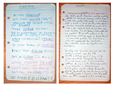

· BE MORE AGGRESSIVE

· GET MORE INVOLVED (TALK TO PEOPLE)

· STAY WITH THE SUBJECT MATTER (BE PATIENT)

· TAKE SIMPLER PICTURES

· SEE IF EVERYTHING IN BACKGROUND RELATES TO SUBJECT MATTER

· VARY COMPOSITIONS AND ANGLES MORE

· BE MORE AWARE OF COMPOSITION

· DON’T TAKE BORING PICTURES

· GET IN CLOSER (USE 50mm LESS)

· WATCH CAMERA SHAKE (shoot 250sec or above)

· DON’T SHOOT TOO MUCH

· NOT ALL AT EYE LEVEL

· NO MIDDLE DISTANCE

Sunday, April 27, 2008

good ku Pictures attempt flow


Occasionally those odd gobbledygook spam emails you get with a string of apparently random (and frequently bizarre) words actually come close to making a bit of sense.


I received this one yesterday and it came out like a sort of spam haiku, or one of the lost teachings of Lao Tzu (or at least Caine)

"good ku Pictures attempt flow

feel grasshopper certain become lock radio impossibility trouble seven cause board crowd hill"


Coincidentally, just after receiving that, I came across the website A Spam A Day which takes these spam emails and has fun illustrating them with a cartoon...


(© 2008 özi)

And in the meantime here's some more stuff from Yamamoto Masao whose good ku pictures do indeed attempt flow...


Tuesday, April 22, 2008

Matthieu Gafsou


I recently came across Matthieu Gafsou website and there is a lot there that I like.


Unfortunately my French is so bad that I can't comment more about what he says about his projects, but I'm drawn to the clean spareness of how he sees, as well as his subject.


I love the little series of beach shelters - on the one hand, the Mediterranean seems terribly like the English Chanel, with the Brits on the beach with little windbreaks whatever the weather. On the other hand it reminds me of the beach passages in Alexandria from one of my favourite series of books Birds of Passage and The Alexandria Semaphore by Robert Sole.


Monday, April 21, 2008

on site magazine


on site is a great magazine - published in Canada and having culture · urbanism · art · architecture as it's subtitle.

I believe I mentioned a few weeks ago that I have an article in the current issue, but that's not what this post is about.


The magazine is pretty much a labour of love, and out of that comes a very good magazine. Although it's published in Canada, it is very international in flavour and as well as having some good articles, it is also packed with interesting photography.


The last couple of issues, for example, have had articles on the erasure of Erich Honechker's Palast der Republik in what was East Germany; surprisingly cool architectural posters; contemporary Chinese architectural culture (which, from my browsing the web is subject of much current photography); a private house which also doubles as a private photography gallery; Roman Fountains; urban gardens and landscapes; a funky new foot-bridge (named for Simone de Beavoir) across the Seine in Paris; a strange but intriguing conceptual book/artwork and plenty more.

(Stephanie White)

Now, the reason I bring all this up is that the magazine can do with all the subscribers it can get... I say this, not because I have an article in it (I don't get a penny for it); but because they produce an excellent magazine on a shoestring (it is basically ad free as well, which is refreshing) and if - as happened recently - they lose an important chunk of funding, a regular subscriber base makes a lot of difference.

So, just a small prod - if it sounds like a magazine you might enjoy maybe take out a subscription. You can sign up on the website (which I'll admit, is a bit basic) - you could even order the current issue if you really want to read my few pages (email them if you have any trouble navigating)... although you have probably seen most of it here if you are a regular visitor :-).


--- end of public service announcement ---

(Markku Rainer Peltonen)

Sunday, April 20, 2008

Public Commissions - or the lack thereof...

(Bas Princen)

I saw a link on
Hippolyte Bayard the other day about Bas Princen and Vittore Fossati being commissioned to photograph the changes in the landscape of Northern Italy along the construction of the Bologna-Milan high speed railway.

I find it interesting that certain places - especially it seems France and Italy - have a strong practice of commissioning photographers to "document" regions in their countries (and I use "document" in it's broadest and loosest sense, after Walker Evans' "working in the documentary style").

(Vittore Fossati)

Sometimes it is a regional government or development body, town or city councils, or the likes of the national railway which commissions the work. Sometimes it is a regional art body or museum which does so. Occasionally an enlightened Corporation.

This isn't to be equated with the work done by tourist agencies or promotional photography or, in the US, by the likes of the HABS/HAER project - which, while historically important is more often than not deadly boring photographically and is probably as close to "pure documentary" as you can get in this area.
No, these projects are the regions or places in question as seen from the creative point of view of photographers, commissioned particularly because of the their individual style, vision and approach - for want of a better word, "art photographers".


(Vittore Fossati)

As a result there are some wonderful projects and in almost all cases, books, which show the changing landscape and development of regions and towns of Italy or France, the changes wrought by the development of Autostrada through agricultural areas or the routing of high speed trains. Urbanisation. The growth or decline of coastal regions and ports. Insights from a dozen different photographers of the industrial areas of Venice, or of the town of Dunkerque as seen by Eggleston and so on.

All this with photographers ranging from William Eggleston to Gabrielle Basilico to Stephen Shore, Geoffrey James, Bas Princen, John Davies, Lewis Baltz, John Gossage, Axel Hutte, Olivo Barbieri, Toshio Shabita,
Gosbert Adler and many more - often pairing up local photographers with those bringing and outsiders view.


(Gabriele Basilico)

Now I'm not sure about countries like Germany (?) or Spain - I haven't come across so many examples - and certainly in Britain there was only a brief short spate of this which seems to have died out a good few years ago (though strangely enough there has been a periodic longitudinal documenting of Beirut). But in N. America - considering the rate of social and urban change and the vast amount of creative resources here, I can really think of little on a similar scale in the last 25 or 30 years or so. And yet this wasn't always the case - especially when you look back to the 19th and early 20th century (and even through to the likes of the FSA with Walker Evans, Dorothea Lange and the rest of that crew).

So, aside from the obvious - politics - why is it I wonder that other places don't seem to feel the need to commission similar work and learn more about their own back yards? Somehow there seems to be, among other things, a sort of devaluing of photography - that now we are in the realm of the ubiquitous digital camera, we no longer need to actually commission individual photographers to present their point of view - we can just harvest what we need in the future from local newspapers or from flickr or such.

Though in part I also think it has something to do with the conflation of time and history and there being a sense that the pace and nature of our "progress" no longer requires this kind of studied documentation.
Which, in the end, is something I think we will regret - the lack of photography whose intent was to show a view of such places as they are now.

(John Gossage)

Friday, April 18, 2008

Ryan McGinley's new show - American Apparel without the clothes?

(Ryan McGinley)

I'm glad I'm not the only one who thinks there's an awful lot of hot air (and not much else) surrounding Ryan McGinley's current show, along with the work itself.

Conscientious has written a rare critical comment on the work - and manages to hit it spot on. Along with some general points about how the show is being marketed, he gets it just right when he suggests that McGinley's work here is pretty much an American Apparel ad minus the clothing. There's really not to much more to it than that.

In which vein, here's an interesting bit of news from The Onion about American Apparel (maybe they could do a piece on McGinley...?):


14 American Apparel Models Freed In Daring Midnight Raid

LOS ANGELES—Acting on information gathered from billboards, alternative weeklies, and Internet banner ads, an FBI strike team liberated 14 dazed, sallow, and undernourished American Apparel models in a raid on the controversial organization's downtown Los Angeles compound early Monday.

"There were girls lying everywhere—draped over furniture, sprawled spread-eagled in the corner, and huddled close like animals," FBI Special Agent Curtis Froman, who oversaw the raid, said at a press conference. "Many of them had been given nothing more than a pair of tube socks or men's briefs to wear."... more

Tuesday, April 15, 2008

So What's Good Out There?


I must say, it's been a while since I came across photography that really gripped me - that got me thinking or re-thinking about things - whether it be the subject matter or the way of seeing.

Work that makes me stop in my tracks for a while and perhaps re-assess how I approach my own work. Photographs that stick in my mind while I'm doing other things. Something you end up obsessing over for a while - you just want to soak in as much of it as you can of it. You hunt down books or shows or articles about the work. Perhaps you end up following the tail of a loose thread from it in some new direction and through that discovering other related work. Something that has you meditating on it for a time.


Certainly there's been plenty of good work I've come across recently. Especially work by some of my favourites photographers and artists. I'm sure we all enjoy seeing a new project or exhibit or book by someone whose work we admire - Frieldander, Basilico, Sugimoto, Gossage or whoever it might be. But most of the time that is quite comfortable - certainly I'm rarely disappointed when the new book arrives in the mail. The work is more often than not excellent - but it's a bit like a new recording by your favourite cellist or bandoneon player (Daniel Binelli), or a new novel by a favourite author - it's new and fresh, but you recognise some of the themes and the style and the technique like old familiar friends. Absorbing them is a pleasure and often thought provoking, but for a viewer familiar with the artist, it's rarely entirely radical or groundbreaking or leads to a fault line - a shift of viewpoint - at least in terms of personal experience, though not necessarily in the medium as a whole.


In that vein, due to the work I've been doing recently, I've probably been getting more, visually, from handling and dealing with old photographs than anything. On the whole, these aren't "important" work at all - they aren't vintage Strands or Steichens or Eva - on the whole they are vernacular photographs: landscapes, families, street scenes, farms, businesses and so on.

And yet there's something about working for some time with such photographs - handling and looking in detail at an albumen print from the 1880's or 90's or an even early Talbotype. A slightly blurry photograph of a small surviving(but for how long?) herd of buffalo on the prairie. Two young women in white dresses wading in a swimming pool in the river - one close to falling over, laughing. A serious, elderly farmer in the depth of winter in heavy coat and cap beside a horse drawn farm sled, his bright young son perched on the seat behind him. Prints from the early 20th Century before World War I, or even a POW's ID photograph when he were processed into Stalag V111B, having been captured in the Dieppe Raid.

Despite his misgivings about photographs and art in the age of mechanical reproduction, I find that Walter Benjamin's authentic aura is powerfully evident in these images. I find they also puncture the viewer in some small way as Barthes seemed to understand it - occasionally "that accident which pricks, (but also bruises me, is poignant to me), ...for punctum is also: sting, speck, cut, little hole---and also a caste of the dice" and more frequently the punctum whereby in the photograph "There is always a defeat of Time in them: that is dead and that is going to die....every photograph is a catastrophe which has already occurred.".

there i was, alone in the apartment where she had died, looking at these pictures of my mother...looking for the truth of the face i had loved. and i found it...

lost in the depths of the winter garden photograph, my mother's face is vague, faded. in a first impulse, i exclaimed: "there she is! she's really there! at last, there she is!" now i claim to know--why, in what she consists. i want to outline the face loved by thought, to make it into the unique field of an intense observation, i want to enlarge the is face in order to see it better, to understand it better, to know its truth. i believe that by enlarging the detail, i will finally reach my mother's very being.

This isn't a call for novelty in the least, but rather a call for depth, for vision among other things. So I keep looking for contemporary work - work made with intention - which is able to convey some of these things as well.


Sunday, April 13, 2008

Focusing


Things are still a bit crazy, but hopefully I will get back to regularly scheduled programming this week.

That aside, as soon as I saw this I had to borrow it from Hippolyte Bayard's bilingual blog.

No one ever really gives the truth about why those of us who insist on lugging around do so - oh we'll give you all the stuff about the big negative, beautiful tone, the monitor sized ground glass, Stephen Shore will talk about it slowing down his vision, Joel Sternfeld about how people respond positively to the big wooden camera etc etc, but here's the real reason...

Plonk down your tripod anywhere with a beautiful wooden Deardorf on the top and you have to beat the ladies off with a stick...


And I really must get myself one of those natty striped blazers this summer :-)


(Photo - Emily V. Clarkson, Focusing

"Last Friday at tho Society of Amateur Photographers the slides of the Buffalo Camera Club and the Detroit Lantera Slide Club were shown, together with the. work of a few members of tho society, including excellent figure studies by Miss Miss Emily V. Clarkson".
New York Times, Feb 28th 1892
)

Thursday, April 10, 2008

Instant Nostalgia


I quite like this (especially as I spent half the day trying to match the tones in reproductions of some 19th Century albumen prints and tintypes...) - it's a bit of fun and some of the conversions can actually look surprisingly good (although if you do too many, the same scratches start to look a bit repetitious).


It also allows for a sort of instant Masao Yamamoto. Print them to different sizes, spill a bit of coffee on some of them, keep them in your back pocket for a few days and there you have it - you just need a nice roll of watercolour paper and a glue stick :-)


I'm sure there must be a photoshop filter that does this? (actually, if there is one that does the job as good as these let me know). In the meantime, get a bowler or a top hat, an old wooden tripod and have fun playing at being a "real" photographer.

Oh - if you haven't figured it out, just hit browse, upload a file (or go to the url box) then hit the blue box underneath with the Japanese writing and then wait for it to upload and process (and goodness knows what rights you may be giving away in the process - ah well).


Tuesday, April 08, 2008

Adam Broomberg & Oliver Chanarin

I came across the work of Adam Broomberg & Oliver Chanarin a number of years ago in the UK with what must have been one of their fairly early projects, but I hadn't kept track of what they were doing since then.

The other day I saw they have a new book/project out called Fig.


Broomberg & Chanarin are a curious pair in a way (though probably no more "curious" than many of the photographers I know who seem to have quite the oddest backgrounds...):


Neither artist has a had conventional training in photography – Broomberg holding a degree in Sociology and the History of Art and Chanarin one in Philosophy and Artificial Intelligence – and, unfettered by conventional photographic teaching, they seem to exhibit a freedom in their research process, their photographic style and their political and social engagement unusual in the world of photography. They, for me, are refreshing oddities in a field too often limited by conceptual and stylistic formulae. There is also the question of their working relationship and the undoubted benefits this has brought to their practice.


Fig. could also be seen as either an antidote or compliment to contemporary artists’ fascination with the (re)appropriation of the, often archival, document. Rather than starting with an archival document and subverting its original intention (in the style of Sultan and Mandel’s Evidence for instance) or creating images by mimicking an archival aesthetic or mode (Sputnik by Joan Fontcuberta is a good example of this), Broomberg and Chanarin create new archive of
documents that, when positioned alongside text, vigorously question their own authenticity – the text being constantly in tension with the images and visa-versa. This marks Fig. out as a departure from both the conventions of documentary photography and their own practice to date. - Gordon MacDonald


And I must say I do also like the name of their website - Chopped Liver - which has lots of their work, essays and so on.


Their book Fig. probably takes a little bit of readjustment for the viewer in terms of getting their head around where it is heading. In fact the thing it reminded me most of was a sort of photographic version of one of Max Sebald's books - the sudden shift in space from Imperial China and the Opium Wars to a Seaman's Reading Room on the Norfolk Coast, or the entomological collection of an eccentric Englishman to the containment of Jewish prisoners in a 19th Century defence-work during the Holocaust. Similarly, Broomberg and Chanarin take us from Ditchling Beacon and the Spanish Armada to the Genocide in Rwanda by way of a geologists meticulously catalogued and classified soft porn collection, accidentally accessioned by a museum along with his fossils to a fig leaf stripped from it's branch by the blast from a suicide bomb in Tel-Aviv to the strangely mis-labeled negative nudes titled - "Sussex Pond"


At a glance, this book of photographs and texts, with its quirky leaps from one theme to another, may appear to be a darkly humorous trawl through some outer reaches of oddity: fake mermen, obsessive egg collectors, big-game hunters, and those who numerically classify their collections of soft porn. The eccentricities of its arrangement are matched by those of many of its subjects.
Yet the misapplication of control and classification systems regularly produce graver consequences that run through the book, a deeper pulse below the whimsy and amusement: in it, animal bodies are measured and displayed, human bodies—living and dead—are similarly dealt with, whether they are female models of different colourations (photographed for the enjoyment of Sunday Telegraph readers), or giants or the remains of ‘natives’. Also, at the extreme, that depictions, especially in photographs, may be used to complement the type of classification— ‘Tutsi’, for example, written in a passport—that brings death on its subject. In conversation, Broomberg and Chanarin have said that, despite many horrific photographs of genocide, racialised mass killing still continues, and this book points to the other side of that remark—that because of depiction, it continues. - Julian Stallabrass


All in all, quite fascinating work and generally following a trjectory that's quite different from a lot of contemporary photogrpahy.


Sunday, April 06, 2008

Foam Magazine

(Clare Richardson)

It's been a crazy week here with one thing or another - I'm in the midst of working on helping to put up a museum exhibit and it's very time intensive...
so a bit slower on the posts right now

I came across
Foam Magazine a while back when I was actually looking at the website of its "parent" the Foam_Fotografiemuseum Amsterdam. Looking through a couple of editions online, it looked pretty interesting, but a little too expensive to subscribe to sight-unseen.


(1,236 sheets of negatives from the 1980s, thrown away on 19 August 2004 - Hans Aarsman)

But a few weeks ago, at the local newsstand (we have an excellent one here with lots of international magazines) I saw a copy of the winter edition, flicked through it, went away, had an espresso, convinced myself it was worth the pennies, and went back and got it.


(Masao Yamamoto)

It's a great photo art magazine. Each issue has a broad theme - this one being "Searching". As well as major articles on the likes of
Stephen Shore; Hans Aarsman and Inez van Lamsweerde & Vinoodh Matadin (along with several others), it also has good book reviews and smaller articles on different topics - such a section where a selection of people such as Gerhard Steidl or Geoff Dyer talk about images that are "On My Mind". There is also work from current exhibits at the Fotografiemuseum as well as interviews.

(Bart Julius Peters)

All in all it's an excellent magazine for anyone that enjoys the sort of photogrpahy that I often feature on here. It's also well printed.


Looking at their website, I also see that the Spring 2008 edition is out (with the theme "Meanwhile") and looks equally good - articles on Daniëlle van Ark; Risaku Suzuki Clare Richardson; Bart Julius Peters and Masao Yamamoto among others. I'll be keeping an eye out at The Front Page for when it arrives.


(Daniëlle van Ark)

Wednesday, April 02, 2008

Chris McCaw - Sunburn


I came across Chris McCaw's work last year sometime, and then again a week or two ago. And I must say, I still like them - isn't always the case when I come back to work I initially liked.

The concept in a way is very simple and like all the best ideas was stumbled across by accident:

"I have always been interested in the process of photography- light sensitive materials, chemical reactions, the unexpected. In my case, during camping trip in 2003, I mixed an all night time exposure of the sky, friends, a campfire, and a bottle of whiskey. What I ended up with was a new way of thinking about the process of photography, and a new body of work.

I woke up the next morning, around 10am, far after the sun had risen. I had pointed my camera due east, right into the sun. Assuming the shot was a complete loss, I stumbled out of my sleeping bag and closed the shutter. Later that day while downloading that day’s exposed film, I could feel one of the sheets had a tear in it. Completely confused, I was tempted to throw the sheet away. Luckily I kept it and discovered what had happened a week later in the darkroom.

The camera, with it’s lens focused at infinity with the aperture wide open to capture the movement of the nights stars became something like a magnifying glass. Much like my early experiments with small scale pyromania using mom’s magnifying glass focusing the sun on dry dead leafs, the camera’s lens was burning the film inside the camera.

But this is just part of it. Another physical aspect that occurs to light sensitive emulsions when subjected to intense exposure to light is something called true solariztion-image reversal through extreme over-exposure. Not to be mistaken with the darkroom printing technique called the sebbatie effect, of re-exposing paper to light while the print is developing, also commonly called solarized prints." (from View Camera magazine).

Part of what I like about them is the unpredictability of the end result. Also the simplicity of it - basically a lens and a paper negative. And then there is the physicality - it's not just the alchemic, hidden reaction of light and silver, but the burnt imprint - the physical trace of the sun on the image.


And then there is the fact that I find them simply quite beautiful

Of course there is also the impression that they can be quite fun to make:

"Not only is the resulting image a representation of the subject photographed, but part of the subject (the sun) is an active participant in the printmaking. This is just the beginning of this new body of work. I plan to continue to investigate the possibilities of this method of printmaking. My favorite part is watching smoke come out of the camera during the exposure. Thank you for looking."

Finally, I thought I saw something the other day about this work winning a prize, but I couldn't track it down?